Building a Content Management App with ADF 2.0.0
- Alfresco Hub
- :
- ADF - Forum
- :
- Building a Content Management App with ADF 2.0.0
Building a Content Management App with ADF 2.0.0
- Subscribe to RSS Feed
- Mark as New
- Mark as Read
- Bookmark
- Subscribe
- Printer Friendly Page
- Report Inappropriate Content
Introduction
In this article we will look at how you can use the Alfresco Content Services (ACS) related ADF components to build a Content Management application. This could be useful if you are about to start on an ADF trial, you need to build a PoC with ADF, or you just want to play around with it and see what's available.
This article builds on two other articles in the ADF Developer Series. The first article talks about how to generate an application with Angular CLI and prepare it for use with ADF 2.0.0 and the second article improves on the first article by adding a navigation system, menu, toolbar, and logout functionality.
We want our new content management application interface to look something like this:
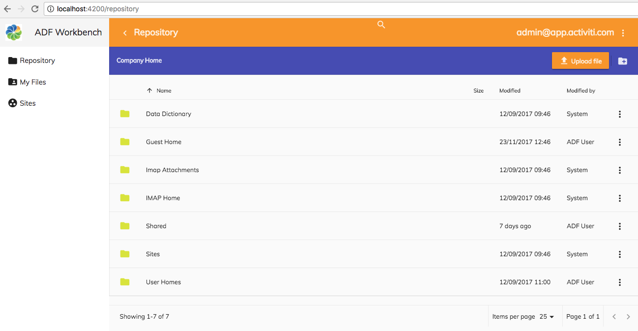
This application should allow the user to browse the complete Alfresco Repository. While browsing the Repository the user will be able to execute some of the more common content actions, such as Download, Details, Copy, Move, etc. There will be file Preview available so the user doesn't have to download a file to look at the content. It will also be possible to look at just My Files and also to browse and work with files via Sites. The interface will provide Search in both metadata and content.
Article Series
This article is part of series of articles covering ADF 2.0:
- Generating an app with Angular CLI and preparing it for use with ADF 2.0.0
- Adding Navigation, Menu, Toolbar, and Logout to your ADF 2.0 App
- Building a Content Management App with ADF 2.0.0 - this article
- Building a Process Management App with ADF 2.0.0
- Deploying ADF 2.0 Apps - COMING SOON
Prerequisites
This articles assumes that you are starting with an ADF application that has a menu, navigation, toolbar, and logout as per this article. You can either walkthrough this article first, or clone the source code as follows:
Martins-Macbook-Pro:ADF mbergljung$ git clone https://github.com/gravitonian/adf-workbench-nav20.git adf-workbench-content20
This clones the starter project within a new directory called adf-workbench-content. Install all the packages for the project like this:
Martins-Macbook-Pro:ADF mbergljung$ cd adf-workbench-content20
Martins-Macbook-Pro:adf-workbench-content20 mbergljung$ npm install
Martins-Macbook-Pro:adf-workbench-content20 mbergljung$ npm dedup
The de-duplication (i.e. npm dedup) attempts to removes all duplicate packages by moving dependencies further up the tree, where they can be more effectively shared by multiple dependent packages.
Source Code
While walking through this article it is a good idea to have the source code available. You can clone the source as follows:
Martins-Macbook-Pro:ADF mbergljung$ git clone https://github.com/gravitonian/adf-workbench-content20.git adf-workbench-content20-src
Listing files and folders in the Alfresco Repository
After we have logged in we most likely want to navigate around in the Alfresco Repository and look at folders and files. This can easily be done with the ADF Document List component. We will create a page that displays the content of the Repository top folder /Company Home. The implementation will actually be in the form of a Master-Detail pattern. So we prepare for the possibility to view details for a file or a folder.
Generating module and pages and setting up routing
As usual, we can easily create a new module and components with the Angular CLI tool. Standing in the adf-workbench-content20 directory do the following:
Martins-MacBook-Pro:adf-workbench-content20 mbergljung$ ng g module repository --flat false --routing
create src/app/repository/repository-routing.module.ts (253 bytes)
create src/app/repository/repository.module.ts (295 bytes)
Martins-MacBook-Pro:adf-workbench-content20 mbergljung$ cd src/app/repository/
Martins-MacBook-Pro:repository mbergljung$ ng g component repository-page
create src/app/repository/repository-page/repository-page.component.css (0 bytes)
create src/app/repository/repository-page/repository-page.component.html (34 bytes)
create src/app/repository/repository-page/repository-page.component.spec.ts (685 bytes)
create src/app/repository/repository-page/repository-page.component.ts (304 bytes)
update src/app/repository/repository.module.ts (405 bytes)
Martins-MacBook-Pro:repository mbergljung$ ng g component repository-list-page
create src/app/repository/repository-list-page/repository-list-page.component.css (0 bytes)
create src/app/repository/repository-list-page/repository-list-page.component.html (39 bytes)
create src/app/repository/repository-list-page/repository-list-page.component.spec.ts (714 bytes)
create src/app/repository/repository-list-page/repository-list-page.component.ts (323 bytes)
update src/app/repository/repository.module.ts (535 bytes)
Martins-MacBook-Pro:repository mbergljung$ ng g component repository-details-page
create src/app/repository/repository-details-page/repository-details-page.component.css (0 bytes)
create src/app/repository/repository-details-page/repository-details-page.component.html (42 bytes)
create src/app/repository/repository-details-page/repository-details-page.component.spec.ts (735 bytes)
create src/app/repository/repository-details-page/repository-details-page.component.ts (335 bytes)
update src/app/repository/repository.module.ts (677 bytes)
This creates a repository module with routing and the following pages:
- Repository Parent page - will contain just the <router-outlet>, and it has the following child pages:
- Repository List Page - this is the Master view with the document list
- Repository Details Page - this is the Details view for a folder or a file
Let’s configure the routing table, open up the src/app/repository/repository-routing.module.ts file and update it with the new route to the repository page:
import { NgModule } from '@angular/core';
import { Routes, RouterModule } from '@angular/router';
import { RepositoryPageComponent } from './repository-page/repository-page.component';
import { RepositoryDetailsPageComponent } from './repository-details-page/repository-details-page.component';
import { RepositoryListPageComponent } from './repository-list-page/repository-list-page.component';
import { AuthGuardEcm } from '@alfresco/adf-core';
const routes: Routes = [
{
path: 'repository',
component: RepositoryPageComponent,
canActivate: [AuthGuardEcm],
data: {
title: 'Repository',
icon: 'folder',
hidden: false,
needEcmAuth: true,
isLogin: false
},
children: [
{ path: '', component: RepositoryListPageComponent, canActivate: [AuthGuardEcm] },
{ path: ':node-id', component: RepositoryDetailsPageComponent, canActivate: [AuthGuardEcm] }
]
}
];
@NgModule({
imports: [RouterModule.forChild(routes)],
exports: [RouterModule]
})
export class RepositoryRoutingModule {}When we use the http://localhost:4200/repository we will hit the parent page component RepositoryPageComponent and as there is a child component RepositoryListPageComponent with empty path '' it will automatically be invoked and the document list displayed.
When one of the items in the document list is clicked, such as a file, and we select a Details content action from the 'Three Dots' menu, then the http://localhost:4200/repository/<node-id> URL will be invoked taking the user to the RepositoryDetailsPageComponent.
If the data object properties are not familiar, then read the previous two articles mentioned in the introduction. They explain everything around these properties and the navigation system.
The AuthGuardEcm ADF component makes sure that the route cannot be activated if the user is not authenticated with ACS. Which leads us to make sure that the app is set up to authenticate with ACS and only that backend service. Open the src/app/app-login/app-login-page/app-login-page.component.html template file and make sure the providers property is configured as follows:
<div fxFlex="100">
<adf-login class="app-logo"
[providers]="'ECM'"
[copyrightText]="'© 2017 Alfresco Training.'"
...For these routes to be known to the Angular Router, and then indirectly to the AppMenuService, we need to import this module in the AppModule. Open the src/app/app.module.ts file and add as follows:
import { BrowserModule } from '@angular/platform-browser';
import { NgModule } from '@angular/core';
import { AppRoutingModule } from './app-routing.module';
import { AppComponent } from './app.component';
import { AppCommonModule } from './app-common/app-common.module';
import { AppLoginRoutingModule } from './app-login/app-login-routing.module';
import { AppLoginModule } from './app-login/app-login.module';
import { AppMenuService } from './app-menu/app-menu.service';
import { RepositoryRoutingModule } from './repository/repository-routing.module';
import { RepositoryModule } from './repository/repository.module';
@NgModule({
declarations: [
AppComponent
],
imports: [
BrowserModule,
AppRoutingModule,
AppCommonModule,
AppLoginModule,
AppLoginRoutingModule,
RepositoryModule,
RepositoryRoutingModule
],
providers: [AppMenuService],
bootstrap: [AppComponent]
})
export class AppModule { }
Note how we also import the RepositoryModule with the page components. The order that we add the *RoutingModules in matter as that is the order in which they will be displayed in the side navigation.
Logging in should display the Repository link in the left navigation as follows (start the server with adf-workbench-content20 $ npm start):

We can now start to implement the list and details pages.
Implementing the Repository Parent Page
The parent page will just be a container for the content that is output from the child pages. Open up the src/app/repository/repository-page/repository-page.component.html file and update it so it contains the Router Outlet:
<router-outlet></router-outlet>Whenever we navigate to the Repository List page (http://localhost:4200/repository) or the Repository Details page (http://localhost:4200/repository/123) their template view will now be output in this router outlet instead of in the main app page router outlet that is contained in the src/app/app.component.html template file.
Clicking on the Repository link in the side navigation should now work and take you to the Repository List page:

Implementing the Repository List Page
To display the contents of the Alfresco Repository we can use the ADF Document List component that is available in the @alfresco/adf-content-services package/library (follow the link for full documentation of this component). We don't need to install this package as that has already been done in the initial articles in this series.
The ADF Document List component uses the ADF Datatable component under the covers. So whatever you know/learn about the ADF Datatable will be applicable also to the ADF Document List.
The basic usage of the ADF Document list is as follows:
<adf-document-list
#documentList
[currentFolderId]="'-my-'"
[contextMenuActions]="true"
[contentActions]="true">
</adf-document-list>The documentList is the identifier we give this document list instance in the UI. We can choose another identifier if we like, but remember that the docs refer to this specific identifier from time to time.
The currentFolderId property is used to specify from where in the repository we want to display folders and files. The following list of constants can be used (also referred to as Data Sources):
- -root- : Displays content from the root of the Repository, which means from the top folder called /Company Home.
- -shared- : Displays shared files (This is the Shared Files menu item in Alfresco Share). Same as /Company Home/Shared.
- -my- : Displays my files (This is the My Files menu item in Alfresco Share). Same as listing /Company Home/User Homes/<user id>.
- -mysites-: Displays a list of Alfresco Share sites that the current user is a member of. This is the content under /Company Home/Sites.
- -trashcan- : Displays files that the user has soft deleted. (This is the User Profile | Trashcan menu item in Alfresco Share).
- -sharedlinks- : Displays a list of shared content item links.
- -sites- : Displays a list of Alfresco Share sites. This is the content under /Company Home/Sites.
- -favorites- : Displays a list of content items that the user has marked as favorites.
- -recent- : Displays a list of recently accessed content items.
Open up the Repository list page template file located in src/app/repository/repository-list-page/repository-list-page.component.html and define the template as follows:
<adf-document-list
#documentList
[navigationMode]="'click'"
[currentFolderId]="'-root-'"
[contextMenuActions]="true"
[contentActions]="true">
</adf-document-list>Note that we changed to use -root- as the data source because we want to show folders and files from the top /Company Home folder. The navigationMode property was also set to click so we don’t have to double click all the time when navigating around in the Document List.
The adf-document-list tag will not be known to the application until we import the AppCommonModule. Open up the src/app/repository/repository.module.ts and add it:
import { NgModule } from '@angular/core';
import { CommonModule } from '@angular/common';
import { RepositoryRoutingModule } from './repository-routing.module';
import { RepositoryPageComponent } from './repository-page/repository-page.component';
import { RepositoryListPageComponent } from './repository-list-page/repository-list-page.component';
import { RepositoryDetailsPageComponent } from './repository-details-page/repository-details-page.component';
import { AppCommonModule } from '../app-common/app-common.module';
@NgModule({
imports: [
CommonModule,
RepositoryRoutingModule,
/* Common App imports (Angular Core and Material, ADF Core, Content, and Process */
AppCommonModule
],
declarations: [RepositoryPageComponent, RepositoryListPageComponent, RepositoryDetailsPageComponent]
})
export class RepositoryModule {}The AppCommonModule will bring in all the Angular stuff, Google Material components and the ADF Content and Process components. So we should be all set to go.
You should see the following result if you login and then click on the Repository link in the side navigation:

Pretty amazing for a few lines of code!
So we got a header where we can sort ascending/descending, we got a default column layout, and we can click and navigate into a folder. We also got the context sensitive menu on each row but it is empty at the moment.
Let’s make some improvements.
After Successful Login navigate to Repository
When the user has successfully logged in it would be nice if the Repository List page was shown automatically. We can fix this with a minor update to the Login page component class. Open up the src/app/app-login/app-login-page/app-login-page.component.ts file and update it as follows:
What we do here is just uncomment the router.navigate code in the onLoginSuccess method and configure it to navigate to /repository.
Adding Pagination
As you might have noticed, the Document List does not have pagination built in (it used to in previous versions of ADF, but having it separate gives more freedom). The ADF component that we need to use is called <adf-pagination. Update the Repository page template file src/app/repository/repository-list-page/repository-list-page.component.html and add the component as follows:
<adf-document-list
#documentList
[navigationMode]="'click'"
[currentFolderId]="'-root-'"
[contextMenuActions]="true"
[contentActions]="true">
</adf-document-list>
<adf-pagination
[target]="documentList">
</adf-pagination>The adf-pagination component has a property called target that needs to be set to point to the Document List component instance that we want to show pagination for. In this case documentList. So make sure the IDs match.
The application UI now displays a pagination bar at the bottom of the Document List:
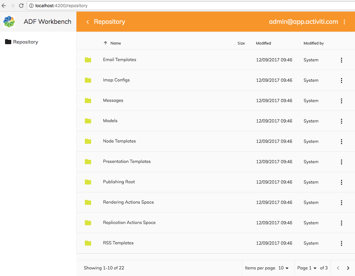
The user can select how many folders and files to display per page via the "Items per page" drop down. It is also possible to navigate directly to a page via the "Page" drop down. To navigate between pages the user clicks on the left (<) and right (>) arrows.
It is possible to inject your own code into the pagination logic. The following events (Outputs) are available:
- (change): called for any change to the pagination bar.
- (changePageNumber): called when the "Page" drop down is changed.
- (changePageSize): called when the "Items per page" drop down is changed.
- (nextPage): called when navigating to the next page
- (prevPage): called when navigating to the previous page
There is also another pagination component called <adf-infinite-pagination that can be used if you want infinite scrolling.
Adding a Toolbar with Breadcrumb Navigation
Adding a Toolbar with Breadcrumb navigation to the Repository view would be nice as then we could navigate in the folder hierarchy more freely. Luckily there are a couple of useful ADF components for just that. Update the Repository page template file src/app/repository/repository-list-page/repository-list-page.component.html and add the <adf-toolbar and <adf-breadcrumb components as follows:
<adf-toolbar [color]="'accent'">
<adf-toolbar-title>
<adf-breadcrumb
root="Company Home"
[target]="documentList"
[folderNode]="documentList.folderNode">
</adf-breadcrumb>
</adf-toolbar-title>
</adf-toolbar>
<adf-document-list
#documentList
[navigationMode]="'click'"
[currentFolderId]="'-root-'"
[contextMenuActions]="true"
[contentActions]="true">
</adf-document-list>
<adf-pagination
[target]="documentList">
</adf-pagination>The adf-breadcrumb component has a property called target that needs to be set to point to the Document List component instance that we want to show breadcrumbs for. In this case documentList. So make sure the IDs match.
The folderNode property should be set to the node that we are currently at. So we grab that directly from the document list instance with documentList.folderNode.
We enclose the breadcrumb component inside an adf-toolbar component so it sits nicely spaced from the document list and from the top toolbar. The document list toolbar will have a different color than the top toolbar, so we set the color property to 'accent', which is part of the Google Material theming.
The application UI now displays a breadcrumb for the Document List as follows:

Here I have navigated down in the folder hierarchy to the Email Templates folder. I can easily navigate back up to Company Home by clicking on that folder in the breadcrumbs toolbar.
Adding Drag-n-Drop File Upload
There is currently no way of dragging and dropping files into a folder. This is usually available in the Alfresco Share folder view so users would expect this feature to be available. We can add that via the ADF Upload Drag area component, here is how you use it:
<adf-upload-drag-area
[parentId]="parent folder id where files should be uploaded"
(success)="onSuccess($event)">
Component that you want to drag and drop into
</adf-upload-drag-area>This component is part of the @alfresco/adf-content-services package and is available without any further configuration. So we can add the adf-upload-drag-area component directly in our template. Open up src/app/repository/repository-list-page/repository-list-page.component.html and add it as follows:
<adf-toolbar [color]="'accent'">
<adf-toolbar-title>
<adf-breadcrumb
root="Company Home"
[target]="documentList"
[folderNode]="documentList.folderNode">
</adf-breadcrumb>
</adf-toolbar-title>
</adf-toolbar>
<adf-upload-drag-area
[parentId]="documentList.currentFolderId || '-root-'"
(success)="onDragAndDropUploadSuccess($event)">
<adf-document-list
#documentList
[navigationMode]="'click'"
[currentFolderId]="'-root-'"
[contextMenuActions]="true"
[contentActions]="true">
</adf-document-list>
<adf-pagination
[target]="documentList">
</adf-pagination>
</adf-upload-drag-area>The most important thing here is to set the parentId property correctly, it should point to where we want the content files to be uploaded. In this case they should be uploaded to the current folder of the Document List, which we can access via the documentList.currentFolderId property. It is important here to give an alternative to the documentList.currentFolderId value when it is null, that's why we do || -root-. If we don't do this, then we will get Angular change detection errors.
Also note that if parentId is not set properly, then files will be uploaded to the /Company Home (if you have permission) folder, which might not be what you want.
Implement the onDragAndDropUploadSuccess method, it will be called when content has been uploaded successfully. Do this as follows in the src/app/repository/repository-list-page/repository-list-page.component.ts class:
import { Component, OnInit, ViewChild } from '@angular/core';
import { DocumentListComponent } from '@alfresco/adf-content-services';
@Component({
selector: 'app-repository-list-page',
templateUrl: './repository-list-page.component.html',
styleUrls: ['./repository-list-page.component.scss']
})
export class RepositoryListPageComponent implements OnInit {
@ViewChild(DocumentListComponent)
documentList: DocumentListComponent;
constructor() { }
ngOnInit() { }
onDragAndDropUploadSuccess($event: Event) {
console.log('Drag and Drop upload successful!');
// Refresh the page so you can see the new files
this.documentList.reload();
}
}The onDragAndDropUploadSuccess method has to do a bit of work as the folder is not automatically refreshed after an upload. So you might think that the upload did not work as you don’t see the file(s). Fix this by accessing the underlying view/template Document List component instance with the Angular ViewChild decorator. It’s then an easy task of just reloading the document list for current folder after a successful upload.
We should now see the following if we navigate into an empty folder such as /Company Home/Shared:

Folders with existing content will not show this information but you can still drag and drop to them. If we drag and drop a file into the Shared folder we see the the log message in the Console window to the right and the file added to the folder and screen updated.
There are two more properties associated with the Drag-n-Drop component that is good to know about:
- disabled (boolean): can be used to disable the control (i.e. disable drag-n-drop), defaults to false.
- versioning (boolean): controls if the uploaded files should be versioned, defaults to false.
Enable/Disable Upload based on User Permissions
So things are working nicely with the upload. However, if you create another user in ACS that does not have more than read permissions to the Content Repository, then you will get some errors in the console if you try an upload, here I'm trying an upload to the Data Dictionary that the user does not have access to:

The error spells it out “You do not have the appropriate permissions to perform this operation”. What we need is a way to disable the Drag-n-Drop upload functionality if the user doesn’t have permission to create stuff in a folder. We can do this with the adf-node-permission and adf-nodes properties:
<adf-toolbar [color]="'accent'">
<adf-toolbar-title>
<adf-breadcrumb
root="Company Home"
[target]="documentList"
[folderNode]="documentList.folderNode">
</adf-breadcrumb>
</adf-toolbar-title>
</adf-toolbar>
<adf-upload-drag-area
[parentId]="documentList.currentFolderId || '-root-'"
[adf-node-permission]="'create'"
[adf-nodes]="getNodesForPermissionCheck()"
(success)="onDragAndDropUploadSuccess($event)">
<adf-document-list
#documentList
[navigationMode]="'click'"
[currentFolderId]="'-root-'"
[contextMenuActions]="true"
[contentActions]="true">
</adf-document-list>
<adf-pagination
[target]="documentList">
</adf-pagination>
</adf-upload-drag-area>
The permission we want the user to have on current folder is ‘create’. For more information see the docs. The adf-node-permission property can be used on any component that implements the NodePermissionSubject interface, so probably good to keep in mind when working with components that interact with the Content Repository. This functionality is part of the ADF Core Module, which we import in the RepositoryModule via the AppCommonModule.
Just specifying these properties on the component is not enough for it to work. You also need to supply the nodes that should be checked. In our case we want to supply current folder in the Document List. We can do this with the adf-nodes property, which gets its value via the getNodesForPermissionCheck method that is implemented as follows in the src/app/repository/repository-list-page/repository-list-page.component.ts class:
import { Component, OnInit, ViewChild } from '@angular/core';
import { DocumentListComponent } from '@alfresco/adf-content-services';
import { MinimalNodeEntity } from 'alfresco-js-api';
@Component({
selector: 'app-repository-list-page',
templateUrl: './repository-list-page.component.html',
styleUrls: ['./repository-list-page.component.scss']
})
export class RepositoryListPageComponent implements OnInit {
@ViewChild(DocumentListComponent)
documentList: DocumentListComponent;
constructor() { }
ngOnInit() {
}
onDragAndDropUploadSuccess($event: Event) {
console.log('Drag and Drop upload successful!');
// Refresh the page so you can see the new files
this.documentList.reload();
}
getNodesForPermissionCheck(): MinimalNodeEntity[] {
if (this.documentList.folderNode) {
return [{entry: this.documentList.folderNode}];
} else {
return [];
}
}
}
The method is expected to return an array of MinimalNodeEntity, which is a class that looks like this:
export class MinimalNodeEntity {
constructor(obj?: any);
entry?: MinimalNodeEntryEntity;
}And looking at MinimalNodeEntryEntity we can see that this class extends the MinimalNode class, which in turn extends the Node class that looks like this:
export class Node {
constructor(obj?: any);
id?: string;
name?: string;
nodeType?: string;
isFolder?: boolean;
isFile?: boolean;
isLocked?: boolean;
modifiedAt?: Date;
modifiedByUser?: UserInfo;
adddAt?: Date;
adddByUser?: UserInfo;
parentId?: string;
isLink?: boolean;
content?: ContentInfo;
aspectNames?: Array<string>;
properties?: any;
allowableOperations?: Array<string>;
path?: PathInfo;
permissions?: PermissionsInfo;
createdAt?: Date;
createdByUser?: UserInfo;
}We can easily recognise the properties of the node as similar to what we have for a node in the Alfresco Content Repository. The documentList.folderNode property is actually of the MinimalNodeEntity type as well, which we can see if we look at the DocumentListComponent source code:
export class DocumentListComponent implements OnInit, OnChanges, AfterContentInit, PaginatedComponent {
...
@Input()
folderNode: MinimalNodeEntryEntity = null;
...
selection = new Array<MinimalNodeEntity>();
We can also see that when you select something in the Document list you will get the selected nodes as MinimalNodeEntity.
If we test this now we will see that drag-n-drop functionality is disabled if we are logged in with a user that does not have create permissions to the folder where we are attempting the upload.
Adding a Delete Action supporting i18n
Now that we can upload new files to the Repository it would be nice to be able to delete folders and files. This can be done via content action configurations on the Document list component. The Delete action will look something like this when you click on the 'Three Dots' menu for an item in the Document List:
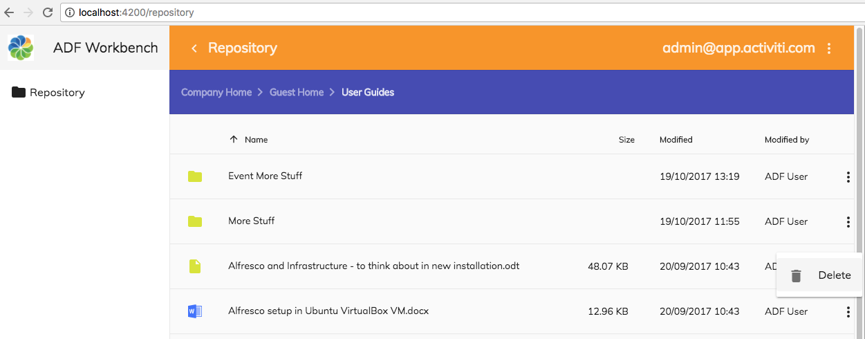
While implementing this we will also have a look at internationalisation (i18n) of UI labels, such as the ‘Delete’ label for this action. We will update the i18n resource file (i.e. src/assets/i18n/en.json) with the labels we need for the application. See the first two articles mentioned in the introduction for more information about translations.
But as usual, we start with the template update, open up the src/app/repository/repository-list-page/repository-list-page.component.html file and add delete actions as follows via the content-actions component:
<adf-toolbar [color]="'accent'">
<adf-toolbar-title>
<adf-breadcrumb
root="Company Home"
[target]="documentList"
[folderNode]="documentList.folderNode">
</adf-breadcrumb>
</adf-toolbar-title>
</adf-toolbar>
<adf-upload-drag-area
[parentId]="documentList.currentFolderId || '-root-'"
[adf-node-permission]="'create'"
[adf-nodes]="getNodesForPermissionCheck()"
(success)="onDragAndDropUploadSuccess($event)">
<adf-document-list
#documentList
[navigationMode]="'click'"
[currentFolderId]="'-root-'"
[contextMenuActions]="true"
[contentActions]="true">
<content-actions>
<!-- Folder actions -->
<content-action
title="{{'DOCUMENT_LIST.ACTIONS.FOLDER.DELETE' | translate}}"
[icon]="'delete'"
[target]="'folder'"
[permission]="'delete'"
[disableWithNoPermission]="true"
[handler]="'delete'"
(permissionEvent)="onDeleteActionPermissionError($event)"
(success)="onDeleteActionSuccess($event)">
</content-action>
<!-- File actions -->
<content-action
title="{{'DOCUMENT_LIST.ACTIONS.DOCUMENT.DELETE' | translate}}"
[icon]="'delete'"
[target]="'document'"
[permission]="'delete'"
[disableWithNoPermission]="true"
[handler]="'delete'"
(permissionEvent)="onDeleteActionPermissionError($event)"
(success)="onDeleteActionSuccess($event)">
</content-action>
</content-actions>
</adf-document-list>
<adf-pagination
[target]="documentList">
</adf-pagination>
</adf-upload-drag-area>
The properties and events for each content-action have the following meaning (not all are used in the above configuration):
- title - The title of the action as displayed in the UI menu, i18n resource ID in this case. Using the translate pipe from the ngx-translate/core library. Note that the bound property format (i.e [...]) is not used here as it is easier to use normal HTML attribute format when using the translate pipe.
- icon - a Google Material Design icon id.
- target - Is this action for a ‘folder’ or for a ‘document’ (file).
- permission - the name of the permission that the user has to have on the content item to be able to delete it. In this case the user needs ‘delete’ permission.
- disableWithNoPermission - set this to true if you want this content action to be disabled in the menu (i.e. grayed out) if the user does not have permission to delete the content item.
- handler - this property is used when the action is available as an out-of-the-box action. Such as for example ‘delete’, ‘download’, ‘copy’, and ‘move’. For an up-to-date list of all available action handlers see the backing service class. If you want to call a custom action implementation use the execute event.
- (permissionEvent) - this function is called if there is a problem with permissions during the delete of the content item.
- (success) - this function is called after the content item has been successfully deleted.
- (error) - this function is called when a content item could not be deleted.
- (execute) - use this instead of handler when a custom content action function should be called.
Now when we have finished configuring the actions that we need it is time to add the required event handler functions. Open up the src/app/repository/repository-list-page/repository-list-page.component.ts file and add the following methods:
import { Component, OnInit, ViewChild } from '@angular/core';
import { NotificationService } from '@alfresco/adf-core';
import { DocumentListComponent } from '@alfresco/adf-content-services';
import { MinimalNodeEntity } from 'alfresco-js-api';
@Component({
selector: 'app-repository-list-page',
templateUrl: './repository-list-page.component.html',
styleUrls: ['./repository-list-page.component.scss']
})
export class RepositoryListPageComponent implements OnInit {
@ViewChild(DocumentListComponent)
documentList: DocumentListComponent;
constructor(private notificationService: NotificationService) { }
ngOnInit() {
}
onDragAndDropUploadSuccess($event: Event) {
console.log('Drag and Drop upload successful!');
// Refresh the page so you can see the new files
this.documentList.reload();
}
getNodesForPermissionCheck(): MinimalNodeEntity[] {
if (this.documentList.folderNode) {
return [{entry: this.documentList.folderNode}];
} else {
return [];
}
}
onDeleteActionPermissionError(event: any) {
this.notificationService.openSnackMessage(
`You don't have the '${event.permission}' permission to do a '${event.action}' operation on the ${event.type}`,
4000);
}
onDeleteActionSuccess(node) {
console.log('Successfully deleted a node: ' + node);
}
}
The onDeleteActionPermissionError method will display a message at the bottom of the screen with a text such as ‘You don't have the 'delete' permission to do a 'delete' operation on the content’. The onDeleteActionSuccess method will write a log message such as ‘Successfully deleted a node: 4fdf9fe4-c5fe-4313-bb50-9edbada9216b’. Note how this success method gives you back an Alfresco Node Reference for the deleted node, which might not be super useful...
Here we bring in another useful service from the ADF Core library. It is called the Notification Service and is implemented on top of the Angular 2 Material Design Snackbar. It can be used to display small messages on screen.
The final thing we need to take care of are the i18n resource identifiers that we have used in our content action configurations:
<content-action
title="{{'DOCUMENT_LIST.ACTIONS.FOLDER.DELETE' | translate}}"
<content-action
title="{{'DOCUMENT_LIST.ACTIONS.DOCUMENT.DELETE' | translate}}"Update the src/assets/i18n/en.json file, it will be included in the Webpack bundle process. Replace whatever it contains with the following content:
{
"DOCUMENT_LIST": {
"ACTIONS": {
"FOLDER": {
"DELETE": "Delete"
},
"DOCUMENT": {
"DELETE": "Delete"
}
}
}
}
Note for Windows users: when copying JSON from this article it might be beneficial to have a JavaScript IDE as it will flag any characters that are not allowed in the document. Otherwise you will get problems with parsing.
You should now be able to try this out now. Note that the server need to be restarted as we updated stuff under /assets, which need to be repackaged by Webpack. Login first with the admin user and make sure that you can delete folders and files. Then login with a user that does not have delete permission and make sure the action is not available then.
Adding a Download File Content Action
Being able to download a file from the repository is one of the essential features that we are likely to need in most apps. Download is also one of the out-of-the-box supported ADF content actions, so it is easy to add. The action will appear in the 'Three Dots' menu as follows for files:
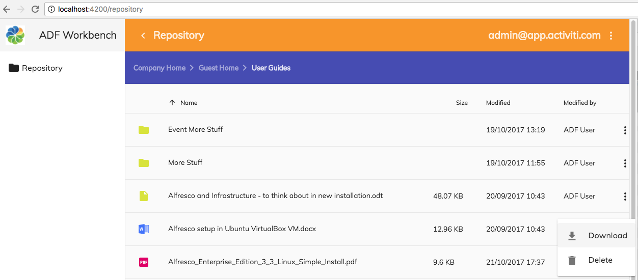
To add the Download content action open up the src/app/repository/repository-list-page/repository-list-page.component.html file and add a 'download' action as follows:
<adf-toolbar [color]="'accent'">
<adf-toolbar-title>
<adf-breadcrumb
root="Company Home"
[target]="documentList"
[folderNode]="documentList.folderNode">
</adf-breadcrumb>
</adf-toolbar-title>
</adf-toolbar>
<adf-upload-drag-area
[parentId]="documentList.currentFolderId || '-root-'"
[adf-node-permission]="'create'"
[adf-nodes]="getNodesForPermissionCheck()"
(success)="onDragAndDropUploadSuccess($event)">
<adf-document-list
#documentList
[navigationMode]="'click'"
[currentFolderId]="'-root-'"
[contextMenuActions]="true"
[contentActions]="true">
<content-actions>
<!-- Folder actions -->
<content-action
title="{{'DOCUMENT_LIST.ACTIONS.FOLDER.DELETE' | translate}}"
[icon]="'delete'"
[target]="'folder'"
[permission]="'delete'"
[disableWithNoPermission]="true"
[handler]="'delete'"
(permissionEvent)="onDeleteActionPermissionError($event)"
(success)="onDeleteActionSuccess($event)">
</content-action>
<!-- File actions -->
<content-action
title="{{'DOCUMENT_LIST.ACTIONS.DOCUMENT.DOWNLOAD' | translate}}"
[icon]="'file_download'"
[target]="'document'"
[handler]="'download'">
</content-action>
<content-action
title="{{'DOCUMENT_LIST.ACTIONS.DOCUMENT.DELETE' | translate}}"
[icon]="'delete'"
[target]="'document'"
[permission]="'delete'"
[disableWithNoPermission]="true"
[handler]="'delete'"
(permissionEvent)="onDeleteActionPermissionError($event)"
(success)="onDeleteActionSuccess($event)">
</content-action>
</content-actions>
</adf-document-list>
<adf-pagination
[target]="documentList">
</adf-pagination>
</adf-upload-drag-area>
The important part of the new action configuration is the handler configuration. We us the download handler that are available out-of-the-box with ADF. We don't need to check permissions, because if the user can see the content item, then they have read permissions.
There are no event handler methods to implement. Update the i18n resource file src/assets/i18n/en.json with the english Download translation:
{
"DOCUMENT_LIST": {
"ACTIONS": {
"FOLDER": {
"DELETE": "Delete"
},
"DOCUMENT": {
"DOWNLOAD": "Download",
"DELETE": "Delete"
}
}
}
}Now we should be ready to try out the Download action.
Adding a Download Folder Content Action
Being able to download a whole folder as a ZIP file from the repository is a useful feature that we can add to the application. Download a folder as a ZIP file is not one of the out-of-the-box supported ADF content actions, so we need to do a bit of work to get it going. The action will appear in the 'Three Dots' menu as follows for folders:
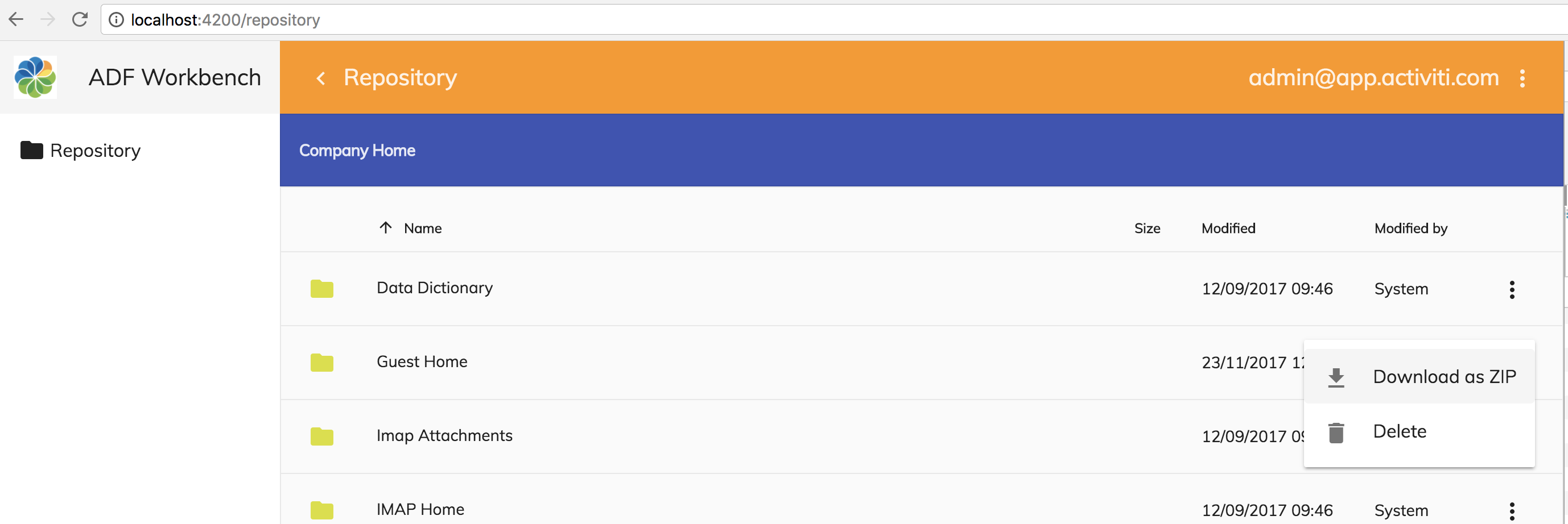
To add the Download as ZIP content action open up the src/app/repository/repository-list-page/repository-list-page.component.html file and add it as follows:
<adf-toolbar [color]="'accent'">
<adf-toolbar-title>
<adf-breadcrumb
root="Company Home"
[target]="documentList"
[folderNode]="documentList.folderNode">
</adf-breadcrumb>
</adf-toolbar-title>
</adf-toolbar>
<adf-upload-drag-area
[parentId]="documentList.currentFolderId || '-root-'"
[adf-node-permission]="'create'"
[adf-nodes]="getNodesForPermissionCheck()"
(success)="onDragAndDropUploadSuccess($event)">
<adf-document-list
#documentList
[navigationMode]="'click'"
[currentFolderId]="'-root-'"
[contextMenuActions]="true"
[contentActions]="true">
<content-actions>
<!-- Folder actions -->
<content-action
title="{{'DOCUMENT_LIST.ACTIONS.FOLDER.DOWNLOAD_AS_ZIP' | translate}}"
[icon]="'file_download'"
[target]="'folder'"
(execute)="onDownloadAsZip($event)">
</content-action>
<content-action
title="{{'DOCUMENT_LIST.ACTIONS.FOLDER.DELETE' | translate}}"
[icon]="'delete'"
[target]="'folder'"
[permission]="'delete'"
[disableWithNoPermission]="true"
[handler]="'delete'"
(permissionEvent)="onDeleteActionPermissionError($event)"
(success)="onDeleteActionSuccess($event)">
</content-action>
<!-- File actions -->
<content-action
title="{{'DOCUMENT_LIST.ACTIONS.DOCUMENT.DOWNLOAD' | translate}}"
[icon]="'file_download'"
[target]="'document'"
[handler]="'download'">
</content-action>
<content-action
title="{{'DOCUMENT_LIST.ACTIONS.DOCUMENT.DELETE' | translate}}"
[icon]="'delete'"
[target]="'document'"
[permission]="'delete'"
[disableWithNoPermission]="true"
[handler]="'delete'"
(permissionEvent)="onDeleteActionPermissionError($event)"
(success)="onDeleteActionSuccess($event)">
</content-action>
</content-actions>
</adf-document-list>
<adf-pagination
[target]="documentList">
</adf-pagination>
</adf-upload-drag-area>The important part of the new action configuration is the handler configuration. We us a custom function handler that is executed by implementing the execute event on the content action. We don't need to check permissions, because if the user can see the folder, then they have read permissions.
Now, let's implement the event handler function onDownloadAsZip. Open up the src/app/repository/repository-list-page/repository-list-page.component.ts file and add the handler function and a helper function called downloadZip:
import { Component, OnInit, ViewChild } from '@angular/core';
import { MatDialog } from '@angular/material';
import { NotificationService } from '@alfresco/adf-core';
import { DocumentListComponent, DownloadZipDialogComponent } from '@alfresco/adf-content-services';
import { MinimalNodeEntity, MinimalNodeEntryEntity } from 'alfresco-js-api';
@Component({
selector: 'app-repository-list-page',
templateUrl: './repository-list-page.component.html',
styleUrls: ['./repository-list-page.component.scss']
})
export class RepositoryListPageComponent implements OnInit {
@ViewChild(DocumentListComponent)
documentList: DocumentListComponent;
constructor(private notificationService: NotificationService,
private dialog: MatDialog) { }
ngOnInit() {
}
onDragAndDropUploadSuccess($event: Event) {
console.log('Drag and Drop upload successful!');
// Refresh the page so you can see the new files
this.documentList.reload();
}
getNodesForPermissionCheck(): MinimalNodeEntity[] {
if (this.documentList.folderNode) {
return [{entry: this.documentList.folderNode}];
} else {
return [];
}
}
onDeleteActionPermissionError(event: any) {
this.notificationService.openSnackMessage(
`You don't have the '${event.permission}' permission to do a '${event.action}' operation on the ${event.type}`,
4000);
}
onDeleteActionSuccess(node) {
console.log('Successfully deleted a node: ' + node);
}
onDownloadAsZip(event: any) {
const node: MinimalNodeEntity = event.value;
this.downloadZip([node]);
}
downloadZip(selection: Array<MinimalNodeEntity>) {
if (selection && selection.length > 0) {
const nodeIds = selection.map(node => node.entry.id);
const dialogRef = this.dialog.open(DownloadZipDialogComponent, {
width: '600px',
data: {
nodeIds: nodeIds
}
});
dialogRef.afterClosed().subscribe(result => {
console.log('Download folder as ZIP result: ', result);
});
}
}
}
Update the i18n resource file src/assets/i18n/en.json with the english Download As Zip translation:
{
"DOCUMENT_LIST": {
"ACTIONS": {
"FOLDER": {
"DOWNLOAD_AS_ZIP": "Download as ZIP",
"DELETE": "Delete"
},
"DOCUMENT": {
"DOWNLOAD": "Download",
"DELETE": "Delete"
}
}
}
}Now we should be ready to try out the new Download as Zip action. The following dialog will display when you execute this action on a folder:
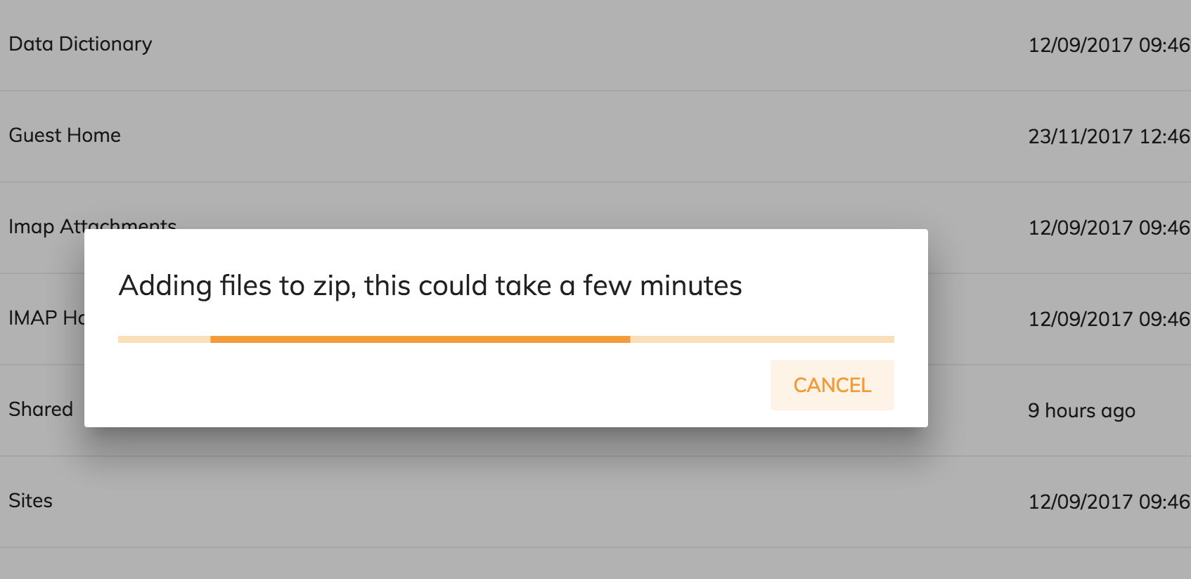
The ZIP file will contain the complete folder hierarchy contained in the selected folder, including all the content files. Try it out with the Data Dictionary folder.
Adding Copy and Move Files Content Actions
Now when we are working with content actions we might as well continue and add more actions. Let's add the Copy and Move actions as well. They will appear in the 'Three Dots' menu as follows:
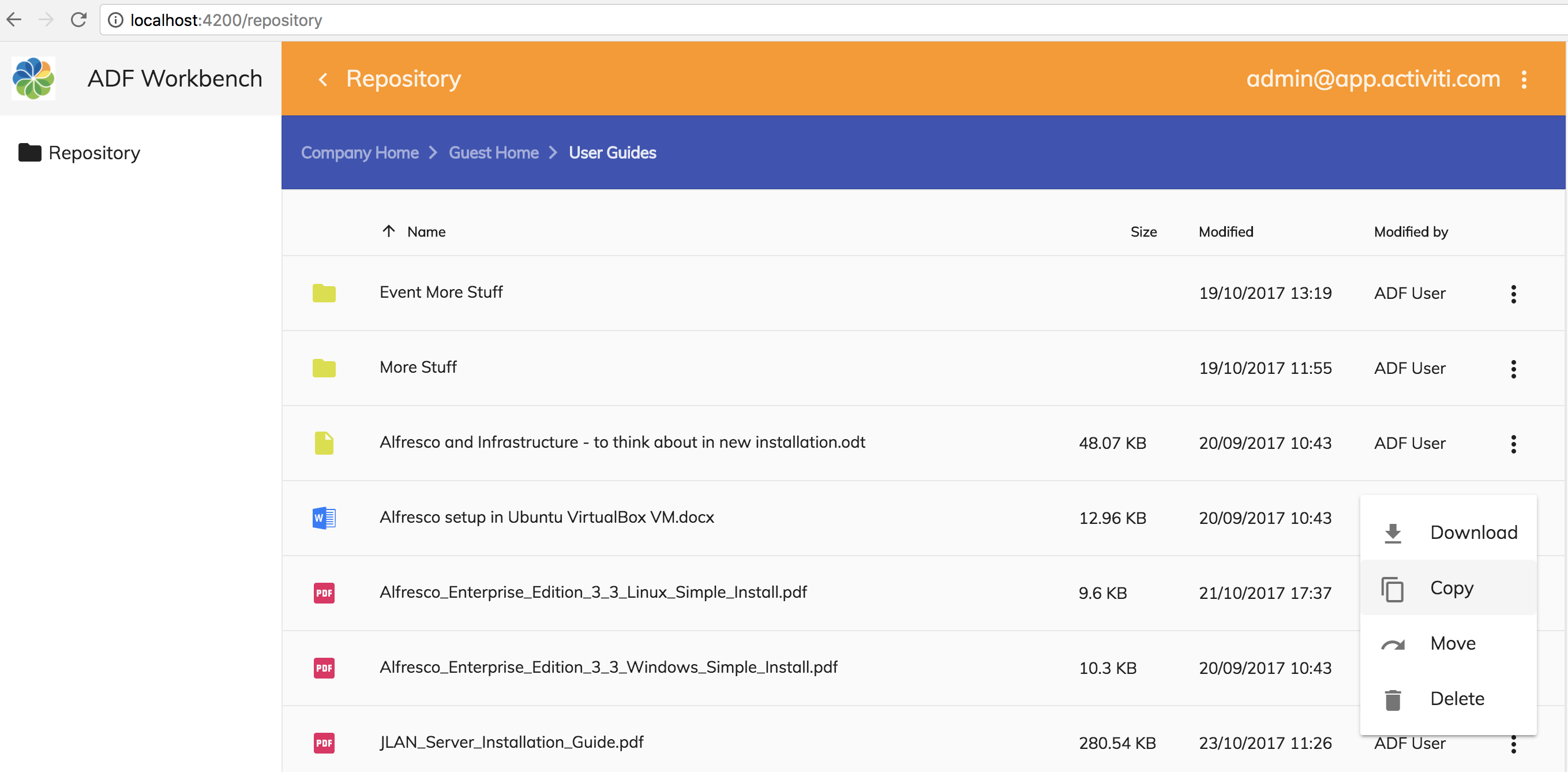
Adding these actions is easy as they are out-of-the-box actions. Open up the src/app/repository/repository-list-page/repository-list-page.component.html file and add copy and move actions as follows:
<adf-toolbar [color]="'accent'">
<adf-toolbar-title>
<adf-breadcrumb
root="Company Home"
[target]="documentList"
[folderNode]="documentList.folderNode">
</adf-breadcrumb>
</adf-toolbar-title>
</adf-toolbar>
<adf-upload-drag-area
[parentId]="documentList.currentFolderId || '-root-'"
[adf-node-permission]="'create'"
[adf-nodes]="getNodesForPermissionCheck()"
(success)="onDragAndDropUploadSuccess($event)">
<adf-document-list
#documentList
[navigationMode]="'click'"
[currentFolderId]="'-root-'"
[contextMenuActions]="true"
[contentActions]="true">
<content-actions>
<!-- Folder actions -->
<content-action
title="{{'DOCUMENT_LIST.ACTIONS.FOLDER.DOWNLOAD_AS_ZIP' | translate}}"
[icon]="'file_download'"
[target]="'folder'"
(execute)="onDownloadAsZip($event)">
</content-action>
<content-action
title="{{'DOCUMENT_LIST.ACTIONS.FOLDER.COPY' | translate}}"
[icon]="'content_copy'"
[target]="'folder'"
[permission]="'update'"
[disableWithNoPermission]="true"
[handler]="'copy'"
(permissionEvent)="onContentActionPermissionError($event)"
(error)="onContentActionError($event)"
(success)="onContentActionSuccess($event)">
</content-action>
<content-action
title="{{'DOCUMENT_LIST.ACTIONS.FOLDER.MOVE' | translate}}"
[icon]="'redo'"
[target]="'folder'"
[permission]="'update'"
[disableWithNoPermission]="true"
[handler]="'move'"
(permissionEvent)="onContentActionPermissionError($event)"
(error)="onContentActionError($event)"
(success)="onContentActionSuccess($event)">
</content-action>
<content-action
title="{{'DOCUMENT_LIST.ACTIONS.FOLDER.DELETE' | translate}}"
[icon]="'delete'"
[target]="'folder'"
[permission]="'delete'"
[disableWithNoPermission]="true"
[handler]="'delete'"
(permissionEvent)="onContentActionPermissionError($event)"
(error)="onContentActionError($event)"
(success)="onContentActionSuccess($event)">
</content-action>
<!-- File actions -->
<content-action
title="{{'DOCUMENT_LIST.ACTIONS.DOCUMENT.DOWNLOAD' | translate}}"
[icon]="'content_copy'"
[target]="'document'"
[handler]="'download'">
</content-action>
<content-action
title="{{'DOCUMENT_LIST.ACTIONS.DOCUMENT.COPY' | translate}}"
[icon]="'content_copy'"
[target]="'document'"
[permission]="'update'"
[disableWithNoPermission]="true"
[handler]="'copy'"
(permissionEvent)="onContentActionPermissionError($event)"
(error)="onContentActionError($event)"
(success)="onContentActionSuccess($event)">
</content-action>
<content-action
title="{{'DOCUMENT_LIST.ACTIONS.DOCUMENT.MOVE' | translate}}"
[icon]="'redo'"
[target]="'document'"
[permission]="'update'"
[disableWithNoPermission]="true"
[handler]="'move'"
(permissionEvent)="onContentActionPermissionError($event)"
(error)="onContentActionError($event)"
(success)="onContentActionSuccess($event)">
</content-action>
<content-action
title="{{'DOCUMENT_LIST.ACTIONS.DOCUMENT.DELETE' | translate}}"
[icon]="'delete'"
[target]="'document'"
[permission]="'delete'"
[disableWithNoPermission]="true"
[handler]="'delete'"
(permissionEvent)="onContentActionPermissionError($event)"
(error)="onContentActionError($event)"
(success)="onContentActionSuccess($event)">
</content-action>
</content-actions>
</adf-document-list>
<adf-pagination
[target]="documentList">
</adf-pagination>
</adf-upload-drag-area>
The important part of the new action configurations is the handler configuration. We us the copy and move handlers that are available out-of-the-box with ADF. And then we make sure that the user has update permission before he or she can invoke these actions.
We have also changed the event handler functions to be generic instead and used for each content action. That is instead of having onDeleteActionSuccess, onMoveActionSuccess, onCopyActionSuccess etc. Implement the new generic action handlers as follows in src/app/repository/repository-list-page/repository-list-page.component.ts:
import { Component, OnInit, ViewChild } from '@angular/core';
import { NotificationService } from '@alfresco/adf-core';
import { DocumentListComponent, DownloadZipDialogComponent } from '@alfresco/adf-content-services';
import { MinimalNodeEntity } from 'alfresco-js-api';
import { MatDialog } from '@angular/material';
@Component({
selector: 'app-repository-list-page',
templateUrl: './repository-list-page.component.html',
styleUrls: ['./repository-list-page.component.scss']
})
export class RepositoryListPageComponent implements OnInit {
@ViewChild(DocumentListComponent)
documentList: DocumentListComponent;
constructor(private notificationService: NotificationService,
private dialog: MatDialog) { }
ngOnInit() {
}
onDragAndDropUploadSuccess($event: Event) {
console.log('Drag and Drop upload successful!');
// Refresh the page so you can see the new files
this.documentList.reload();
}
getNodesForPermissionCheck(): MinimalNodeEntity[] {
if (this.documentList.folderNode) {
return [{entry: this.documentList.folderNode}];
} else {
return [];
}
}
onDownloadAsZip(event: any) {
const node: MinimalNodeEntity = event.value;
this.downloadZip([node]);
}
downloadZip(selection: Array<MinimalNodeEntity>) {
if (selection && selection.length > 0) {
const nodeIds = selection.map(node => node.entry.id);
const dialogRef = this.dialog.open(DownloadZipDialogComponent, {
width: '600px',
data: {
nodeIds: nodeIds
}
});
dialogRef.afterClosed().subscribe(result => {
console.log('Download folder as ZIP result: ', result);
});
}
}
onContentActionPermissionError(event: any) {
this.notificationService.openSnackMessage(
`You don't have the '${event.permission}' permission to do a '${event.action}' operation on the ${event.type}`,
4000);
}
onContentActionSuccess(nodeId) {
console.log('Successfully executed content action for node: ' + nodeId);
}
onContentActionError(error) {
console.log('There was an error executing content action: ' + error);
}
}Update also the i18n resource file src/assets/i18n/en.json:
{
"DOCUMENT_LIST": {
"ACTIONS": {
"FOLDER": {
"DOWNLOAD_AS_ZIP": "Download as ZIP",
"COPY": "Copy",
"MOVE": "Move",
"DELETE": "Delete"
},
"DOCUMENT": {
"DOWNLOAD": "Download",
"COPY": "Copy",
"MOVE": "Move",
"DELETE": "Delete"
}
}
}
}You can now try out these new content actions. Starting with the Copy action you will see the following dialog when copying an item:

The dialog will allow both searching for a folder to copy to and navigating to a folder you want to copy to. The move action will present the same dialog.
Adding a Manage Versions Content Action
ADF now supports version management of file nodes (BTW. Alfresco Content Service does not support versioning of folders). Let's add a Manage Versions action where we can view and manage versions for a file:
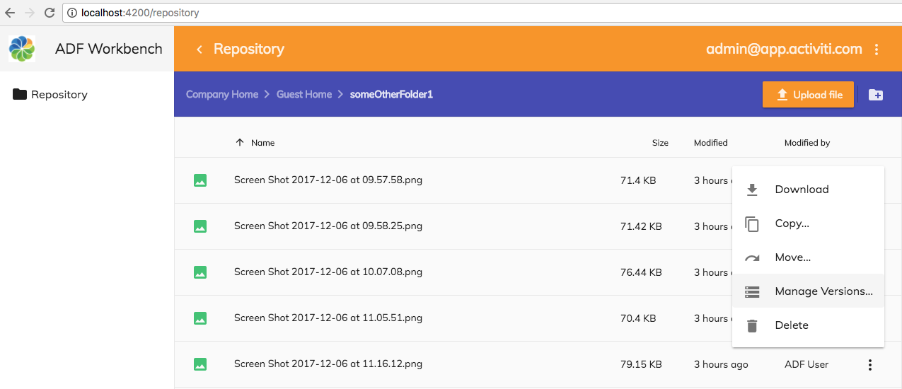
This is going to have to be a custom action implementation. Open up the src/app/repository/repository-list-page/repository-list-page.component.html file and add the action as follows in the File actions section:
<adf-toolbar [color]="'accent'">
<adf-toolbar-title>
<adf-breadcrumb
root="Company Home"
[target]="documentList"
[folderNode]="documentList.folderNode">
</adf-breadcrumb>
</adf-toolbar-title>
</adf-toolbar>
<adf-upload-drag-area
[parentId]="documentList.currentFolderId || '-root-'"
[adf-node-permission]="'create'"
[adf-nodes]="getNodesForPermissionCheck()"
(success)="onDragAndDropUploadSuccess($event)">
<adf-document-list
#documentList
[navigationMode]="'click'"
[currentFolderId]="'-root-'"
[contextMenuActions]="true"
[contentActions]="true">
<content-actions>
<!-- Folder actions -->
<content-action
title="{{'DOCUMENT_LIST.ACTIONS.FOLDER.DOWNLOAD_AS_ZIP' | translate}}"
[icon]="'file_download'"
[target]="'folder'"
(execute)="onDownloadAsZip($event)">
</content-action>
<content-action
title="{{'DOCUMENT_LIST.ACTIONS.FOLDER.COPY' | translate}}"
[icon]="'content_copy'"
[target]="'folder'"
[permission]="'update'"
[disableWithNoPermission]="true"
[handler]="'copy'"
(permissionEvent)="onContentActionPermissionError($event)"
(error)="onContentActionError($event)"
(success)="onContentActionSuccess($event)">
</content-action>
<content-action
title="{{'DOCUMENT_LIST.ACTIONS.FOLDER.MOVE' | translate}}"
[icon]="'redo'"
[target]="'folder'"
[permission]="'update'"
[disableWithNoPermission]="true"
[handler]="'move'"
(permissionEvent)="onContentActionPermissionError($event)"
(error)="onContentActionError($event)"
(success)="onContentActionSuccess($event)">
</content-action>
<content-action
title="{{'DOCUMENT_LIST.ACTIONS.FOLDER.DELETE' | translate}}"
[icon]="'delete'"
[target]="'folder'"
[permission]="'delete'"
[disableWithNoPermission]="true"
[handler]="'delete'"
(permissionEvent)="onContentActionPermissionError($event)"
(error)="onContentActionError($event)"
(success)="onContentActionSuccess($event)">
</content-action>
<!-- File actions -->
<content-action
title="{{'DOCUMENT_LIST.ACTIONS.DOCUMENT.DOWNLOAD' | translate}}"
[icon]="'content_copy'"
[target]="'document'"
[handler]="'download'">
</content-action>
<content-action
title="{{'DOCUMENT_LIST.ACTIONS.DOCUMENT.COPY' | translate}}"
[icon]="'content_copy'"
[target]="'document'"
[permission]="'update'"
[disableWithNoPermission]="true"
[handler]="'copy'"
(permissionEvent)="onContentActionPermissionError($event)"
(error)="onContentActionError($event)"
(success)="onContentActionSuccess($event)">
</content-action>
<content-action
title="{{'DOCUMENT_LIST.ACTIONS.DOCUMENT.MOVE' | translate}}"
[icon]="'redo'"
[target]="'document'"
[permission]="'update'"
[disableWithNoPermission]="true"
[handler]="'move'"
(permissionEvent)="onContentActionPermissionError($event)"
(error)="onContentActionError($event)"
(success)="onContentActionSuccess($event)">
</content-action>
<content-action
title="{{'DOCUMENT_LIST.ACTIONS.DOCUMENT.MANAGE_VERSIONS' | translate}}"
[icon]="'storage'"
[target]="'document'"
[permission]="'update'"
[disableWithNoPermission]="true"
(execute)="onManageVersions($event)">
</content-action>
<content-action
title="{{'DOCUMENT_LIST.ACTIONS.DOCUMENT.DELETE' | translate}}"
[icon]="'delete'"
[target]="'document'"
[permission]="'delete'"
[disableWithNoPermission]="true"
[handler]="'delete'"
(permissionEvent)="onContentActionPermissionError($event)"
(error)="onContentActionError($event)"
(success)="onContentActionSuccess($event)">
</content-action>
</content-actions>
</adf-document-list>
<adf-pagination
[target]="documentList">
</adf-pagination>
</adf-upload-drag-area>The important part of the new action configurations is the handler configuration. We use the execute event and set the onManageVersions function to be called, where we will implement this functionality. Implement the new action handler as follows in src/app/repository/repository-list-page/repository-list-page.component.ts:
import { Component, OnInit, ViewChild } from '@angular/core';
import { MatDialog } from '@angular/material';
import { NotificationService } from '@alfresco/adf-core';
import { DocumentListComponent, DownloadZipDialogComponent } from '@alfresco/adf-content-services';
import { MinimalNodeEntity, MinimalNodeEntryEntity } from 'alfresco-js-api';
import { VersionManagerDialogComponent } from './version-manager-dialog.component';
@Component({
selector: 'app-repository-list-page',
templateUrl: './repository-list-page.component.html',
styleUrls: ['./repository-list-page.component.scss']
})
export class RepositoryListPageComponent implements OnInit {
@ViewChild(DocumentListComponent)
documentList: DocumentListComponent;
constructor(private notificationService: NotificationService,
private dialog: MatDialog) { }
ngOnInit() {
}
onDragAndDropUploadSuccess($event: Event) {
console.log('Drag and Drop upload successful!');
// Refresh the page so you can see the new files
this.documentList.reload();
}
getNodesForPermissionCheck(): MinimalNodeEntity[] {
if (this.documentList.folderNode) {
return [{entry: this.documentList.folderNode}];
} else {
return [];
}
}
onDownloadAsZip(event: any) {
const node: MinimalNodeEntity = event.value;
this.downloadZip([node]);
}
downloadZip(selection: Array<MinimalNodeEntity>) {
if (selection && selection.length > 0) {
const nodeIds = selection.map(node => node.entry.id);
const dialogRef = this.dialog.open(DownloadZipDialogComponent, {
width: '600px',
data: {
nodeIds: nodeIds
}
});
dialogRef.afterClosed().subscribe(result => {
console.log('Download folder as ZIP result: ', result);
});
}
}
onContentActionPermissionError(event: any) {
this.notificationService.openSnackMessage(
`You don't have the '${event.permission}' permission to do a '${event.action}' operation on the ${event.type}`,
4000);
}
onContentActionSuccess(nodeId) {
console.log('Successfully executed content action for node: ' + nodeId);
}
onContentActionError(error) {
console.log('There was an error executing content action: ' + error);
}
onManageVersions(event) {
const nodeEntry: MinimalNodeEntryEntity = event.value.entry;
this.dialog.open(VersionManagerDialogComponent, {
data: { nodeEntry },
panelClass: 'adf-version-manager-dialog',
width: '630px'
});
}
}We will display the version information in a Angular Material Dialog component, so we inject a MatDialog in the constructor. This dialog component will need a dialog layout to display that takes a MinimalNodeEntryEntity as input (i.e. the data: { nodeEntry }. So we define a custom dialog called VersionManagerDialogComponent. Implement it by creating a new dialog template file src/app/repository/repository-list-page/version-manager-dialog.component.html:
<header mat-dialog-title>Manage versions for ({{ nodeName }})</header>
<section mat-dialog-content>
<adf-version-manager [node]="nodeEntry"></adf-version-manager>
</section>
<footer mat-dialog-actions fxLayout="row" fxLayoutAlign="end center">
<button mat-button (click)="close()">Close</button>
</footer>
This template uses the <adf-version-manager ADF component. This shows you that you can also use ADF components in dialogs. The rest of the markup is mostly related to Angular Material components. The corresponding component class should be implemented in the src/app/repository/repository-list-page/version-manager-dialog.component.ts file as follows:
import { Component, Inject, ViewEncapsulation } from '@angular/core';
import { MAT_DIALOG_DATA, MatDialogRef } from '@angular/material';
import { MinimalNodeEntryEntity } from 'alfresco-js-api';
@Component({
templateUrl: './version-manager-dialog.component.html',
encapsulation: ViewEncapsulation.None
})
export class VersionManagerDialogComponent {
public nodeName: string;
public nodeEntry: MinimalNodeEntryEntity;
constructor(@Inject(MAT_DIALOG_DATA) data: any,
private containingDialog?: MatDialogRef<VersionManagerDialogComponent>) {
this.nodeEntry = data.nodeEntry;
this.nodeName = this.nodeEntry.name;
}
close() {
this.containingDialog.close();
}
}We created the VersionManagerDialogComponent related files manually so we need to declare the class in the associated module. And we also need to define it as an entry component. Open up the src/app/repository/repository.module.ts file and update to look like this:
import { NgModule } from '@angular/core';
import { CommonModule } from '@angular/common';
import { RepositoryRoutingModule } from './repository-routing.module';
import { RepositoryPageComponent } from './repository-page/repository-page.component';
import { RepositoryListPageComponent } from './repository-list-page/repository-list-page.component';
import { RepositoryDetailsPageComponent } from './repository-details-page/repository-details-page.component';
import { VersionManagerDialogComponent } from './repository-list-page/version-manager-dialog.component';
import { AppCommonModule } from '../app-common/app-common.module';
@NgModule({
imports: [
CommonModule,
RepositoryRoutingModule,
/* Common App imports (Angular Core and Material, ADF Core, Content, and Process */
AppCommonModule
],
declarations: [RepositoryPageComponent, RepositoryListPageComponent, RepositoryDetailsPageComponent, VersionManagerDialogComponent],
entryComponents: [ VersionManagerDialogComponent ],
})
export class RepositoryModule { }Now, update also the i18n resource file src/assets/i18n/en.json:
{
"DOCUMENT_LIST": {
"ACTIONS": {
"FOLDER": {
"DOWNLOAD_AS_ZIP": "Download as ZIP",
"COPY": "Copy...",
"MOVE": "Move...",
"DELETE": "Delete"
},
"DOCUMENT": {
"DOWNLOAD": "Download",
"COPY": "Copy...",
"MOVE": "Move...",
"MANAGE_VERSIONS": "Manage Versions...",
"DELETE": "Delete"
}
}
}
}You can now try out the Manage Versions... action, a dialog such as the following should be displayed:
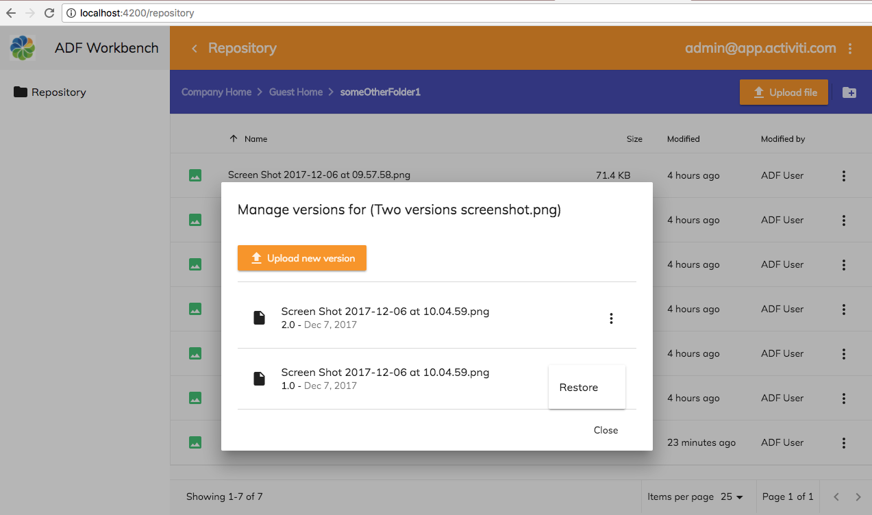
The dialog will show all available versions for the file and allow you to restore a previous version. It also provides a button that can be used to upload a new version of the file.
Adding a Create Folder Action
Being able to create folders is always nice. Let’s add a Create folder action to the document list. This action would need to be somewhere above the document list view as it is not associated with a specific row in the document list. We can add it to the Toolbar that currently has the breadcrumb.
We should at the end have something like follows, with the create folder button on the right side of the blue toolbar:

When we click on the Create Folder button in the toolbar a dialog is displayed:
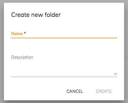
The dialog will have two input fields that represent the Name (i.e. cm:name) and the Description (i.e. cm:description) of the folder. The Title (cm:title) will be set to the same as Name.
We start with the template as usual, open up the
src/app/repository/repository-list-page/repository-list-page.component.html file and add the following markup:
<adf-toolbar [color]="'accent'">
<adf-toolbar-title>
<adf-breadcrumb
root="Company Home"
[target]="documentList"
[folderNode]="documentList.folderNode">
</adf-breadcrumb>
</adf-toolbar-title>
<adf-toolbar-divider></adf-toolbar-divider>
<button
mat-icon-button
[disabled]="!canCreateContent(documentList.folderNode)"
[adf-create-folder]="getDocumentListCurrentFolderId()">
<mat-icon>create_new_folder</mat-icon>
</button>
</adf-toolbar>
<adf-upload-drag-area
[parentId]="getDocumentListCurrentFolderId()"
[adf-node-permission]="'create'"
[adf-nodes]="getNodesForPermissionCheck()"
(success)="onDragAndDropUploadSuccess($event)">
<adf-document-list
#documentList
[navigationMode]="'click'"
[currentFolderId]="getDocumentListCurrentFolderId()"
[contextMenuActions]="true"
[contentActions]="true">
...
We have put the Create Folder button on the right side of the toolbar and it has an mat-icon with an identifier taken from the standard Google Material Design icons. There is a new ADF directive called adf-create-folder that will handle everything around creating a new folder.
When we do this we also take the opportunity to add the getDocumentListCurrentFolderId function that will return current folder ID of the Document List. We then use this function for both the Create Folder button, Drag-n-Drop component, and the Document List itself. This function will take care of returning a default folder ID, if no navigation has happened yet, or the current folder ID.
The only thing we have to do now is implement the canCreateContent and the getDocumentListCurrentFolderId functions in src/app/repository/repository-list-page/repository-list-page.component.ts:
import { Component, OnDestroy, OnInit, ViewChild } from '@angular/core';
import { MatDialog } from '@angular/material';
import { ContentService, NotificationService } from '@alfresco/adf-core';
import { DocumentListComponent, DownloadZipDialogComponent } from '@alfresco/adf-content-services';
import { MinimalNodeEntity, MinimalNodeEntryEntity } from 'alfresco-js-api';
import { VersionManagerDialogComponent } from './version-manager-dialog.component';
@Component({
selector: 'app-repository-list-page',
templateUrl: './repository-list-page.component.html',
styleUrls: ['./repository-list-page.component.scss']
})
export class RepositoryListPageComponent implements OnInit, OnDestroy {
private onCreateFolderSubscription: Subscription;
@ViewChild(DocumentListComponent)
documentList: DocumentListComponent;
constructor(private notificationService: NotificationService,
private contentService: ContentService,
private dialog: MatDialog) { }
ngOnInit() {
this.onCreateFolderSubscription =
this.contentService.folderCreate.subscribe(value => this.onFolderCreated(value));
}
ngOnDestroy() {
this.onCreateFolderSubscription.unsubscribe();
}
onDragAndDropUploadSuccess($event: Event) {
console.log('Drag and Drop upload successful!');
// Refresh the page so you can see the new files
this.documentList.reload();
}
getNodesForPermissionCheck(): MinimalNodeEntity[] {
if (this.documentList.folderNode) {
return [{entry: this.documentList.folderNode}];
} else {
return [];
}
}
onDownloadAsZip(event: any) {
const node: MinimalNodeEntity = event.value;
this.downloadZip([node]);
}
downloadZip(selection: Array<MinimalNodeEntity>) {
if (selection && selection.length > 0) {
const nodeIds = selection.map(node => node.entry.id);
const dialogRef = this.dialog.open(DownloadZipDialogComponent, {
width: '600px',
data: {
nodeIds: nodeIds
}
});
dialogRef.afterClosed().subscribe(result => {
console.log('Download folder as ZIP result: ', result);
});
}
}
onContentActionPermissionError(event: any) {
this.notificationService.openSnackMessage(
`You don't have the '${event.permission}' permission to do a '${event.action}' operation on the ${event.type}`,
4000);
}
onContentActionSuccess(nodeId) {
console.log('Successfully executed content action for node: ' + nodeId);
}
onContentActionError(error) {
console.log('There was an error executing content action: ' + error);
}
onManageVersions(event) {
const nodeEntry: MinimalNodeEntryEntity = event.value.entry;
this.dialog.open(VersionManagerDialogComponent, {
data: {nodeEntry},
panelClass: 'adf-version-manager-dialog',
width: '630px'
});
}
onFolderCreated(node: MinimalNodeEntryEntity) {
if (node && node.parentId === this.documentList.currentFolderId) {
this.documentList.reload();
}
}
getDocumentListCurrentFolderId() {
return this.documentList.currentFolderId || '-root-';
}
canCreateContent(parentNode: MinimalNodeEntryEntity): boolean {
if (parentNode) {
return this.contentService.hasPermission(parentNode, 'create');
}
return false;
}
}There is actually two parts to the Create Folder implementation. First the method that is called to check if we have create permission in the folder (canCreateContent). Secondly there is another method that is called when the folder has been successfully created (onFolderCreated).
The first method is straightforward, it executes the ContentService hasPermission function on the folder where we want to create a subfolder, and checks that the current user has create permission. We also use the ContentService to subscribe to a folderCreate RxJS Subject (Observable) and it will be called whenever a folder is created. We do this in the ngOnInit method as follows:
private onCreateFolderSubscription: Subscription;
ngOnInit() {
this.onCreateFolderSubscription =
this.contentService.folderCreate.subscribe(value => this.onFolderCreated(value));
}
ngOnDestroy() {
this.onCreateFolderSubscription.unsubscribe();
}
So whenever a folder is created we configure the onFolderCreated method to be called. This method just checks that the folder that was created has a parent folder that is the current folder of the Document List, just so we don’t do stuff if a folder was created unrelated to our operation/page (remember, any component can use the Content Service). Then it reloads the document list so we can see the new folder.
You should be able to test this out now, no need to restart the server.
Adding an Upload Button to the Toolbar
We already got the drag-and-drop upload working. However, there might some browsers where this is not working. So would be good with a button in the Repository toolbar for uploading files. It would look something like this:

An upload button can easily be added to a toolbar with the <adf-upload-button> component. Open up the src/app/repository/repository-list-page/repository-list-page.component.html file and add it as follows:
<adf-toolbar [color]="'accent'">
<adf-toolbar-title>
<adf-breadcrumb
root="Company Home"
[target]="documentList"
[folderNode]="documentList.folderNode">
</adf-breadcrumb>
</adf-toolbar-title>
<adf-upload-button
[rootFolderId]="getDocumentListCurrentFolderId()"
[uploadFolders]="false"
[multipleFiles]="true"
[acceptedFilesType]="'*'"
[versioning]="false"
[adf-node-permission]="'create'"
[adf-nodes]="getNodesForPermissionCheck()"
(success)="onButtonUploadSuccess($event)">
</adf-upload-button>
<adf-toolbar-divider></adf-toolbar-divider>
<button
mat-icon-button
[disabled]="!canCreateContent(documentList.folderNode)"
[adf-create-folder]="getDocumentListCurrentFolderId()">
<mat-icon>create_new_folder</mat-icon>
</button>
</adf-toolbar>
<adf-upload-drag-area
...
</adf-upload-drag-area>
The rootFolderId tells the upload functionality what folder the selected files should be uploaded to, which is the current folder of the document list. We also configure the upload button to only be enabled if the user has create permission, this is similar to how we did it for the drag-and-drop upload.
There are a number of properties that you can set on the Upload Button:
- disabled: controls wether the button is disabled or not, defaults to false.
- uploadFolders: controls if you can upload folders or not, defaults to false.
- multipleFiles: controls if you can upload multiple files or not, defaults to false.
- versioning: controls wether the uploaded files should have versioning turned on or not, defaults to false.
- acceptedFilesType: controls what type of files that can be uploaded, defaults to all types of files ('*')
- maxFilesSize: controls how big files that can be uploaded. Set the size in bytes. Defaults to accept any size.
- staticTitle: can be used to change the button text. Defaults to "Upload File".
- tooltip: can be used to set a tooltip text that will be displayed when you hover over the button.
- rootFolderId: See above text.
- (success): function is called after a successful upload.
- (error): function is called if something went wrong during the upload.
- (permissionEvent): function is called if trying to upload without proper permission.
After a successful upload we configure the onButtonUploadSuccess function to be called, which is implemented as follows in the src/app/repository/repository-list-page/repository-list-page.component.ts file:
...
onButtonUploadSuccess($event: Event) {
console.log('Upload button successful!');
this.documentList.reload();
}
}The function just makes sure the document list is reloaded so it reflects the new files that were uploaded.
Viewing the Details for Files and Folders
As it stands now you cannot view (or edit) the properties (i.e. metadata) for a folder or file, this is quite standard and essential functionality. Neither can you preview a file. In this section we will fix that by implementing a Repository Details page.
Introduction to the Details page
The page will be accessible via a new content action in the Document List called Details:
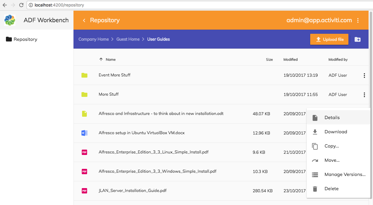
Clicking the Details action takes you to a new Repository Details page that looks like this:

The first tab in the Details page shows the Preview of the document. Clicking in the second tab, which is called Properties, displays metadata for the file:
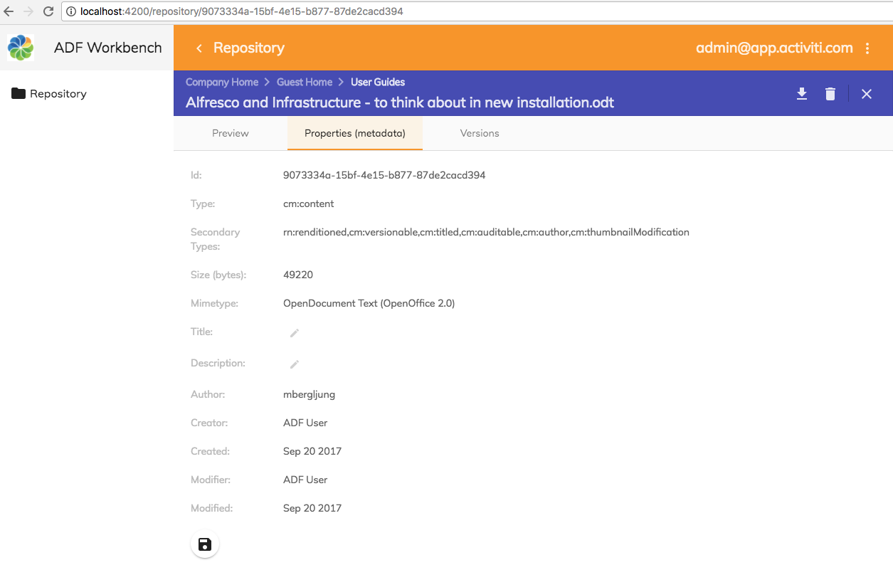
The last tab will display versioning information for a file node:

The Details page also has some action buttons in the upper right corner that closes the view and takes you back to the document list, allows you to delete the content item, and provides download. If you look at a folder you will not see any the Preview and Versionins tabs:
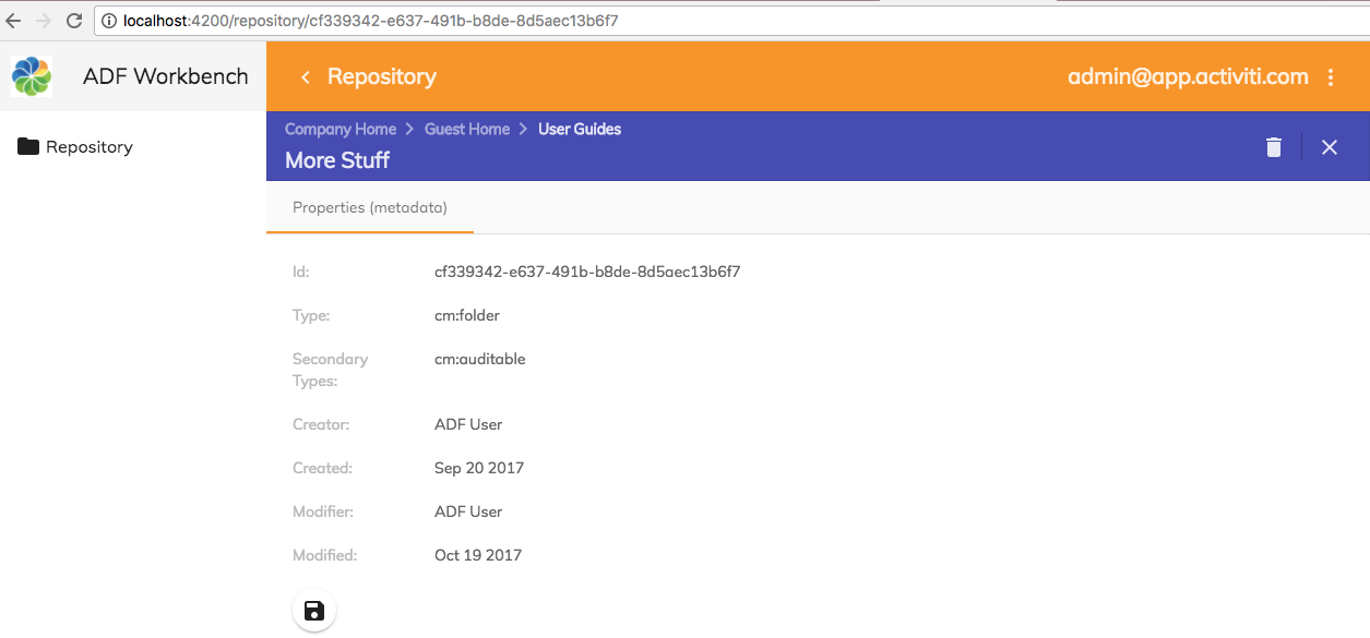
Implementing the Details page
So this is the page that should display details for the content item. In Alfresco Share there are loads of things that you can find out about an item in the details page, such as preview, metadata, workflow info, version history, comments, sharing information etc. However, we will focus on the more significant details, the properties, preview, and versions for the content item.
The preview, properties (i.e. metadata for the content item), and version info will be displayed in a tabbed view with the preview in the first tab, properties in the second one, and versions in the last tab. In fact, I could not get the preview to work in the second tab. Above the tabbed view will be a toolbar with a breadcrumb displaying the path to the content item and under it the name of the content item. The right side of the toolbar will contain three content actions: download, delete, and close.
Defining the template for the Details page
Ok, so let’s start with the template for the Details page, open up the src/app/repository/repository-details-page/repository-details-page.component.html file and replace any existing content with the following:
<adf-toolbar [color]="'accent'" *ngIf="node">
<adf-toolbar-title>
<adf-breadcrumb
[folderNode]="parentFolder">
</adf-breadcrumb>
<span *ngIf="node.name">{{ node.name }}</span>
</adf-toolbar-title>
<button *ngIf="node.isFile"
mat-icon-button
matTooltip="Download this file"
(click)="onDownload($event)">
<mat-icon>file_download</mat-icon>
</button>
<button mat-icon-button
matTooltip="Delete this content item"
(click)="onDelete($event)">
<mat-icon>delete</mat-icon>
</button>
<adf-toolbar-divider></adf-toolbar-divider>
<button mat-icon-button
class="adf-viewer-close-button"
matTooltip="Close and go back to document list"
(click)="onGoBack($event)"
aria-label="Close">
<mat-icon>close</mat-icon>
</button>
</adf-toolbar>
<mat-tab-group *ngIf="node">
<!-- Currently the Preview has to be the first tab -->
<mat-tab label="Preview" *ngIf="node.isFile">
<div class="adf-not-overlay-viewer">
<adf-viewer
[showViewer]="true"
[overlayMode]="false"
[showToolbar]="false"
[fileNodeId]="node.id">
</adf-viewer>
</div>
</mat-tab>
<mat-tab label="Properties (metadata)">
<mat-card class="adf-card-container">
<mat-card-content>
<adf-card-view
[properties]="properties"
[editable]="true">
</adf-card-view>
<button
mat-icon-button
mat-raised-button
matTooltip="Save changes to properties"
[disabled]="isSaveDisabled()"
(click)="onSave($event)">
<mat-icon>save</mat-icon>
</button>
</mat-card-content>
</mat-card>
</mat-tab>
<mat-tab label="Versions" *ngIf="node.isFile">
<adf-version-manager [node]="node"></adf-version-manager>
</mat-tab>
</mat-tab-group>We start by using the same ADF specific toolbar (adf-toolbar) that we used for the List view, which can have breadcrumb and title specifically suited for content applications. We used the adf-breadcrumb before when it was tightly coupled with the document list, here we just give it a folder object (parentFolder) so it can display the path to it, there is no need to link to a document list. After the breadcrumb we display the name (nodeName) of the node.
We then got three buttons for downloading, deleting, and closing the content item. Download is only available if it is a file. Note here that we use tooltips for the buttons that will be displayed when you hover over them. The mat-icon value is as usual taken from the list of available Material Design icons.
We then use a bunch of Angular Material components (i.e. all tags starting with mat-) to build the tabbed view. These components are already imported via our src/app/app-common/app-common.module.ts module. The first tab will contain the preview of the content item, second one will display the metadata, and the last tab the version information.
Note that we use *ngIf="node" in several places to hide the markup if we are in a state of not having any node information. For example, when the template is just being loaded. If we don't do this we will get all sorts of weird errors.
Implementing the Preview Tab for the Details page
The first tab contains the content file preview (this tab is hidden for folders) and it is implemented via the adf-viewer component. We use the previewer without toolbar and other actions as follows:
<adf-viewer
[showViewer]="true"
[overlayMode]="false"
[showToolbar]="false"
[fileNodeId]="nodeId">
</adf-viewer>
It is possible to configure quite a few properties for the previewer (default values in parenthesis):
- Ways of fetching content to preview, choose one of these:
- urlFile: specify a URL that points directly to the file.
- blobFile: supply a binary BLOB with the file content bytes.
- fileNodeId: an Alfresco Node Reference for the file (this is what we use).
- overlayMode (false): should the preview take over the whole screen.
- showViewer (true): toggles the display of the viewer.
- displayName: name of the file being previewed, taken from URL or from Node name.
- showToolbar (true): Should the viewer have its own toolbar (we don't want this as we already got a toolbar).
- allowGoBack (true): show the back button in the toolbar.
- (goBack): function that will be called when the user clicks the Go Back button in the toolbar.
- allowDownload (true): show the download button in the toolbar.
- (download): function is called when the content item is downloaded.
- allowPrint (false): show the print button in the toolbar.
- (print): function is called when the content item is printed.
- allowShare (false): show the share button in the toolbar.
- (share): function is called when the content item is shared
- allowSidebar (false): how the sidebar button in the toolbar.
- showSidebar (false): Should the viewer have its own sidebar with metadata and version information (we don't want this as we have a separate tab for metadata).
- sidebarPosition (right): on which side of the viewer should the sidebar be displayed? Can also be set to 'left'.
- sidebarTemplate (null): the sidebar view.
- showSidebar (false): Should the viewer have its own sidebar with metadata and version information (we don't want this as we have a separate tab for metadata).
- allowGoBack (true): show the back button in the toolbar.
- (showViewerChange): function is called when the viewer is closed.
- (extensionChange): function is called with the file MimeType or file extension.
The viewer is configured to be displayed inline ([overlayMode]="false") and this only works if we apply a style to the enclosing div that sets the height. We do this via the adf-not-overlay-viewer class. Add this class definition to the src/app/repository/repository-details-page/repository-details-page.component.scss style file as follows:
.adf-not-overlay-viewer {
height:900px;
}Implementing the Properties Tab with the ADF Card View
The second tab contains the content item properties and it is implemented via the adf-card-view component, which is specifically designed to display a list of properties of different types, such as text, number, and date. We can use this component to display a simple view of the metadata for a content item such as file or a folder.
We will also look at how to display metadata with the ADF Form component, which gives you more layout features, and it can be designed via the Alfresco Process Services WYSIWYG UI. See next section.We got the Details page template defined so let’s implement the supporting component class.
However, before we start doing that we will add a class that will keep some constants related to the Alfresco content model. Create the src/app/repository/repository-content.model.ts file with the following content:
/**
* Alfresco Content Model QNames
* and other Alfresco related constants
*/
export class RepositoryContentModel {
static readonly TITLED_ASPECT_QNAME = 'cm:titled';
static readonly TITLE_PROP_QNAME = 'cm:title';
static readonly DESC_PROP_QNAME = 'cm:description';
static readonly AUTHOR_PROP_QNAME = 'cm:author';
static readonly NODE_BODY_PROPERTIES_KEY = 'properties';
}
It is a good idea to define the Alfresco content model constants in a common place and then use throughout your component classes.
Now, implement the Details page component class in the src/app/repository/repository-details-page/repository-details-page.component.ts file. It is pretty much empty at the moment, add the following implementation to it:
import { Component, OnInit } from '@angular/core';
import { ActivatedRoute, Router } from '@angular/router';
import { MinimalNodeEntryEntity } from 'alfresco-js-api';
import { CardViewDateItemModel, CardViewTextItemModel, CardViewItem, ContentService, NodesApiService } from '@alfresco/adf-core';
import { RepositoryContentModel } from '../repository-content.model';
@Component({
selector: 'app-repository-details-page',
templateUrl: './repository-details-page.component.html',
styleUrls: ['./repository-details-page.component.scss']
})
export class RepositoryDetailsPageComponent implements OnInit {
node: MinimalNodeEntryEntity;
parentFolder: MinimalNodeEntryEntity;
properties: Array<CardViewItem>;
constructor(private router: Router,
private activatedRoute: ActivatedRoute,
private nodeService: NodesApiService,
private contentService: ContentService) {
this.properties = new Array<CardViewItem>();
}
ngOnInit() {
const nodeId = this.activatedRoute.snapshot.params['node-id'];
this.nodeService.getNode(nodeId).subscribe((entry: MinimalNodeEntryEntity) => {
this.node = entry;
this.nodeService.getNode(this.node.parentId).subscribe((parentNode: MinimalNodeEntryEntity) => {
this.parentFolder = parentNode;
});
this.setupProps(this.node);
});
}
private setupProps(node: MinimalNodeEntryEntity) {
console.log('setupProps: ', node.id);
// Properties that are always available
const idProp = new CardViewTextItemModel({label: 'Id:', value: node.id, key: 'nodeId'});
const typeProp = new CardViewTextItemModel({label: 'Type:', value: node.nodeType, key: 'nodeType'});
const secTypeProp = new CardViewTextItemModel({
label: 'Secondary Types:',
value: node.aspectNames,
key: 'nodeSecTypes'
});
const creatorProp = new CardViewTextItemModel({
label: 'Creator:',
value: node.createdByUser.displayName,
key: 'createdBy'
});
const createdProp = new CardViewDateItemModel({
label: 'Created:',
value: node.createdAt,
format: 'MMM DD YYYY',
key: 'createdDate'
});
const modifierProp = new CardViewTextItemModel({
label: 'Modifier:',
value: node.modifiedByUser.displayName,
key: 'createdBy'
});
const modifiedProp = new CardViewDateItemModel({
label: 'Modified:',
value: node.modifiedAt,
format: 'MMM DD YYYY',
key: 'modifiedDate'
});
this.properties.push(idProp);
this.properties.push(typeProp);
this.properties.push(secTypeProp);
if (node.isFile) {
// Add some content file specific props
const sizeProp = new CardViewTextItemModel({
label: 'Size (bytes):',
value: node.content.sizeInBytes,
key: 'size'
});
const mimetypeProp = new CardViewTextItemModel({
label: 'Mimetype:',
value: node.content.mimeTypeName,
key: 'mimetype'
});
this.properties.push(sizeProp);
this.properties.push(mimetypeProp);
}
// Aspect properties
if (node.aspectNames.indexOf(RepositoryContentModel.TITLED_ASPECT_QNAME) > -1) {
const titleProp = new CardViewTextItemModel({label: 'Title:',
value: node.properties[RepositoryContentModel.TITLE_PROP_QNAME],
key: 'title', editable: true, default: ''});
const descProp = new CardViewTextItemModel({label: 'Description:',
value: node.properties[RepositoryContentModel.DESC_PROP_QNAME],
key: 'description', editable: true, default: '', multiline: true});
this.properties.push(titleProp);
this.properties.push(descProp);
}
// Author can be available if extracted during ingestion of content
if (node.properties && node.properties[RepositoryContentModel.AUTHOR_PROP_QNAME]) {
const authorProp = new CardViewTextItemModel({
label: 'Author:',
value: node.properties[RepositoryContentModel.AUTHOR_PROP_QNAME], key: 'author'
});
this.properties.push(authorProp);
}
this.properties.push(creatorProp);
this.properties.push(createdProp);
this.properties.push(modifierProp);
this.properties.push(modifiedProp);
}
onGoBack($event: Event) {
this.navigateBack2DocList();
}
onDownload($event: Event) {
const url = this.contentService.getContentUrl(this.node.id, true);
const fileName = this.node.name;
this.download(url, fileName);
}
onDelete($event: Event) {
this.nodeService.deleteNode(this.node.id).subscribe(() => {
this.navigateBack2DocList();
});
}
private navigateBack2DocList() {
this.router.navigate(['../'],
{
queryParams: {current_folder_id: this.parentFolder.id},
relativeTo: this.activatedRoute
});
}
private download(url: string, fileName: string) {
if (url && fileName) {
const link = document.createElement('a');
link.style.display = 'none';
link.download = fileName;
link.href = url;
document.body.appendChild(link);
link.click();
document.body.removeChild(link);
}
}
isSaveDisabled() { }
onSave($event: Event) { }
}This is quite a bit of code to take in at first. But let’s break it down. There are basically two things here, member variables that are mapped in the template, like nodeId, and event handler methods like onDownload() that are also mapped in the template.
Let’s look at the member variables:
- node: The content object that should be displayed in the Details page. It is of type MinimalNodeEntryEntity and it is fetched for the node-id that is passed in as URL path parameter to the details page from the list page. Will be set in the ngOnInit() method. The node-id is an Alfresco node reference and it will look something like this: 53ef6110-ed9c-4739-a520-e7b4336229c0.
- parentFolder: The parent folder object of type MinimalNodeEntryEntity that is fed to the breadcrumbs component so it can display corresponding path. Also set in the ngOnInit() method.
- properties: This is an array of CardViewItem objects that are fed to the ADF Card view component. These are set up in the setupProps method based on a MinimalNodeEntryEntity object for the node we want to display properties for.
The ngOnInit() method is implemented as follows:
ngOnInit() {
const nodeId = this.activatedRoute.snapshot.params['node-id'];
this.nodeService.getNode(nodeId).subscribe((entry: MinimalNodeEntryEntity) => {
this.node = entry;
this.nodeService.getNode(this.node.parentId).subscribe((parentNode: MinimalNodeEntryEntity) => {
this.parentFolder = parentNode;
});
this.setupProps(this.node);
});
}The first line uses the activatedRoute object that has been injected via the constructor. It represents the application route that was taken to get to this page and it is based on the routing table we set up earlier. We use a snapshot of the route so we can get to the parameters immediately synchronously (otherwise it would be via async call). The routing table contained the node-id parameter for the http://localhost:8080/repository/<node-id> route so we can extract it here like this.
We then fetch a MinimalNodeEntryEntity object for that node ID with the help of the NodesApiService that was injected via the constructor. As we have seen before, this type of object is useful as it gives access to loads of data for the node. We can see that this class extends the MinimalNode class, which in turn extends the Node class that looks like this:
export class Node {
constructor(obj?: any);
id?: string;
name?: string;
nodeType?: string;
isFolder?: boolean;
isFile?: boolean;
isLocked?: boolean;
modifiedAt?: Date;
modifiedByUser?: UserInfo;
adddAt?: Date;
adddByUser?: UserInfo;
parentId?: string;
isLink?: boolean;
content?: ContentInfo;
aspectNames?: Array<string>;
properties?: any;
allowableOperations?: Array<string>;
path?: PathInfo;
permissions?: PermissionsInfo;
createdAt?: Date;
createdByUser?: UserInfo;
}Lots of these properties are familiar to you if you have worked with Alfresco Repository Nodes before. We can use it to set up the properties variable that should be fed to the card view. But before we do that we also fetch the parent node for the node that is displayed. The nodeService.getNode method returns an Observable that we can subscribe to. Most of the stuff in the Angular app world is asynchronous.
The last thing that we do in the ngOnInit() method is to call the setupProps method. This method sets up all the node properties that we want to display in the ADF card view. Properties are displayed in the order that they are added to the property array. There are a number of CardViewItem subclasses that we can use depending on the type of property, such as CardViewTextItemModel and CardViewDateItemModel. For more info see card view docs. We can see how we can extract any repository node property from any content model via the node.properties['cm:title'] notation.
If you do some JavaScript debugging you will see that a MinimalNodeEntryEntity object instance looks something like this:
event:
entry:
allowableOperations:(3) ["delete", "update", "updatePermissions"]
content:
encoding:"UTF-8"
mimeType:"application/vnd.oasis.opendocument.text"
mimeTypeName:"OpenDocument Text (OpenOffice 2.0)"
sizeInBytes:32472
__proto__:Object
createdAt:Tue Sep 12 2017 15:25:17 GMT+0100 (BST) {}
createdByUser:{id: "admin@app.activiti.com", displayName: "ADF User"}
id:"35f91e69-2ece-4b21-9f98-2f8dfbd0613f"
isFile:true
isFolder:false
modifiedAt:Tue Sep 12 2017 15:25:17 GMT+0100 (BST) {}
modifiedByUser:{id: "admin@app.activiti.com", displayName: "ADF User"}
name:"Installing Alfresco 4.0 on CentOS 5 using existing MySQL 5.odt"
nodeType:"cm:content"
parentId:"80ca4db6-85dd-43aa-a3d9-84c2fe321aaa"
path:
elements:(2) [{…}, {…}]
isComplete:true
name:"/Company Home/Guest Home"
__proto__:Object
properties:
cm:author:"mbergljung"
cm:lastThumbnailModification:(2) ["doclib:1505226318981", "pdf:1505310067960"]
cm:versionLabel:"1.0"
cm:versionType:"MAJOR”The final part of the details page component implementation contains the content action handler methods. It starts with the onGoBack method:
onGoBack($event: Event) {
this.navigateBack2DocList();
}
private navigateBack2DocList() {
this.router.navigate(['../'],
{
queryParams: { current_folder_id: this.parentFolder.id },
relativeTo: this.activatedRoute
});
}When you click the close button in the right corner of the toolbar it will take you back to the document list, which is represented by the parent Repository List page (i.e. ../). When this is done you want to display the document list for the folder you came from, not the folder list for /Company Home. This is done by adding a current folder query parameter (i.e. current_folder_id) to the URL. The good thing with query parameters is that they don’t require a new route definition. We will see later how we can make use of this query parameter in the Repository list page component.
The next two event handler methods onDownload and onDelete are straightforward using ADF services to get to the content to be downloaded and to delete the node. There are also two empty functions that have to do with saving edited properties, which we will implement in a bit.
Before we can test the new details page we need to have some way of navigating to it, this is what we are going to fix in the next section.
Adding a Details page content action to the Repository List page
The Details page is now finished and we can create a content action in the List page that takes you to it. We want to implement a Details content action that looks like this:

When the user clicks the Details action for an item in the list the details page route should be activated (e.g. http://localhost:4200/repository/6bcdad1d-f28f-44ee-9476-b7fdcc964451). First thing we need to do is define the new content action. Open up the src/app/repository/repository-list-page/repository-list-page.component.html template file and update it with the new Details action, put it first in the list for folder actions and for document actions:
<adf-toolbar [color]="'accent'">
...
</adf-toolbar>
<adf-upload-drag-area
[parentId]="getDocumentListCurrentFolderId()"
[adf-node-permission]="'create'"
[adf-nodes]="getNodesForPermissionCheck()"
(success)="onDragAndDropUploadSuccess($event)">
<adf-document-list
#documentList
[navigationMode]="'click'"
[currentFolderId]="getDocumentListCurrentFolderId()"
[contextMenuActions]="true"
[contentActions]="true">
<content-actions>
<!-- Folder actions -->
<content-action
title="{{'DOCUMENT_LIST.ACTIONS.FOLDER.DETAILS' | translate}}"
[icon]="'folder'"
[target]="'folder'"
(execute)="onFolderDetails($event)">
</content-action>
<content-action
title="{{'DOCUMENT_LIST.ACTIONS.FOLDER.DOWNLOAD_AS_ZIP' | translate}}"
[icon]="'file_download'"
[target]="'folder'"
(execute)="onDownloadAsZip($event)">
</content-action>
<content-action
title="{{'DOCUMENT_LIST.ACTIONS.FOLDER.COPY' | translate}}"
[icon]="'content_copy'"
[target]="'folder'"
[permission]="'update'"
[disableWithNoPermission]="true"
[handler]="'copy'"
(permissionEvent)="onContentActionPermissionError($event)"
(error)="onContentActionError($event)"
(success)="onContentActionSuccess($event)">
</content-action>
<content-action
title="{{'DOCUMENT_LIST.ACTIONS.FOLDER.MOVE' | translate}}"
[icon]="'redo'"
[target]="'folder'"
[permission]="'update'"
[disableWithNoPermission]="true"
[handler]="'move'"
(permissionEvent)="onContentActionPermissionError($event)"
(error)="onContentActionError($event)"
(success)="onContentActionSuccess($event)">
</content-action>
<content-action
title="{{'DOCUMENT_LIST.ACTIONS.FOLDER.DELETE' | translate}}"
[icon]="'delete'"
[target]="'folder'"
[permission]="'delete'"
[disableWithNoPermission]="true"
[handler]="'delete'"
(permissionEvent)="onContentActionPermissionError($event)"
(error)="onContentActionError($event)"
(success)="onContentActionSuccess($event)">
</content-action>
<!-- File actions -->
<content-action
title="{{'DOCUMENT_LIST.ACTIONS.DOCUMENT.DETAILS' | translate}}"
[icon]="'insert_drive_file'"
[target]="'document'"
(execute)="onDocumentDetails($event)">
</content-action>
<content-action
title="{{'DOCUMENT_LIST.ACTIONS.DOCUMENT.DOWNLOAD' | translate}}"
[icon]="'file_download'"
[target]="'document'"
[handler]="'download'">
</content-action>
<content-action
title="{{'DOCUMENT_LIST.ACTIONS.DOCUMENT.COPY' | translate}}"
[icon]="'content_copy'"
[target]="'document'"
[permission]="'update'"
[disableWithNoPermission]="true"
[handler]="'copy'"
(permissionEvent)="onContentActionPermissionError($event)"
(error)="onContentActionError($event)"
(success)="onContentActionSuccess($event)">
</content-action>
<content-action
title="{{'DOCUMENT_LIST.ACTIONS.DOCUMENT.MOVE' | translate}}"
[icon]="'redo'"
[target]="'document'"
[permission]="'update'"
[disableWithNoPermission]="true"
[handler]="'move'"
(permissionEvent)="onContentActionPermissionError($event)"
(error)="onContentActionError($event)"
(success)="onContentActionSuccess($event)">
</content-action>
<content-action
title="{{'DOCUMENT_LIST.ACTIONS.DOCUMENT.MANAGE_VERSIONS' | translate}}"
[icon]="'storage'"
[target]="'document'"
[permission]="'update'"
[disableWithNoPermission]="true"
(execute)="onManageVersions($event)">
</content-action>
<content-action
title="{{'DOCUMENT_LIST.ACTIONS.DOCUMENT.DELETE' | translate}}"
[icon]="'delete'"
[target]="'document'"
[permission]="'delete'"
[disableWithNoPermission]="true"
[handler]="'delete'"
(permissionEvent)="onContentActionPermissionError($event)"
(error)="onContentActionError($event)"
(success)="onContentActionSuccess($event)">
</content-action>
</content-actions>
</adf-document-list>
<adf-pagination
[target]="documentList">
</adf-pagination>
</adf-upload-drag-area>Now we will update the getDocumentListCurrentFolderId implementation a bit to take into account that the user might be navigating back from the Details page to a particular folder in the Document List. We will add a new member variable called currentFolderId that will keep track of where we are in the Document List. This way we can set the folder to display dynamically, which is useful when we navigate back from the Details page.
Update the component class in the src/app/repository/repository-list-page/repository-list-page.component.ts file so it sets the currentFolderId value correctly depending on if the list is displayed on the way back from the Details page or if it is the first time we display it:
import { Component, OnDestroy, OnInit, ViewChild } from '@angular/core';
import { MatDialog } from '@angular/material';
import { ActivatedRoute, Router } from '@angular/router';
import { Subscription } from 'rxjs/Subscription';
import { ContentService, NotificationService } from '@alfresco/adf-core';
import { DocumentListComponent, DownloadZipDialogComponent } from '@alfresco/adf-content-services';
import { MinimalNodeEntity, MinimalNodeEntryEntity } from 'alfresco-js-api';
import { VersionManagerDialogComponent } from './version-manager-dialog.component';
@Component({
selector: 'app-repository-list-page',
templateUrl: './repository-list-page.component.html',
styleUrls: ['./repository-list-page.component.scss']
})
export class RepositoryListPageComponent implements OnInit, OnDestroy {
currentFolderId = '-root-'; // By default display /Company Home
private onCreateFolderSubscription: Subscription;
@ViewChild(DocumentListComponent)
documentList: DocumentListComponent;
constructor(protected notificationService: NotificationService,
protected contentService: ContentService,
protected dialog: MatDialog,
protected activatedRoute: ActivatedRoute,
protected router: Router) { }
ngOnInit() {
// Check if we should display some other folder than root
const currentFolderIdObservable = this.activatedRoute
.queryParamMap
.map(params => params.get('current_folder_id'));
currentFolderIdObservable.subscribe((id: string) => {
if (id) {
this.currentFolderId = id;
this.documentList.loadFolderByNodeId(this.currentFolderId);
}
});
this.onCreateFolderSubscription = this.contentService.folderCreate.subscribe(value => this.onFolderCreated(value));
}
ngOnDestroy() {
this.onCreateFolderSubscription.unsubscribe();
}
...
getDocumentListCurrentFolderId() {
return this.currentFolderId;
}
...First we add the new class variable currentFolderId and set it to default to the ‘-root-’ store, which will be the top folder in the Alfresco Repository called /Company Home. In the ngOnInit() method we check if we are coming from the Details page with the query parameter set to what folder that we want to display in the list.
What this means is that if we for example are located in the /Company Home/Guest Home folder, and then display the Details for a file in this folder, and then click close, we will end up in the /Company Home/Guest Home folder on the way back from the Details page, which is what we want.
The getDocumentListCurrentFolderId function is then updated to just return currentFolderId.
The component class then need to implement the two so called custom content actions. They are called custom as they don’t have out-of-the-box handler implementations, such as ‘delete’. Instead we point to the action implementation via the (execute) event. These new action handlers look as follows, add them to the src/app/repository/repository-list-page/repository-list-page.component.ts file:
...
import { MinimalNodeEntity, MinimalNodeEntryEntity } from 'alfresco-js-api';
...
onFolderDetails(event: any) {
const entry: MinimalNodeEntryEntity = event.value.entry;
console.log('RepositoryListPageComponent: Navigating to details page for folder: ' + entry.name);
this.router.navigate(['/repository', entry.id]);
}
onDocumentDetails(event: any) {
const entry: MinimalNodeEntryEntity = event.value.entry;
console.log('RepositoryListPageComponent: Navigating to details page for document: ' + entry.name);
this.router.navigate(['/repository', entry.id]);
}We use the router to navigate to the Details page for the node that was selected in the list. This should be all that is needed, except the i18n resources for the extra Details actions. Things will work as is but the UI will be missing the DOCUMENT_LIST.ACTIONS.FOLDER.DETAILS and the DOCUMENT_LIST.ACTIONS.DOCUMENT.DETAILS resources. Add them in the src/assets/i18n/en.json file as follows:
{
"DOCUMENT_LIST": {
"ACTIONS": {
"FOLDER": {
"DETAILS": "Details",
"DOWNLOAD_AS_ZIP": "Download as ZIP",
"COPY": "Copy...",
"MOVE": "Move...",
"DELETE": "Delete"
},
"DOCUMENT": {
"DETAILS": "Details",
"DOWNLOAD": "Download",
"COPY": "Copy...",
"MOVE": "Move...",
"MANAGE_VERSIONS": "Manage Versions...",
"DELETE": "Delete"
}
}
}
}We are now ready to test the new Details page implementation.
Enable Editing in the Properties tab Card View
We now got a pretty nice detail view going. However, we cannot edit any of the properties yet. This is pretty fundamental thing to be able to do. We would like to be able to edit at least the Title and the Description properties for a content item. It would look something like this when finished:
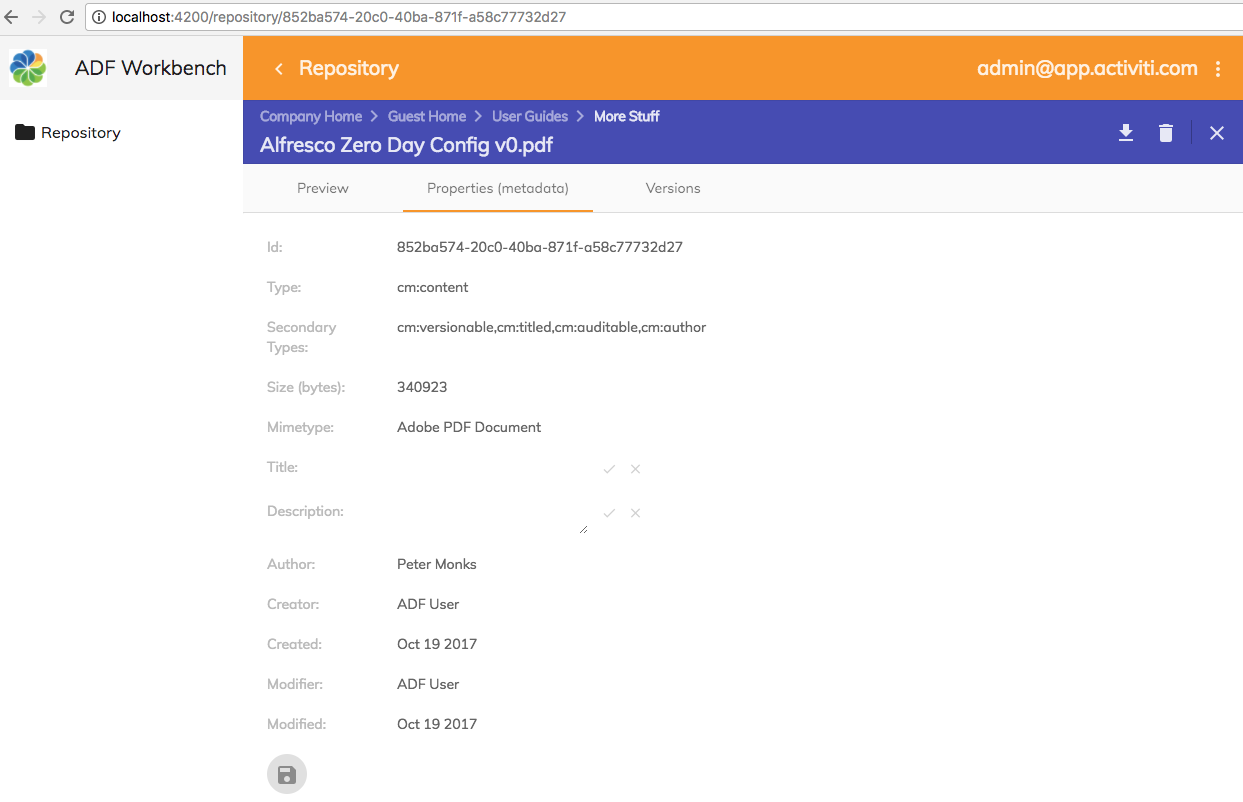
After each editable property we can see a pen and at the bottom of the page is a Save button. When clicking one of the pens an input field is displayed:
If we change one of the fields so it has a new value and then click on the check mark at the end of the input field, then the Save button will be active:
Clicking the Save button stores the new values for the node properties to the repository and a message is displayed at the bottom of the screen.
We have already prepared the src/app/repository/repository-details-page/repository-details-page.component.html template by adding a Save button below the properties and making the Card View editable. Now we have to setup each individual property that we want to be able to change as editable. Open the src/app/repository/repository-details-page/repository-details-page.component.ts file and set up the title and description properties as editable:
import { Component, OnInit } from '@angular/core';
import { ActivatedRoute, Router } from '@angular/router';
import {MinimalNodeEntryEntity, NodeBody} from 'alfresco-js-api';
import {
CardViewDateItemModel, CardViewTextItemModel,
CardViewItem, ContentService, NodesApiService,
NotificationService, CardViewUpdateService, UpdateNotification
} from '@alfresco/adf-core';
import { RepositoryContentModel } from '../repository-content.model';
@Component({
selector: 'app-repository-details-page',
templateUrl: './repository-details-page.component.html',
styleUrls: ['./repository-details-page.component.scss']
})
export class RepositoryDetailsPageComponent implements OnInit {
node: MinimalNodeEntryEntity;
parentFolder: MinimalNodeEntryEntity;
properties: Array<CardViewItem>;
/* Properties to do with editing */
propertiesChanged = false;
titleProp: CardViewTextItemModel;
descProp: CardViewTextItemModel;
constructor(private router: Router,
private activatedRoute: ActivatedRoute,
private nodeService: NodesApiService,
private contentService: ContentService,
private cardViewUpdateService: CardViewUpdateService,
protected notificationService: NotificationService) {
this.properties = new Array<CardViewItem>();
}
ngOnInit() {
const nodeId = this.activatedRoute.snapshot.params['node-id'];
this.nodeService.getNode(nodeId).subscribe((entry: MinimalNodeEntryEntity) => {
this.node = entry;
this.nodeService.getNode(this.node.parentId).subscribe((parentNode: MinimalNodeEntryEntity) => {
this.parentFolder = parentNode;
});
this.setupProps(this.node);
});
this.cardViewUpdateService.itemUpdated$.subscribe(this.updateNodeDetails.bind(this));
}
private setupProps(node: MinimalNodeEntryEntity) {
console.log('setupProps: ', node.id);
// Properties that are always available
const idProp = new CardViewTextItemModel({label: 'Id:', value: node.id, key: 'nodeId'});
const typeProp = new CardViewTextItemModel({label: 'Type:', value: node.nodeType, key: 'nodeType'});
const secTypeProp = new CardViewTextItemModel({
label: 'Secondary Types:',
value: node.aspectNames,
key: 'nodeSecTypes'
});
const creatorProp = new CardViewTextItemModel({
label: 'Creator:',
value: node.createdByUser.displayName,
key: 'createdBy'
});
const createdProp = new CardViewDateItemModel({
label: 'Created:',
value: node.createdAt,
format: 'MMM DD YYYY',
key: 'createdDate'
});
const modifierProp = new CardViewTextItemModel({
label: 'Modifier:',
value: node.modifiedByUser.displayName,
key: 'createdBy'
});
const modifiedProp = new CardViewDateItemModel({
label: 'Modified:',
value: node.modifiedAt,
format: 'MMM DD YYYY',
key: 'modifiedDate'
});
this.properties.push(idProp);
this.properties.push(typeProp);
this.properties.push(secTypeProp);
if (this.node.isFile) {
// Add some content file specific props
const sizeProp = new CardViewTextItemModel({
label: 'Size (bytes):',
value: node.content.sizeInBytes,
key: 'size'
});
const mimetypeProp = new CardViewTextItemModel({
label: 'Mimetype:',
value: node.content.mimeTypeName,
key: 'mimetype'
});
this.properties.push(sizeProp);
this.properties.push(mimetypeProp);
}
// Aspect properties
if (node.aspectNames.indexOf(RepositoryContentModel.TITLED_ASPECT_QNAME) > -1) {
this.titleProp = new CardViewTextItemModel({label: 'Title:',
value: node.properties[RepositoryContentModel.TITLE_PROP_QNAME],
key: 'title', editable: true, default: ''});
this.descProp = new CardViewTextItemModel({label: 'Description:',
value: node.properties[RepositoryContentModel.DESC_PROP_QNAME],
key: 'description', editable: true, default: '', multiline: true});
this.properties.push(this.titleProp);
this.properties.push(this.descProp);
}
// Author can be available if extracted during ingestion of content
if (node.properties && node.properties[RepositoryContentModel.AUTHOR_PROP_QNAME]) {
const authorProp = new CardViewTextItemModel({
label: 'Author:',
value: node.properties[RepositoryContentModel.AUTHOR_PROP_QNAME], key: 'author'
});
this.properties.push(authorProp);
}
this.properties.push(creatorProp);
this.properties.push(createdProp);
this.properties.push(modifierProp);
this.properties.push(modifiedProp);
}
onGoBack($event: Event) {
this.navigateBack2DocList();
}
onDownload($event: Event) {
const url = this.contentService.getContentUrl(this.node.id, true);
const fileName = this.node.name;
this.download(url, fileName);
}
onDelete($event: Event) {
this.nodeService.deleteNode(this.node.id).subscribe(() => {
this.navigateBack2DocList();
});
}
private navigateBack2DocList() {
this.router.navigate(['../'],
{
queryParams: {current_folder_id: this.parentFolder.id},
relativeTo: this.activatedRoute
});
}
private download(url: string, fileName: string) {
if (url && fileName) {
const link = document.createElement('a');
link.style.display = 'none';
link.download = fileName;
link.href = url;
document.body.appendChild(link);
link.click();
document.body.removeChild(link);
}
}
private updateNodeDetails(updateNotification: UpdateNotification) {
const currentValue = updateNotification.target.value;
const newValue = updateNotification.changed[updateNotification.target.key];
if (currentValue !== newValue) {
console.log(updateNotification.target, ' = ', updateNotification.changed);
if (updateNotification.target.key === this.titleProp.key) {
this.titleProp.value = updateNotification.changed[this.titleProp.key];
}
if (updateNotification.target.key === this.descProp.key) {
this.descProp.value = updateNotification.changed[this.descProp.key];
}
this.propertiesChanged = true;
}
}
onSave($event: Event) {
console.log('this.titleProp.value = ', this.titleProp.value);
console.log('this.descProp.value = ', this.descProp.value);
// Set up the properties that should be updated
const nodeBody = <NodeBody> {};
nodeBody[RepositoryContentModel.NODE_BODY_PROPERTIES_KEY] = {};
nodeBody[RepositoryContentModel.NODE_BODY_PROPERTIES_KEY][RepositoryContentModel.TITLE_PROP_QNAME] = this.titleProp.value;
nodeBody[RepositoryContentModel.NODE_BODY_PROPERTIES_KEY][RepositoryContentModel.DESC_PROP_QNAME] = this.descProp.value;
// Make the call to Alfresco Repo and update props
this.nodeService.updateNode(this.node.id, nodeBody).subscribe(
() => {
this.notificationService.openSnackMessage(
`Updated properties for '${this.node.name}' successfully`,
4000);
}
);
this.propertiesChanged = false;
}
isSaveDisabled() {
return !this.propertiesChanged;
}
}Here we start by adding three new properties:
- propertiesChanged: keeps track of if any of the editable properties have changed. To start with nothing have changed so we set it to false.
- titleProp: now we need to have the properties we want to be editable available in the component class so we can set and get their values.
- descProp: same as fore titleProp.
We then inject the CardViewUpdateService so we can listen in on any changes happening in the Card View. So if a property value, such as Title, is changed we can be notified about it by subscribing to the itemUpdated Observable in the ngOnInit function. When this happens we have the updateNodeDetails function to be called.
The updateNodeDetails method will do two things if a property value has changed, first take that new property value and set it on the property object, such as this.titleProp. Then set the propertiesChanged variable to true, which will enable the Save button.
The final thing we need to do is implement the onSave handler for the Save button. We can save the new properties values via the this.nodeService.updateNode call. This call takes the node identifier, which is the Alfresco Node Reference as a string, and an object of type NodeBody.
The NodeBody class looks like this:
export class NodeBody {
constructor(obj?: any);
name?: string;
nodeType?: string;
aspectNames?: Array<string>;
properties?: {
[key: string]: string;
};
relativePath?: string;
association?: NodeBodyAssociation;
secondaryChildren?: Array<ChildAssociationBody>;
targets?: Array<AssociationBody>;
permissions?: PermissionsBodyUpdate;
}So as we can see, we can set up a NodeBody structure as follows to store our new property values:
const nodeBody = <NodeBody> {
'properties':
{
'cm:title': this.titleProp.value,
'cm:description': this.descProp.value
}
};If the call to updateNode is successful, then we display a message with the notification service.
Note that if you plan to update the number of aspects (i.e. secondary types) for a node, then you must first take the existing aspects and add the new one to that list. You cannot just set one aspect to be added, it would replace all existing ones.
Implementing the Details page Properties tab with the ADF Form
Sometimes you would like a more complex layout for your metadata display then the ADF Card View can offer. We can then use the ADF Form component. It is very flexible and can display metadata based on an Alfresco Node Reference, a Workflow Task ID, in memory form etc. And the form can be designed with the APS Form Designer. Read more about the <adf-form component in the official docs.
Depending on how you use the ADF Form it might require authentication with APS as it will connect and try and download form definitions. In this article we assume that the app is only authenticated with ACS. So the form will be designed in APS but downloaded and kept in the App.
We will design a new form for the node metadata and display the properties for a node as follows:
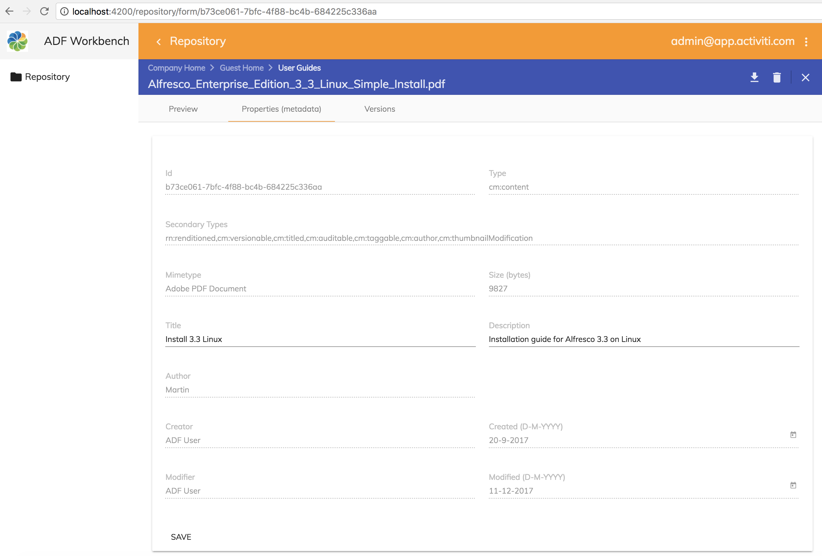
This form has been designed in APS and the JSON for it downloaded and added to the app. Notice that only two fields are updatable, the title (cm:title) and the description (cm:description). There is a SAVE button at the bottom of the form that can be used to save any updates to the title and description fields. The rest of the fields are readonly as they are controlled by the Alfresco Repository.
Next we will have a look at how a form can be created and exported from APS. But first let's just generate the module and component files that we need.
Generating a new details page and setting up routing
We will keep the Card View Details page implementation side by side with the Form Details page implementation. So let's generate a separate details page component to use for the ADF Form implementation. As usual, we can easily create a page component with the Angular CLI tool. Standing in the adf-workbench-content20 directory do the following:
Martins-MacBook-Pro:adf-workbench-content20 mbergljung$ cd src/app/repository/
Martins-MacBook-Pro:repository mbergljung$ ng g component repository-details-form-page
create src/app/repository/repository-details-form-page/repository-details-form-page.component.css (0 bytes)
create src/app/repository/repository-details-form-page/repository-details-form-page.component.html (47 bytes)
create src/app/repository/repository-details-form-page/repository-details-form-page.component.spec.ts (764 bytes)
create src/app/repository/repository-details-form-page/repository-details-form-page.component.ts (354 bytes)
update src/app/repository/repository.module.ts (1460 bytes)
This creates a repository details page that we can use for the new metadata display via ADF Form.
Let’s configure the routing table with the new details page, open up the src/app/repository/repository-routing.module.ts file and update it with the new route to the repository details form page:
import { NgModule } from '@angular/core';
import { Routes, RouterModule } from '@angular/router';
import { RepositoryPageComponent } from './repository-page/repository-page.component';
import { RepositoryDetailsPageComponent } from './repository-details-page/repository-details-page.component';
import { RepositoryListPageComponent } from './repository-list-page/repository-list-page.component';
import { RepositoryDetailsFormPageComponent } from './repository-details-form-page/repository-details-form-page.component';
import { AuthGuardEcm } from '@alfresco/adf-core';
const routes: Routes = [
{
path: 'repository',
component: RepositoryPageComponent,
canActivate: [AuthGuardEcm],
data: {
title: 'Repository',
icon: 'folder',
hidden: false,
needEcmAuth: true,
isLogin: false
},
children: [
{ path: '', component: RepositoryListPageComponent, canActivate: [AuthGuardEcm] },
{ path: ':node-id', component: RepositoryDetailsPageComponent, canActivate: [AuthGuardEcm] },
{ path: 'form/:node-id', component: RepositoryDetailsFormPageComponent, canActivate: [AuthGuardEcm] }
]
}
];
@NgModule({
imports: [RouterModule.forChild(routes)],
exports: [RouterModule]
})
export class RepositoryRoutingModule {}
When one of the items in the document list is clicked, and we select a new Details (form) content action, the http://localhost:4200/repository/form/<node-id> URL will be invoked taking the user to the new RepositoryDetailsFormPageComponent.
Creating and Exporting a form from APS
Although it is technically possible to hand craft the JSON that defines the form, it is highly unlikely that you will do that as it is so much easier to do it via the form designer in Alfresco Process Services (the first article that is mentioned in the introduction shows the steps to install a trial of APS). You can access the form designer via the App Designer | Forms | Create Form:
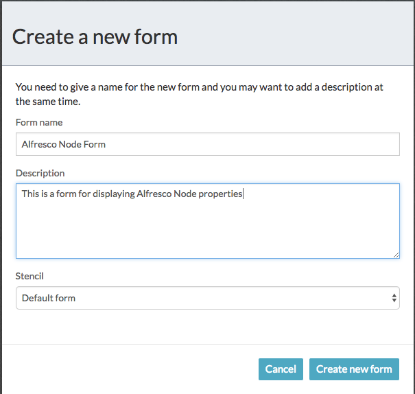
After clicking Create new form the following form designer will be displayed:
Here you can drag and drop controls into the form canvas and build up your form layout. While doing this it is important to think about the form field IDs that you are using. They will be used to fill the form with data when creating the details page component class. Our form will display some essential Alfresco Node metadata and look like this:
 If we look at one of the form fields, such as Secondary Types, it has the following configuration:
The important config here is the ID, which has the value secondarytypes. When we fill in the data for the form field in our details page component class we will refer to this field ID. That way the ADF Form Service can match our data with a form field.
To export the JSON for a form we use the Export Form (download) button in the upper right corner:

The source code for this article have the exported JSON for this form in the src/app/repository/repository-details-form-page/alfresco-node-form.ts file. Copy it into the same place in the project you are working on (of course, if you have access to APS you can design the form from scratch and play around with the form designer to get a feel for it).
As you can see in the file, the form JSON has been wrapped inside a class and a static function (and it has been reformatted):
export class AlfrescoNodeForm {
static getDefinition(): any {
return {
'id': 3011,
'name': 'Alfresco Node Form',
'description': 'Display basic data for an Alfresco Repository node.',
'version': 1,
'lastUpdatedBy': 1,
'lastUpdatedByFullName': ' Administrator',
'lastUpdated': '2017-10-20T12:34:42.995+0000',
'stencilSetId': 0,
'referenceId': null,
'formDefinition': {
'tabs': [],
'fields': [
{
'fieldType': 'ContainerRepresentation',
'id': '1508502563892',
'name': 'Label',
...We will use this class in our details page component implementation.
You might have noticed that setting a field up as readonly via the APS Form Designer is not possible, at least I cannot find a way of doing it... So I have set up all readonly fields directly in the exported JSON file:
'fields': {
'1': [
{
'fieldType': 'FormFieldRepresentation',
'id': 'secondarytypes',
'name': 'Secondary Types',
'type': 'text',
'value': null,
'required': false,
'readOnly': true,Implementing the Form Details page template
Let's start with the template, copy the src/app/repository/repository-details-page/repository-details-page.component.html template content into the src/app/repository/repository-details-form-page/repository-details-form-page.component.html template.
Then replace the <adf-card-view component with an <adf-form component as follows:
<adf-toolbar [color]="'accent'" *ngIf="node">
<adf-toolbar-title>
<adf-breadcrumb
[folderNode]="parentFolder">
</adf-breadcrumb>
<span *ngIf="node.name">{{ node.name }}</span>
</adf-toolbar-title>
<button *ngIf="node.isFile"
mat-icon-button
matTooltip="Download this file"
(click)="onDownload($event)">
<mat-icon>file_download</mat-icon>
</button>
<button mat-icon-button
matTooltip="Delete this content item"
(click)="onDelete($event)">
<mat-icon>delete</mat-icon>
</button>
<adf-toolbar-divider></adf-toolbar-divider>
<button mat-icon-button
class="adf-viewer-close-button"
matTooltip="Close and go back to document list"
(click)="onGoBack($event)"
aria-label="Close">
<mat-icon>close</mat-icon>
</button>
</adf-toolbar>
<mat-tab-group *ngIf="node">
<!-- Currently the Preview has to be the first tab -->
<mat-tab label="Preview" *ngIf="node.isFile">
<div class="adf-not-overlay-viewer">
<adf-viewer
[showViewer]="true"
[overlayMode]="false"
[showToolbar]="false"
[fileNodeId]="node.id">
</adf-viewer>
</div>
</mat-tab>
<mat-tab label="Properties (metadata)">
<mat-card class="adf-card-container">
<adf-form
[form]="form"
[showTitle]="false"
(formSaved)="onSave($event)">
</adf-form>
</mat-card>
</mat-tab>
<mat-tab label="Versions" *ngIf="node.isFile">
<adf-version-manager [node]="node"></adf-version-manager>
</mat-tab>
</mat-tab-group>There are quite a few properties and events that can be used to implement a form. Here we have used only the most essential ones. The following list explains the properties that you can work with (default values in parenthesis):
- There are a number of ways the form can be created, choose one of the following:
- form: this is the form model that should be used when creating the form. It is of type FormModel and contains the form design (i.e. form field configuration as per exported JSON) and form field values. Typically you can get one of these objects by using the formService.parseForm(formDefinitionJSON, data, readOnly) function. You can also feed this function with just the form definition JSON and get an empty form presented.
- taskId: the APS User Task ID that should be used to fetch the form definition JSON. A user task usually has an associated form (APS needs to be running so the form definition can be downloaded).
- showCompleteButton (true): should the complete button be visible for the task.
- disableCompleteButton (false): set this to true if the complete button should be disabled.
- nodeId: the ACS node identifier (i.e. node reference). The APS will be searched for a form that has a name that is the same as the content type of the node, such as 'cm:content' or 'cm:folder'. The form will then be populated and displayed.
- formId: the form definition JSON will be fetched from APS based on this form ID.
- formName: the form definition JSON will be fetched from APS based on this form name.
- data: use this to supply the form field values. It is of the type FormValues. You need this if you do not supply data when invoking the formService.parseForm(formDefinitionJSON) function.
- saveMetadata (false): can be used to store an APS task form as metadata in ACS. A new node will be created in ACS with all the task field data as metadata.
- path: the path in the Alfresco Repository where the new node should be stored.
- nameNode: the name of the new node.
- showTitle (true): Show a form title with a refresh button in the right corner of title.
- showRefreshButton (true): If you don't want the refresh button in the title set this to false. The refresh button is relevant if the form data comes directly from a task instance or node instance and can be updated 'live' via the APS or ACS backing services. It is not relevant for example in our scenario in this article where form data is only updated via the app.
- showSaveButton (true): Set this to false if the Save button should be hidden. We could potentially use this to hide the button if nothing has changed.
- readOnly (false): should the whole form be readonly. Used when you don't pass in this info to the formService.parseForm(formDefinitionJSON) function.
- showValidationIcon (true): does not seem to be used...
- showDebugButton (false): shows debug related information if set to true.
- fieldValidators: supply your own form field validators of type FormFieldValidator.
- (formSaved): when the form is saved this function is called with the current FormModel. We use it in our implementation to store updated properties in the Alfresco Repository.
- (formCompleted): called when the user clicked the Complete button.
- (formContentClicked): called when content in the form is clicked.
- (formLoaded): this function will be called when the data has been loaded into the form fields.
- (formDataRefreshed): this function will be called when the data has been updated in the form fields.
- (executeOutcome): called after the form service has executed the outcome of a task form.
- (onError): called when something went wrong in the form processing.
Implementing the Form Details page component class
Now when we got the template sorted we need to implement also the backing component class. Open up the src/app/repository/repository-details-form-page/repository-details-form-page.component.ts class file and update it to look like this:
import { Component, OnInit } from '@angular/core';
import { ActivatedRoute, Router } from '@angular/router';
import { MinimalNodeEntryEntity, NodeBody } from 'alfresco-js-api';
import { ContentService, FormModel, FormService, FormValues,
NodesApiService, NotificationService } from '@alfresco/adf-core';
import { RepositoryContentModel } from '../repository-content.model';
import { AlfrescoNodeForm } from '../repository-details-page/alfresco-node-form';
import { RepositoryFormFieldModel } from '../repository-formfield.model';
@Component({
selector: 'app-repository-details-form-page',
templateUrl: './repository-details-form-page.component.html',
styleUrls: ['./repository-details-form-page.component.scss']
})
export class RepositoryDetailsFormPageComponent implements OnInit {
node: MinimalNodeEntryEntity;
parentFolder: MinimalNodeEntryEntity;
form: FormModel;
originalFormData: FormValues = {};
constructor(private router: Router,
private activatedRoute: ActivatedRoute,
private nodeService: NodesApiService,
private contentService: ContentService,
private formService: FormService,
protected notificationService: NotificationService) {
}
ngOnInit() {
const nodeId = this.activatedRoute.snapshot.params['node-id'];
this.nodeService.getNode(nodeId).subscribe((entry: MinimalNodeEntryEntity) => {
this.node = entry;
this.nodeService.getNode(this.node.parentId).subscribe((parentNode: MinimalNodeEntryEntity) => {
this.parentFolder = parentNode;
});
this.setupFormData(this.node);
});
}
private setupFormData(node: MinimalNodeEntryEntity) {
console.log('setupFormData: ', node.id);
// Content file specific props
let size = 'N/A';
let mimetype = 'N/A';
if (node.isFile) {
size = '' + node.content.sizeInBytes;
mimetype = node.content.mimeTypeName;
}
// Aspect properties
let title = '';
let desc = '';
if (node.aspectNames.indexOf(RepositoryContentModel.TITLED_ASPECT_QNAME) > -1) {
title = node.properties[RepositoryContentModel.TITLE_PROP_QNAME];
desc = node.properties[RepositoryContentModel.DESC_PROP_QNAME];
}
// Author can be available if extracted during ingestion of content
let author = '';
if (node.properties && node.properties[RepositoryContentModel.AUTHOR_PROP_QNAME]) {
author = node.properties[RepositoryContentModel.AUTHOR_PROP_QNAME];
}
this.originalFormData = {
'id': node.id,
'type': node.nodeType,
'secondarytypes': node.aspectNames,
'creator': node.createdByUser.displayName,
'created': node.createdAt,
'modifier': node.modifiedByUser.displayName,
'modified': node.modifiedAt,
'sizebytes': size,
'mimetype': mimetype,
'title': title,
'description': desc,
'author': author
};
// Read and parse the form that we will use to display the node
const formDefinitionJSON: any = AlfrescoNodeForm.getDefinition();
const readOnly = false;
this.form = this.formService.parseForm(formDefinitionJSON, this.originalFormData, readOnly);
}
onGoBack($event: Event) {
this.navigateBack2DocList();
}
onDownload($event: Event) {
const url = this.contentService.getContentUrl(this.node.id, true);
const fileName = this.node.name;
this.download(url, fileName);
}
onDelete($event: Event) {
this.nodeService.deleteNode(this.node.id).subscribe(() => {
this.navigateBack2DocList();
});
}
onSave(form: FormModel) {
const titleChanged = this.form.values[RepositoryFormFieldModel.TITLE_FIELD_NAME] &&
(this.form.values[RepositoryFormFieldModel.TITLE_FIELD_NAME] !==
this.originalFormData[RepositoryFormFieldModel.TITLE_FIELD_NAME]);
const descriptionChanged = this.form.values[RepositoryFormFieldModel.DESC_FIELD_NAME] &&
(this.form.values[RepositoryFormFieldModel.DESC_FIELD_NAME] !==
this.originalFormData[RepositoryFormFieldModel.DESC_FIELD_NAME]);
if (titleChanged || descriptionChanged) {
// We got some non-readonly metadata that has been updated
console.log('Updating [cm:title = ' + this.form.values[RepositoryFormFieldModel.TITLE_FIELD_NAME] + ']');
console.log('Updating [cm:description = ' + this.form.values[RepositoryFormFieldModel.DESC_FIELD_NAME] + ']');
// Set up the properties that should be updated
const nodeBody = <NodeBody> {};
nodeBody[RepositoryContentModel.NODE_BODY_PROPERTIES_KEY] = {};
nodeBody[RepositoryContentModel.NODE_BODY_PROPERTIES_KEY][RepositoryContentModel.TITLE_PROP_QNAME] = this.form.values['title'];
nodeBody[RepositoryContentModel.NODE_BODY_PROPERTIES_KEY][RepositoryContentModel.DESC_PROP_QNAME] = this.form.values['description'];
// Make the call to Alfresco Repo and update props
this.nodeService.updateNode(this.node.id, nodeBody).subscribe(
() => {
this.notificationService.openSnackMessage(
`Updated properties for '${this.node.name}' successfully`,
4000);
}
);
} else {
this.notificationService.openSnackMessage(
`Node '${this.node.name}' was NOT saved, nothing has been changed!`,
4000);
}
}
private navigateBack2DocList() {
this.router.navigate(['../../'],
{
queryParams: {current_folder_id: this.parentFolder.id},
relativeTo: this.activatedRoute
});
}
private download(url: string, fileName: string) {
if (url && fileName) {
const link = document.createElement('a');
link.style.display = 'none';
link.download = fileName;
link.href = url;
document.body.appendChild(link);
link.click();
document.body.removeChild(link);
}
}
}The fist two properties node and parentFolder are the same as we had when implementing the Card View based Details page. However, instead of keeping an array of card view items we keep the form object and the originalFormData object. The form object will be created based on the form definition JSON that we downloaded and stored in the AlfrescoNodeForm class and the originalFormData.
The ngOnInit function is also almost identical to the one we have in the Card View implementation, it just fetches the Alfresco Repo node that we are going to show in the form. But, instead of calling setupProps we call setupFormData, which is a rewritten setupProps function that instead sets up the originalFormData that we load the form with and then uses the Form Service to parse the form definition JSON we got from the AlfrescoNodeForm.getDefinition() call.
The onGoBack, onDownload, and onDelete event handler functions are the same as for the Card View implementation. The onSave function looks a lot like the one we had in the Card View implementation except here we get the properties we are about to update from the form field values.
The navigateBack2DocList function has been changed a little bit as the route to the Form Details page is /form/<node-id> and not just /<node-id>. So we have to navigate two steps up with ../../
Last thing to note here is that I have started to create a Repository Form Field model that will contain all constants for form field names etc. Create the src/app/repository/repository-formfield.model.ts file and put the following into it:
/**
* Form field identifiers when working with ADF Forms
*/
export class RepositoryFormFieldModel {
static readonly TITLE_FIELD_NAME = 'title';
static readonly DESC_FIELD_NAME = 'description';
}For the preview to work in this details page we also need to copy the CSS from the src/app/repository/repository-details-page/repository-details-page.component.css style file to the src/app/repository/repository-details-form-page/repository-details-form-page.component.css file.
Adding the Form Details content action to the Repository List page
The Form Details page is now finished and we can create a content action in the List page that takes you to it. We want to implement a Details(form) content action that looks like this:
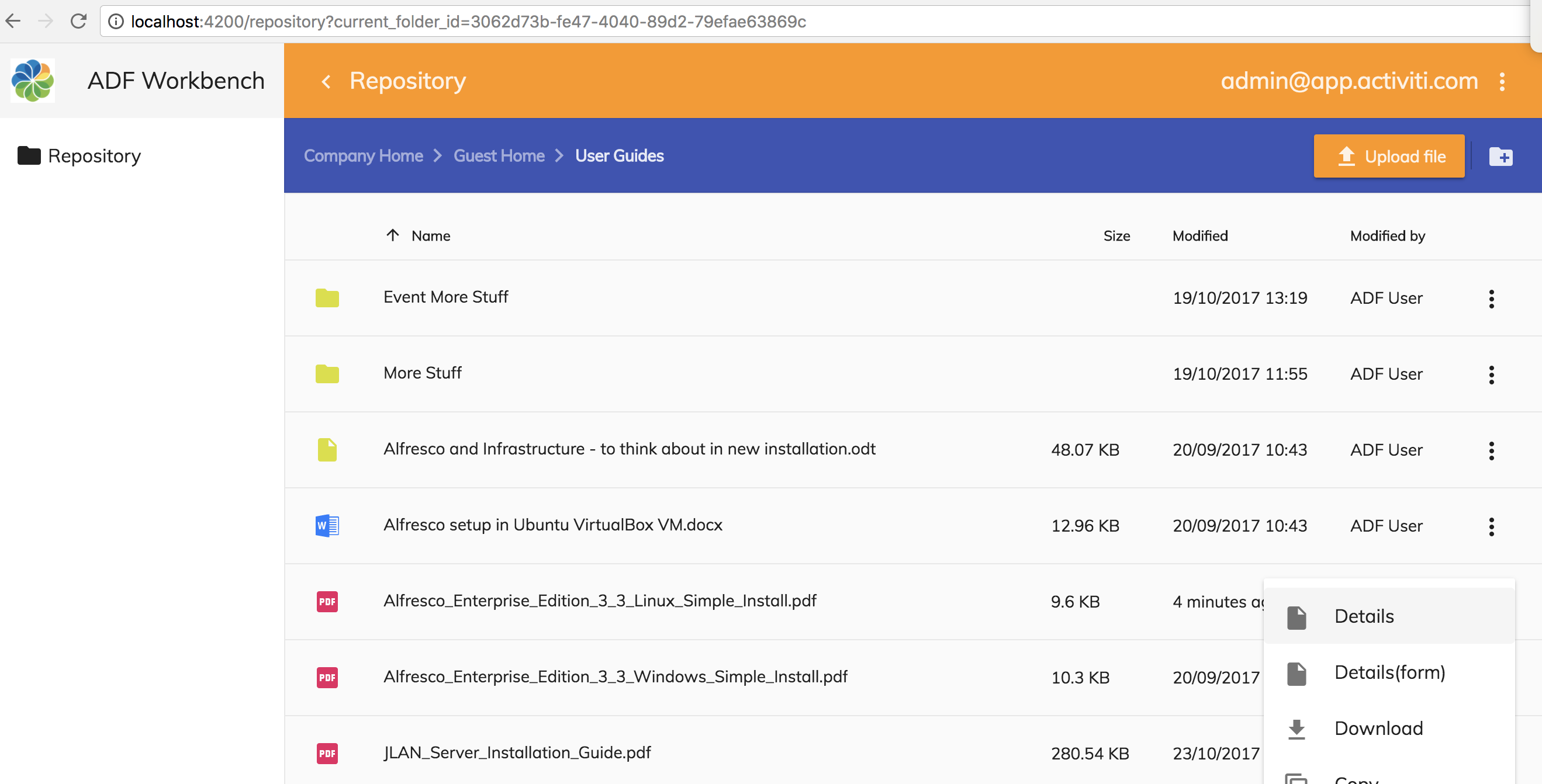
When the user clicks the Details action for an item in the list the form details page route should be activated (e.g. http://localhost:4200/repository/form/6bcdad1d-f28f-44ee-9476-b7fdcc964451). First thing we need to do is define the new content action. Open up the src/app/repository/repository-list-page/repository-list-page.component.html template file and update it with the new Form Details action, put it just after the other Details action for folder actions and for document actions:
<adf-toolbar [color]="'accent'">
<adf-toolbar-title>
<adf-breadcrumb
root="Company Home"
[target]="documentList"
[folderNode]="documentList.folderNode">
</adf-breadcrumb>
</adf-toolbar-title>
<adf-upload-button
[rootFolderId]="getDocumentListCurrentFolderId()"
[uploadFolders]="false"
[multipleFiles]="true"
[acceptedFilesType]="'*'"
[versioning]="false"
[adf-node-permission]="'create'"
[adf-nodes]="getNodesForPermissionCheck()"
(success)="onButtonUploadSuccess($event)">
</adf-upload-button>
<adf-toolbar-divider></adf-toolbar-divider>
<button
mat-icon-button
[disabled]="!canCreateContent(documentList.folderNode)"
[adf-create-folder]="getDocumentListCurrentFolderId()">
<mat-icon>create_new_folder</mat-icon>
</button>
</adf-toolbar>
<adf-upload-drag-area
[parentId]="getDocumentListCurrentFolderId()"
[adf-node-permission]="'create'"
[adf-nodes]="getNodesForPermissionCheck()"
(success)="onDragAndDropUploadSuccess($event)">
<adf-document-list
#documentList
[navigationMode]="'click'"
[currentFolderId]="getDocumentListCurrentFolderId()"
[contextMenuActions]="true"
[contentActions]="true">
<content-actions>
<!-- Folder actions -->
<content-action
title="{{'DOCUMENT_LIST.ACTIONS.FOLDER.DETAILS' | translate}}"
[icon]="'folder'"
[target]="'folder'"
(execute)="onFolderDetails($event)">
</content-action>
<content-action
title="{{'DOCUMENT_LIST.ACTIONS.FOLDER.DETAILS_FORM' | translate}}"
[icon]="'folder'"
[target]="'folder'"
(execute)="onFolderDetailsForm($event)">
</content-action>
<content-action
title="{{'DOCUMENT_LIST.ACTIONS.FOLDER.DOWNLOAD_AS_ZIP' | translate}}"
[icon]="'file_download'"
[target]="'folder'"
(execute)="onDownloadAsZip($event)">
</content-action>
<content-action
title="{{'DOCUMENT_LIST.ACTIONS.FOLDER.COPY' | translate}}"
[icon]="'content_copy'"
[target]="'folder'"
[permission]="'update'"
[disableWithNoPermission]="true"
[handler]="'copy'"
(permissionEvent)="onContentActionPermissionError($event)"
(error)="onContentActionError($event)"
(success)="onContentActionSuccess($event)">
</content-action>
<content-action
title="{{'DOCUMENT_LIST.ACTIONS.FOLDER.MOVE' | translate}}"
[icon]="'redo'"
[target]="'folder'"
[permission]="'update'"
[disableWithNoPermission]="true"
[handler]="'move'"
(permissionEvent)="onContentActionPermissionError($event)"
(error)="onContentActionError($event)"
(success)="onContentActionSuccess($event)">
</content-action>
<content-action
title="{{'DOCUMENT_LIST.ACTIONS.FOLDER.DELETE' | translate}}"
[icon]="'delete'"
[target]="'folder'"
[permission]="'delete'"
[disableWithNoPermission]="true"
[handler]="'delete'"
(permissionEvent)="onContentActionPermissionError($event)"
(error)="onContentActionError($event)"
(success)="onContentActionSuccess($event)">
</content-action>
<!-- File actions -->
<content-action
title="{{'DOCUMENT_LIST.ACTIONS.DOCUMENT.DETAILS' | translate}}"
[icon]="'insert_drive_file'"
[target]="'document'"
(execute)="onDocumentDetails($event)">
</content-action>
<content-action
title="{{'DOCUMENT_LIST.ACTIONS.DOCUMENT.DETAILS_FORM' | translate}}"
[icon]="'insert_drive_file'"
[target]="'document'"
(execute)="onDocumentDetailsForm($event)">
</content-action>
<content-action
title="{{'DOCUMENT_LIST.ACTIONS.DOCUMENT.DOWNLOAD' | translate}}"
[icon]="'file_download'"
[target]="'document'"
[handler]="'download'">
</content-action>
<content-action
title="{{'DOCUMENT_LIST.ACTIONS.DOCUMENT.COPY' | translate}}"
[icon]="'content_copy'"
[target]="'document'"
[permission]="'update'"
[disableWithNoPermission]="true"
[handler]="'copy'"
(permissionEvent)="onContentActionPermissionError($event)"
(error)="onContentActionError($event)"
(success)="onContentActionSuccess($event)">
</content-action>
<content-action
title="{{'DOCUMENT_LIST.ACTIONS.DOCUMENT.MOVE' | translate}}"
[icon]="'redo'"
[target]="'document'"
[permission]="'update'"
[disableWithNoPermission]="true"
[handler]="'move'"
(permissionEvent)="onContentActionPermissionError($event)"
(error)="onContentActionError($event)"
(success)="onContentActionSuccess($event)">
</content-action>
<content-action
title="{{'DOCUMENT_LIST.ACTIONS.DOCUMENT.MANAGE_VERSIONS' | translate}}"
[icon]="'storage'"
[target]="'document'"
[permission]="'update'"
[disableWithNoPermission]="true"
(execute)="onManageVersions($event)">
</content-action>
<content-action
title="{{'DOCUMENT_LIST.ACTIONS.DOCUMENT.DELETE' | translate}}"
[icon]="'delete'"
[target]="'document'"
[permission]="'delete'"
[disableWithNoPermission]="true"
[handler]="'delete'"
(permissionEvent)="onContentActionPermissionError($event)"
(error)="onContentActionError($event)"
(success)="onContentActionSuccess($event)">
</content-action>
</content-actions>
</adf-document-list>
<adf-pagination
[target]="documentList">
</adf-pagination>
</adf-upload-drag-area>The component class then need to implement the two so called custom content actions. They are called custom as they don’t have out-of-the-box handler implementations, such as ‘delete’. Instead we point to the action implementation via the (execute) event. These new action handlers look as follows, add them to the src/app/repository/repository-list-page/repository-list-page.component.ts file:
onFolderDetailsForm(event: any) {
const entry: MinimalNodeEntryEntity = event.value.entry;
console.log('RepositoryListPageComponent: Navigating to details page (form) for folder: ' + entry.name);
this.router.navigate(['/repository/form', entry.id]);
}
onDocumentDetailsForm(event: any) {
const entry: MinimalNodeEntryEntity = event.value.entry;
console.log('RepositoryListPageComponent: Navigating to details page (form) for document: ' + entry.name);
this.router.navigate(['/repository/form', entry.id]);
}We need these extra functions as we want to navigate to a different Details page than the one we already have for Card View display. This should be all that is needed, except the i18n resources for the extra Form Details actions. Add them in the src/assets/i18n/en.json file as follows:
{
"DOCUMENT_LIST": {
"ACTIONS": {
"FOLDER": {
"DETAILS": "Details",
"DETAILS_FORM": "Details(form)",
"DOWNLOAD_AS_ZIP": "Download as ZIP",
"COPY": "Copy...",
"MOVE": "Move...",
"DELETE": "Delete"
},
"DOCUMENT": {
"DETAILS": "Details",
"DETAILS_FORM": "Details(form)",
"DOWNLOAD": "Download",
"COPY": "Copy...",
"MOVE": "Move...",
"MANAGE_VERSIONS": "Manage Versions...",
"DELETE": "Delete"
}
}
}
}We are now ready to test the new Form Details page implementation.
Adding Search to the main toolbar
Our little content management application is starting to take shape. However, we are missing an essential piece of functionality, search. So let’s implement it.
Introduction to the search functionality
What we want is a Search Bar in the main orange toolbar that supports both live/instant search and also supports navigating to a Search Result page. The Search Bar component would look something like this:
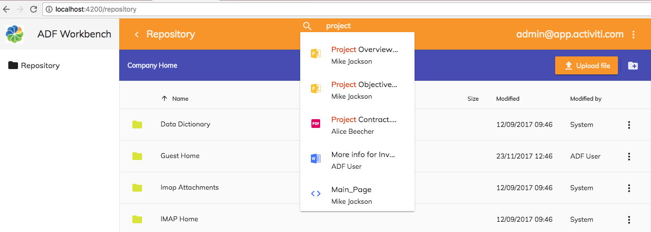
The live search result drop down appears automatically as soon as the user has typed 3 or more characters. If you select (i.e. click or hit enter) on an item in the list the Repository Details page will be displayed.
If you hit enter in the Search Bar input field, then the Search Result page appears:
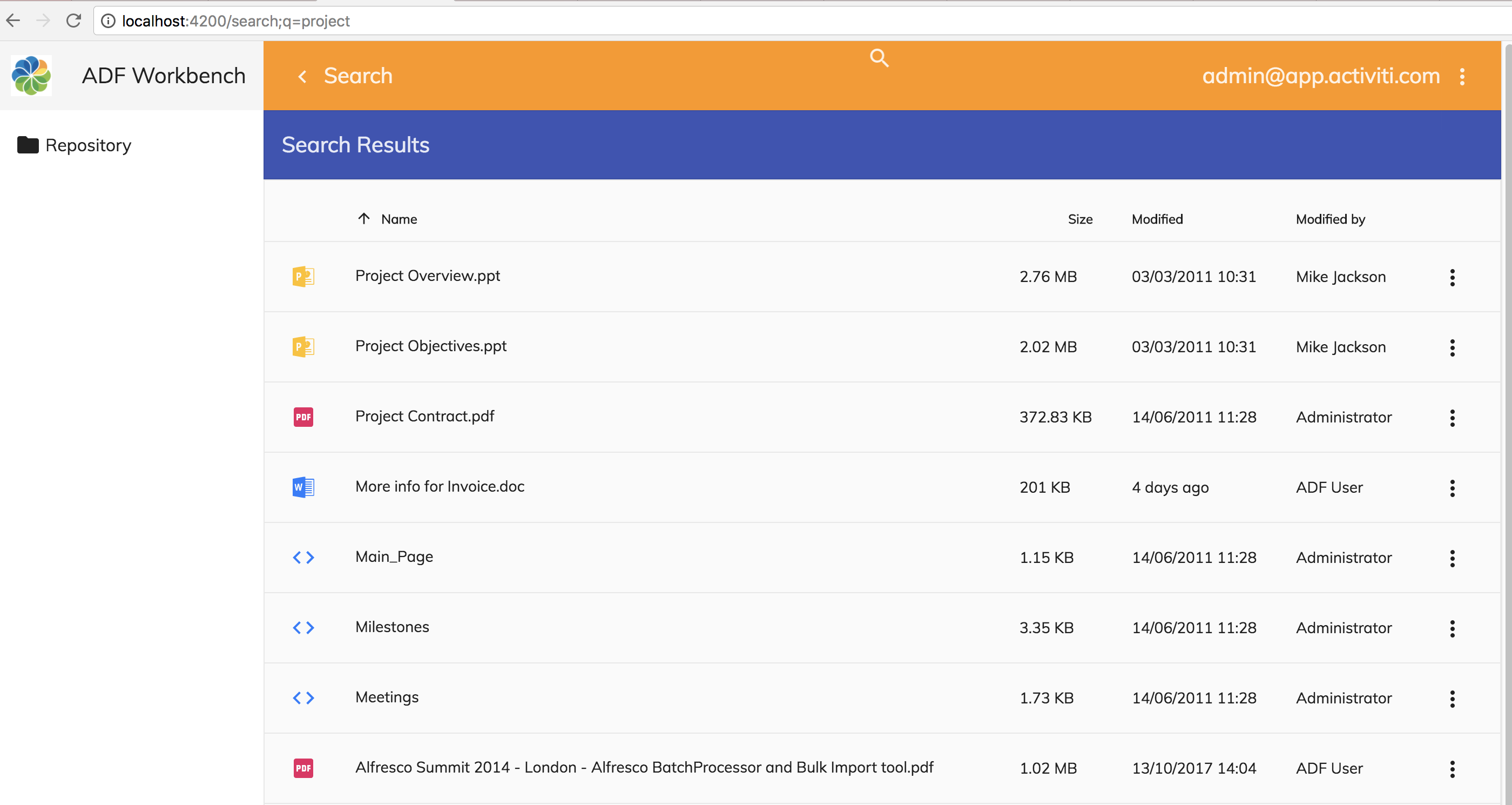
Notice how, in the URL, the search term is passed on to the search result page as the q parameter (i.e. http://localhost:4200/search;q=project).
Generating a new search module and page components
We are going to need one Search Bar component and one Search Result page component. Plus a search module to keep everything organised.
As usual, we can easily create a new module and the needed components with the Angular CLI tool:
Martins-MacBook-Pro:adf-workbench-content20 mbergljung$
ng g module content-search --flat false --routing
create src/app/content-search/content-search-routing.module.ts (256 bytes)
create src/app/content-search/content-search.module.ts (308 bytes)
Martins-MacBook-Pro:adf-workbench-content20 mbergljung$ cd src/app/content-search/
Martins-MacBook-Pro:search mbergljung$ ng g component search-bar
create src/app/content-search/search-bar/search-bar.component.scss (0 bytes)
create src/app/content-search/search-bar/search-bar.component.html (29 bytes)
create src/app/content-search/search-bar/search-bar.component.spec.ts (650 bytes)
create src/app/content-search/search-bar/search-bar.component.ts (285 bytes)
update src/app/content-search/content-search.module.ts (398 bytes)
Martins-MacBook-Pro:search mbergljung$ ng g component search-result-page
create src/app/content-search/search-result-page/search-result-page.component.scss (0 bytes)
create src/app/content-search/search-result-page/search-result-page.component.html (37 bytes)
create src/app/content-search/search-result-page/search-result-page.component.spec.ts (700 bytes)
create src/app/content-search/search-result-page/search-result-page.component.ts (316 bytes)
update src/app/content-search/content-search.module.ts (520 bytes)
This creates a search module with routing and a search-bar component from where to do the searching, and a search result page where we can display the result of a search.
For the ADF Search components and the ADF Viewer component to be available to use in a template we need to import the App Common Module. Open up src/app/content-search/content-search.module.ts file and add it as follows:
import { NgModule } from '@angular/core';
import { CommonModule } from '@angular/common';
import { ContentSearchRoutingModule } from './content-search-routing.module';
import { SearchBarComponent } from './search-bar/search-bar.component';
import { SearchResultPageComponent } from './search-result-page/search-result-page.component';
import { AppCommonModule } from '../app-common/app-common.module';
@NgModule({
imports: [
CommonModule,
ContentSearchRoutingModule,
/* Common App imports (Angular Core and Material, ADF Core, Content, and Process */
AppCommonModule
],
declarations: [SearchBarComponent, SearchResultPageComponent],
exports: [SearchBarComponent]
})
export class ContentSearchModule { }Note here that we need to export the SearchBar component from the ContentSearchModule as it is going to be used outside this module in the main app layout.
We need a new route set up for the Search Result page. Let’s add it in the src/app/content-search/content-search-routing.module.ts file as follows:
import { NgModule } from '@angular/core';
import { Routes, RouterModule } from '@angular/router';
import { SearchResultPageComponent } from './search-result-page/search-result-page.component';
import { AuthGuardEcm } from '@alfresco/adf-core';
const routes: Routes = [
{ path: 'search',
component: SearchResultPageComponent,
canActivate: [AuthGuardEcm],
data: {
title: 'Search',
hidden: true,
needEcmAuth: true,
isLogin: false
}
}
];
@NgModule({
imports: [RouterModule.forChild(routes)],
exports: [RouterModule]
})
export class ContentSearchRoutingModule { }The route configuration should be familiar from what we have done before and the data object is explained in the second article that is linked to in the introduction. This route only makes sense when you have done a search via the Search Bar, and then want to show the result, so it is set up as hidden. So we don't want to show a left navigation item called “Search”.
For the search components to be known at the app component level we need to import the ADF Search Module into the App Module file. Open up the src/app/app.module.ts file and add the following modules:
import { BrowserModule } from '@angular/platform-browser';
import { NgModule } from '@angular/core';
import { AppRoutingModule } from './app-routing.module';
import { AppComponent } from './app.component';
import { AppCommonModule } from './app-common/app-common.module';
import { AppLoginRoutingModule } from './app-login/app-login-routing.module';
import { AppLoginModule } from './app-login/app-login.module';
import { AppMenuService } from './app-menu/app-menu.service';
import { RepositoryRoutingModule } from './repository/repository-routing.module';
import { RepositoryModule } from './repository/repository.module';
import { ContentSearchRoutingModule} from './content-search/content-search-routing.module';
import { ContentSearchModule} from './content-search/content-search.module';
@NgModule({
declarations: [
AppComponent
],
imports: [
BrowserModule,
AppRoutingModule,
AppCommonModule,
AppLoginModule,
AppLoginRoutingModule,
RepositoryModule,
RepositoryRoutingModule,
ContentSearchModule,
ContentSearchRoutingModule
],
providers: [AppMenuService],
bootstrap: [AppComponent]
})
export class AppModule { }Note also that we make the search routing configuration known to the application router.
Implementing the Search Bar component
Now we can move on and implement the Search Bar component that will provide live search and navigation to the Search Result page if you hit enter. Let’s start with the template for it. Open up the src/app/content-search/search-bar/search-bar.component.html file and replace whatever is there with the following:
<adf-search-control *ngIf="isLoggedIn()"
[autocomplete]="false"
[highlight]="true"
(submit)="onSearchSubmit($event)"
(searchChange)="onSearchTermChange($event)"
(optionClicked)="onItemClicked($event)">
</adf-search-control>To implement the Search Bar we use the <adf-search-control. It will provide all of the functionality that we need, including hooks for customisation. The parameters and events have the following meaning:
- inputType (text): the type of <input field to use for the Search Bar.
- autocomplete (false): set to true if you want the system to autocomplete search terms as you are typing them in.
- expandable (true): controls if the search bar/input field is expandable or not.
- highlight (false): true means highlight the search term in the search result.
- liveSearchEnabled (true): should live search be possible in the search bar.
- liveSearchMaxResults (5): how many items to show in search result drop down.
- (submit): function is called when user hits enter in Search Bar field.
- (searchChange): function is called when the search term is changed.
- (expand): can be used to do stuff when the Search Bar input field is expanded or collapsed.
- (optionClicked): function is called when user clicks on an item in the live search result drop down.
We implement the event handler functions, such as the onSearchSubmit() as follows in the src/app/content-search/search-bar/search-bar.component.ts file:
import { Component, OnInit } from '@angular/core';
import { Router } from '@angular/router';
import { AuthenticationService } from '@alfresco/adf-core';
import { MinimalNodeEntity } from 'alfresco-js-api';
@Component({
selector: 'app-search-bar',
templateUrl: './search-bar.component.html',
styleUrls: ['./search-bar.component.scss']
})
export class SearchBarComponent implements OnInit {
searchTerm = '';
constructor(public router: Router,
public authService: AuthenticationService) {
}
ngOnInit() {
}
isLoggedIn(): boolean {
return this.authService.isLoggedIn();
}
onSearchSubmit(event: KeyboardEvent) {
const searchTerm = (event.target as HTMLInputElement).value;
this.router.navigate(['/search', {
'q': searchTerm
}]);
}
onItemClicked(node: MinimalNodeEntity) {
console.log('Item clicked: ', node);
this.router.navigate(['/repository', node.entry.id]);
}
onSearchTermChange(event) {
this.searchTerm = event.value;
}
}The onSearchSubmit() function will navigate to the Search Result page component (i.e. /search) with the search term set as parameter q. The ‘q’ parameter could have any name you like, but traditionally it has been named q, so let's stick with it.
Before version 2.0 of ADF the search result page was pre-built and the parameter name was hardcoded into the Search/Search Result component as q.
The search is actually executed in the Search Result page component with out-of-the-box ADF search components. We will implement the Search Result page in the next section.
If you click on an item in the live search dropdown (onItemClicked()), then the Repository Details page will be displayed both for files and folders. The onSearchTermChange() function just keeps current search term stored in the searchTerm variable, so it is always displayed in the Search Bar input field.
Adding the Search Bar to the main toolbar
Now when we have finished the Search Bar we can include it in the main application toolbar 2. Open up the src/app/app.component.html file and update it to look as follows:
<mat-sidenav-container>
<mat-sidenav #mainSideNav mode="side" opened>
<mat-toolbar>
<img src="../assets/images/alfresco-logo.png" style="height:60%">
<span fxFlex></span>
{{ appName }}
</mat-toolbar>
<mat-nav-list>
<a *ngFor="let menuItem of mainMenuItems"
mat-list-item
mat-ripple
[style.position]="'relative'"
routerLinkActive="selected"
[routerLink]="[menuItem.path]">
<mat-icon mat-list-icon *ngIf="menuItem.icon">{{ menuItem.icon }}</mat-icon>
<span>{{ menuItem.title }}</span>
</a>
</mat-nav-list>
</mat-sidenav>
<mat-toolbar color="primary">
<button mat-icon-button (click)="mainSideNav.toggle()">
<mat-icon *ngIf="mainSideNav.opened">chevron_left</mat-icon>
<mat-icon *ngIf="!mainSideNav.opened">menu</mat-icon>
</button>
{{ (activeMenuItem$ | async)?.title }}
<span fxFlex></span>
<app-search-bar></app-search-bar>
<span fxFlex></span>
{{ getCurrentUser() }}
<button mat-icon-button [matMenuTriggerFor]="dropdownMenu">
<mat-icon>more_vert</mat-icon>
</button>
</mat-toolbar>
<router-outlet></router-outlet>
</mat-sidenav-container>
<mat-menu #dropdownMenu x-position="before">
<a mat-menu-item href="" (click)="onLogout($event)">
<mat-icon>exit_to_app</mat-icon>
<span>Logout</span>
</a>
<a mat-menu-item href="" routerLink="/about">
<mat-icon>info_outline</mat-icon>
<span>About</span>
</a>
</mat-menu>To inject the Search Bar we use the <app-search-bar> selector that was set when the component was generated. There are also some span tags with flex styling around it so it ends up in the middle of the toolbar.
The Search Bar should now be visible in the main orange toolbar:

Update the Repository Details page component to read node-id async
When we select an item (i.e. file or folder) in the Search Bar result drop down and it takes you to the Repository Details page it works nicely the first time around. However, if we do a search again and select an item the Details page is not updated. This is because we currently read the node-id parameter from the Repository Details page URL (e.g. http://localhost:4200/repository/80ca4db6-85dd-43aa-a3d9-84c2fe321aaa) synchronously as follows in the src/app/repository/repository-details-page/repository-details-page.component.ts file:
export class RepositoryDetailsPageComponent implements OnInit {
...
ngOnInit() {
const nodeId = this.activatedRoute.snapshot.params['node-id'];If we keep this way of extracting the node identifier (i.e. Alfresco Node Reference), it will not work when the page is called multiple times with just a different node-id parameter. We need to update it to fetch the parameter synchronously as follows:
ngOnInit() {
this.activatedRoute.params.subscribe(params => {
const nodeId = params['node-id'];
console.log('Node ID: ', nodeId);
this.nodeService.getNode(nodeId).subscribe((entry: MinimalNodeEntryEntity) => {
this.node = entry;
this.nodeService.getNode(this.node.parentId).subscribe((parentNode: MinimalNodeEntryEntity) => {
this.parentFolder = parentNode;
});
this.setupProps(this.node);
});
});
this.cardViewUpdateService.itemUpdated$.subscribe(this.updateNodeDetails.bind(this));
}
Implementing the Search Result component
Last thing we need to do is implement the Search Result page component. Which actually also does the search based on the search term parameter that it receives (e.g. http://localhost:4200/search;q=project). Open up the template located in the src/app/content-search/search-result-page/search-result-page.component.html file and update to look like this:
<adf-search [searchTerm]="searchTerm"
[maxResults]="20"
(resultLoaded)="showSearchResult($event)">
</adf-search>
<adf-toolbar [color]="'accent'">
<adf-toolbar-title>
Search Results
</adf-toolbar-title>
</adf-toolbar>
<adf-document-list
#documentList
[navigationMode]="'click'"
[currentFolderId]="null"
[contextMenuActions]="true"
[contentActions]="true"
[node]="resultNodePageList">
<content-actions>
<!-- Folder actions -->
<content-action
title="{{'DOCUMENT_LIST.ACTIONS.FOLDER.DETAILS' | translate}}"
[icon]="'folder'"
[target]="'folder'"
(execute)="onDetails($event)">
</content-action>
<content-action
title="{{'DOCUMENT_LIST.ACTIONS.FOLDER.COPY' | translate}}"
[icon]="'content_copy'"
[target]="'folder'"
[permission]="'update'"
[disableWithNoPermission]="true"
[handler]="'copy'"
(permissionEvent)="onContentActionPermissionError($event)"
(error)="onContentActionError($event)"
(success)="onContentActionSuccess($event)">
</content-action>
<content-action
title="{{'DOCUMENT_LIST.ACTIONS.FOLDER.MOVE' | translate}}"
[icon]="'redo'"
[target]="'folder'"
[permission]="'update'"
[disableWithNoPermission]="true"
[handler]="'move'"
(permissionEvent)="onContentActionPermissionError($event)"
(error)="onContentActionError($event)"
(success)="onContentActionSuccess($event)">
</content-action>
<content-action
title="{{'DOCUMENT_LIST.ACTIONS.FOLDER.DELETE' | translate}}"
[icon]="'delete'"
[target]="'folder'"
[permission]="'delete'"
[disableWithNoPermission]="true"
[handler]="'delete'"
(permissionEvent)="onContentActionPermissionError($event)"
(error)="onContentActionError($event)"
(success)="onContentActionSuccess($event)">
</content-action>
<!-- File actions -->
<content-action
title="{{'DOCUMENT_LIST.ACTIONS.DOCUMENT.DETAILS' | translate}}"
[icon]="'insert_drive_file'"
[target]="'document'"
(execute)="onDetails($event)">
</content-action>
<content-action
title="{{'DOCUMENT_LIST.ACTIONS.DOCUMENT.DOWNLOAD' | translate}}"
[icon]="'file_download'"
[target]="'document'"
[handler]="'download'">
</content-action>
<content-action
title="{{'DOCUMENT_LIST.ACTIONS.DOCUMENT.COPY' | translate}}"
[icon]="'content_copy'"
[target]="'document'"
[permission]="'update'"
[disableWithNoPermission]="true"
[handler]="'copy'"
(permissionEvent)="onContentActionPermissionError($event)"
(error)="onContentActionError($event)"
(success)="onContentActionSuccess($event)">
</content-action>
<content-action
title="{{'DOCUMENT_LIST.ACTIONS.DOCUMENT.MOVE' | translate}}"
[icon]="'redo'"
[target]="'document'"
[permission]="'update'"
[disableWithNoPermission]="true"
[handler]="'move'"
(permissionEvent)="onContentActionPermissionError($event)"
(error)="onContentActionError($event)"
(success)="onContentActionSuccess($event)">
</content-action>
<content-action
title="{{'DOCUMENT_LIST.ACTIONS.DOCUMENT.DELETE' | translate}}"
[icon]="'delete'"
[target]="'document'"
[permission]="'delete'"
[disableWithNoPermission]="true"
[handler]="'delete'"
(permissionEvent)="onContentActionPermissionError($event)"
(error)="onContentActionError($event)"
(success)="onContentActionSuccess($event)">
</content-action>
</content-actions>
<empty-folder-content>
<ng-template>
<div class="adf-empty_template">
<div class="adf-no-result-message">{{ 'DOCUMENT_LIST.SEARCH.NO_RESULT' | translate }}</div>
</div>
</ng-template>
</empty-folder-content>
</adf-document-list>
<adf-pagination
[target]="documentList">
</adf-pagination>The Search is implemented with the <adf-search component. There are a number of parameters that you can configure for this component. In our case we want to customise what happens when the search result is available (i.e. implement the resultLoaded event handler). We then just want to take the list of nodes that was returned in the search result and display them in an ADF Document List.
In ADF versions prior to 2.0 the <adf-search component had a built in view based on Document List. This is no longer the case and we now have to build the search result view, giving us greater flexibility.
You will be familiar with the document list template code (i.e. <adf-document-list) as it is copied from the Repository List template. I took out some of the content actions. If the search result is empty we will display the following view via the <empty-folder-content component:

The markup for the empty result page uses some CSS classes that we define in the src/app/search/search-result-page/search-result-page.component.scss file as follows:
.adf-empty_template {
text-align: center;
margin-top: 20px;
margin-bottom: 20px;
}
.adf-no-result-message{
height: 32px;
opacity: 0.26;
font-size: 24px;
line-height: 1.33;
letter-spacing: -1px;
}We search result component implementation is done in the src/app/content-search/search-result-page/search-result-page.component.ts file as follows:
import { Component, OnInit } from '@angular/core';
import { ActivatedRoute, Params, Router } from '@angular/router';
import { MinimalNodeEntryEntity, NodePaging } from 'alfresco-js-api';
import { NotificationService } from '@alfresco/adf-core';
@Component({
selector: 'app-search-result-page',
templateUrl: './search-result-page.component.html',
styleUrls: ['./search-result-page.component.scss']
})
export class SearchResultPageComponent implements OnInit {
queryParamName = 'q';
searchTerm = '';
resultNodePageList: NodePaging;
constructor(private activatedRoute: ActivatedRoute,
private router: Router,
private notificationService: NotificationService) { }
ngOnInit() {
if (this.activatedRoute) {
this.activatedRoute.params.forEach((params: Params) => {
this.searchTerm = params.hasOwnProperty(this.queryParamName) ? params[this.queryParamName] : null;
});
}
}
showSearchResult(event: NodePaging) {
this.resultNodePageList = event;
}
onDetails(event: any) {
const entry: MinimalNodeEntryEntity = event.value.entry;
this.router.navigate(['/repository', entry.id]);
}
onContentActionPermissionError(event: any) {
this.notificationService.openSnackMessage(
`You don't have the '${event.permission}' permission to do a '${event.action}' operation on the ${event.type}`,
4000);
}
onContentActionSuccess(nodeId) {
console.log('Successfully executed content action for node: ' + nodeId);
}
onContentActionError(error) {
console.log('There was an error executing content action: ' + error);
}
}In the ngOnInit we read the search term from the URL parameter q. When a search for the search term is executed by the <adf-search component and a result is available, then the showSearchResult function is called. It just sets the nodes that was returned in the resultNodePageList variable. This variable is then fed into the Document list as follows:
...
<adf-document-list
#documentList
[navigationMode]="'click'"
[currentFolderId]="null"
[contextMenuActions]="true"
[contentActions]="true"
[node]="resultNodePageList">
<content-actions>
...Note how the currentFolderId is set to null to indicate to the Document List component that we don't want it to handle fetching the node data, we will inject it via the node property.
This should be all that is needed for the search functionality to work.
Working with My Files
In this section we will see how we can add another page with a document list that shows our personal files in the repository. We call these files My Files.
Introduction to My Files
My Files are basically the content that each Alfresco user has under /Company Home/User Homes/<userid>. When displaying our own files we want a bit different layout when it comes to the data columns that we use compared to when displaying the Repository (i.e. All Files). For example, we don’t need to display the Created By and Created At columns as it is mostly likely ourselves who created the file or folder, so we already know this. We also want to display the version of a file, plus some other changes. It will look something like this when finished:
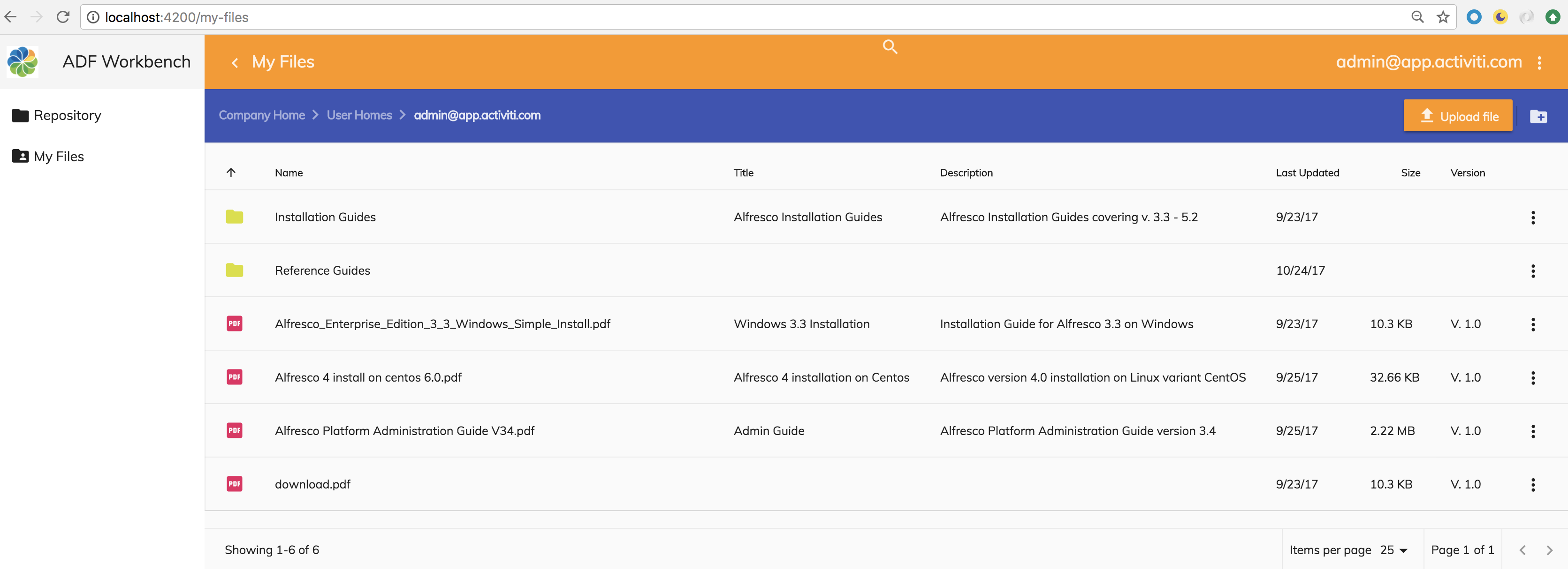
So the list of columns start with the name of the content item, then the title and description from the cm:titled aspect, last updated date (i.e. modified at), size, and version. The size should not be displayed for folders, and the same for version, folder are not versioned.
When we implement this we want to reuse as much as possible from the Repository List page. When building the My Files document list view we will use custom data columns, so it is also worth looking in more detail at the <adf-datatable.
Generating the My Files module and page components
We are going to need a My Files parent page component and a list page component. Plus a module to keep everything organised. Note that we don't need a details page component as we will reuse the one from the Repository implementation.
As usual, we can easily create a new module and the needed components with the Angular CLI tool. Standing in the adf-workbench-content20 directory:
Martins-MacBook-Pro:adf-workbench-content20 mbergljung$ ng g module my-files --flat false --routing
create src/app/my-files/my-files-routing.module.ts (250 bytes)
create src/app/my-files/my-files.module.ts (284 bytes)
Martins-MacBook-Pro:adf-workbench-content20 mbergljung$ cd src/app/my-files
Martins-MacBook-Pro:my-files mbergljung$ ng g component my-files-page
create src/app/my-files/my-files-page/my-files-page.component.css (0 bytes)
create src/app/my-files/my-files-page/my-files-page.component.html (32 bytes)
create src/app/my-files/my-files-page/my-files-page.component.spec.ts (665 bytes)
create src/app/my-files/my-files-page/my-files-page.component.ts (295 bytes)
update src/app/my-files/my-files.module.ts (384 bytes)
Martins-MacBook-Pro:my-files mbergljung$ ng g component my-files-list-page
create src/app/my-files/my-files-list-page/my-files-list-page.component.css (0 bytes)
create src/app/my-files/my-files-list-page/my-files-list-page.component.html (37 bytes)
create src/app/my-files/my-files-list-page/my-files-list-page.component.spec.ts (694 bytes)
create src/app/my-files/my-files-list-page/my-files-list-page.component.ts (314 bytes)
update src/app/my-files/my-files.module.ts (504 bytes)
This creates a my-files module with routing, a my-files parent page, and a my-files list page component where we will display the My Files Document List.
We need to set up a new route configuration similar to what we did for Repository. A parent route with two child routes for list and detail pages. Let’s add it in the src/app/my-files/my-files-routing.module.ts file as follows:
import { NgModule } from '@angular/core';
import { Routes, RouterModule } from '@angular/router';
import { RepositoryDetailsPageComponent } from '../repository/repository-details-page/repository-details-page.component';
import { MyFilesListPageComponent } from './my-files-list-page/my-files-list-page.component';
import { MyFilesPageComponent } from './my-files-page/my-files-page.component';
import { AuthGuardEcm } from '@alfresco/adf-core';
const routes: Routes = [ {
path: 'my-files',
component: MyFilesPageComponent,
canActivate: [AuthGuardEcm],
data: {
title: 'My Files',
icon: 'folder_shared',
hidden: false,
needEcmAuth: true,
isLogin: false
},
children: [
{ path: '', component: MyFilesListPageComponent, canActivate: [AuthGuardEcm] },
{ path: ':node-id', component: RepositoryDetailsPageComponent, canActivate: [AuthGuardEcm] }
]
}];
@NgModule({
imports: [RouterModule.forChild(routes)],
exports: [RouterModule]
})
export class MyFilesRoutingModule { }The cool thing here is that we will reuse the Repository Details page. We most likely want to see a detail view of our files too, and we don’t want to write it from scratch. The route configuration should be familiar and straightforward by now. This parent route is not hidden and should appear in the left navigation section.
We also need to make the new page and route known to the main app. Open up the src/app/app.module.ts file and add as follows:
import { BrowserModule } from '@angular/platform-browser';
import { NgModule } from '@angular/core';
import { AppRoutingModule } from './app-routing.module';
import { AppComponent } from './app.component';
import { AppCommonModule } from './app-common/app-common.module';
import { AppLoginRoutingModule } from './app-login/app-login-routing.module';
import { AppLoginModule } from './app-login/app-login.module';
import { AppMenuService } from './app-menu/app-menu.service';
import { RepositoryRoutingModule } from './repository/repository-routing.module';
import { RepositoryModule } from './repository/repository.module';
import { ContentSearchRoutingModule} from './content-search/content-search-routing.module';
import { ContentSearchModule} from './content-search/content-search.module';
import { MyFilesModule } from './my-files/my-files.module';
import { MyFilesRoutingModule } from './my-files/my-files-routing.module';
@NgModule({
declarations: [
AppComponent
],
imports: [
BrowserModule,
AppRoutingModule,
AppCommonModule,
AppLoginModule,
AppLoginRoutingModule,
RepositoryModule,
RepositoryRoutingModule,
ContentSearchModule,
ContentSearchRoutingModule,
MyFilesModule,
MyFilesRoutingModule
],
providers: [AppMenuService],
bootstrap: [AppComponent]
})
export class AppModule { }Implementing the My Files Parent component
The parent component should only be providing a <router-outlet>. Add it to the src/app/my-files/my-files-page/my-files-page.component.html file as follows:
<router-outlet></router-outlet>Implementing the My Files List component
Now we can move on and implement the My Files List component that will provide a Document List of the files and folders that exists in the /Company Home/User Homes/<userid> folder. Let’s start with the page template. Open up the src/app/my-files/my-files-list-page/my-files-list-page.component.html file and replace whatever is there with the following:
<adf-toolbar [color]="'accent'">
<adf-toolbar-title>
<adf-breadcrumb
root="Company Home"
[target]="documentList"
[folderNode]="documentList.folderNode">
</adf-breadcrumb>
</adf-toolbar-title>
<adf-upload-button
[rootFolderId]="getDocumentListCurrentFolderId()"
[uploadFolders]="false"
[multipleFiles]="true"
[acceptedFilesType]="'*'"
[versioning]="false"
[adf-node-permission]="'create'"
[adf-nodes]="getNodesForPermissionCheck()"
(success)="onButtonUploadSuccess($event)">
</adf-upload-button>
<adf-toolbar-divider></adf-toolbar-divider>
<button
mat-icon-button
[disabled]="!canCreateContent(documentList.folderNode)"
[adf-create-folder]="getDocumentListCurrentFolderId()">
<mat-icon>create_new_folder</mat-icon>
</button>
</adf-toolbar>
<adf-upload-drag-area
[parentId]="getDocumentListCurrentFolderId()"
[adf-node-permission]="'create'"
[adf-nodes]="getNodesForPermissionCheck()"
(success)="onDragAndDropUploadSuccess($event)">
<adf-document-list
#documentList
[navigationMode]="'click'"
[currentFolderId]="getDocumentListCurrentFolderId()"
[contextMenuActions]="true"
[contentActions]="true">
<data-columns>
<data-column key="$thumbnail" type="image"></data-column>
<data-column title="{{'DOCUMENT_LIST.COLUMNS.NAME' | translate}}" key="name" class="full-width ellipsis-cell"></data-column>
<data-column title="{{'DOCUMENT_LIST.COLUMNS.TITLE' | translate}}" key="properties.cm:title" type="text"></data-column>
<data-column title="{{'DOCUMENT_LIST.COLUMNS.DESCRIPTION' | translate}}" key="properties.cm:description" type="text"></data-column>
<data-column title="{{'DOCUMENT_LIST.COLUMNS.LAST_UPDATED' | translate}}" key="modifiedAt" type="date" format="shortDate" ></data-column>
<data-column title="{{'DOCUMENT_LIST.COLUMNS.SIZE' | translate}}" key="content.sizeInBytes" type="fileSize"></data-column>
<data-column title="{{'DOCUMENT_LIST.COLUMNS.VERSION' | translate}}" key="properties.cm:versionLabel">
<ng-template let-value="value">
<span *ngIf="value">V. {{value}}</span>
</ng-template>
</data-column>
</data-columns>
<content-actions>
<!-- Folder actions -->
<content-action
title="{{'DOCUMENT_LIST.ACTIONS.FOLDER.DETAILS' | translate}}"
[icon]="'folder'"
[target]="'folder'"
(execute)="onFolderDetails($event)">
</content-action>
<content-action
title="{{'DOCUMENT_LIST.ACTIONS.FOLDER.DELETE' | translate}}"
[icon]="'delete'"
[target]="'folder'"
[permission]="'delete'"
[disableWithNoPermission]="true"
[handler]="'delete'"
(permissionEvent)="onContentActionPermissionError($event)"
(error)="onContentActionError($event)"
(success)="onContentActionSuccess($event)">
</content-action>
<!-- File actions -->
<content-action
title="{{'DOCUMENT_LIST.ACTIONS.DOCUMENT.DETAILS' | translate}}"
[icon]="'insert_drive_file'"
[target]="'document'"
(execute)="onDocumentDetails($event)">
</content-action>
<content-action
title="{{'DOCUMENT_LIST.ACTIONS.DOCUMENT.DELETE' | translate}}"
[icon]="'delete'"
[target]="'document'"
[permission]="'delete'"
[disableWithNoPermission]="true"
[handler]="'delete'"
(permissionEvent)="onContentActionPermissionError($event)"
(error)="onContentActionError($event)"
(success)="onContentActionSuccess($event)">
</content-action>
</content-actions>
</adf-document-list>
<adf-pagination
[target]="documentList">
</adf-pagination>
</adf-upload-drag-area>We can see here that this template looks a lot like the one we did before in the src/app/repository/repository-list-page/repository-list-page.component.html file. This is because we want the same layout for the My Files List page as for the Repository List page. We want a toolbar at the top with upload button and create folder button. We want to be able to drag-and-drop files into My Files folder. However, we want less content actions (if you need all actions, just copy them over from Repository List...). The only real difference is the data column layout, and you can see the new <data-columns> markup for it above.
Each Document List column is represented by a <data-column> element with a number of attributes. The most significant one is the key, which is the name of the property whose value is to be displayed. We can choose from the following properties of the MinimalNode class, which in turn extends the Node class that looks like this:
export class Node {
constructor(obj?: any);
id?: string;
name?: string;
nodeType?: string;
isFolder?: boolean;
isFile?: boolean;
isLocked?: boolean;
modifiedAt?: Date;
modifiedByUser?: UserInfo;
adddAt?: Date;
adddByUser?: UserInfo;
parentId?: string;
isLink?: boolean;
content?: ContentInfo;
aspectNames?: Array<string>;
properties?: any;
allowableOperations?: Array<string>;
path?: PathInfo;
permissions?: PermissionsInfo;
createdAt?: Date;
createdByUser?: UserInfo;
}Some properties are directly accessible via their name, such as name and modifiedAt. To reach other properties you need to use a path, such as when accessing file content data:
export interface ContentInfo {
mimeType?: string;
mimeTypeName?: string;
sizeInBytes?: number;
encoding?: string;
}To access the size of a content file we use content.sizeInBytes. We can also access other properties that are part of different types of aspects (i.e. secondary types). We access both the title (cm:title) and description (cm:description) from the cm:titled aspect. Note the notation to access these properties, properties.<content model namespace>:localname. For example: properties.cm:description.
It is possible to customize how the value should be displayed for a column. For example, we display the version label with a V in front of it by using the following data column configuration:
<data-column title="{{'DOCUMENT_LIST.COLUMNS.VERSION' | translate}}" key="properties.cm:versionLabel">
<ng-template let-value="value">
<span *ngIf="value">V. {{value}}</span>
</ng-template>
</data-column>Here we first create a variable for the property value called value. We do this with the let-value construct. Then we use ng-template to output our own view of the property value. We also don’t display the value if it is undefined, by using ngIf, which means it will not be displayed as V. for folder nodes.
The title of a data column is fetched from our i18n resource file via the title="{{'DOCUMENT_LIST.COLUMNS.<name> | translate}}" construct. Open up the src/assets/i18n/en.json file and update the column titles as follows:
{
"DOCUMENT_LIST": {
"SEARCH": {
"NO_RESULT": "0 - results found"
},
"COLUMNS": {
"NAME": "Name",
"TITLE": "Title",
"DESCRIPTION": "Description",
"LAST_UPDATED": "Last Updated",
"SIZE": "Size",
"VERSION": "Version"
},
"ACTIONS": {
"FOLDER": {
"DETAILS": "Details",
"DETAILS_FORM": "Details(form)",
"DOWNLOAD_AS_ZIP": "Download as ZIP",
"COPY": "Copy...",
"MOVE": "Move...",
"DELETE": "Delete"
},
"DOCUMENT": {
"DETAILS": "Details",
"DETAILS_FORM": "Details(form)",
"DOWNLOAD": "Download",
"COPY": "Copy...",
"MOVE": "Move...",
"MANAGE_VERSIONS": "Manage Versions...",
"DELETE": "Delete"
}
}
}
}That should do it as far as the page template goes.
Now we need to implement the backing component class. We don’t want to implement everything from scratch like we did for the Repository List page component. Instead we want to reuse as much as possible. Open up the src/app/my-files/my-files-list-page/my-files-list-page.component.ts file and update it to look as follows:
import { Component, OnInit } from '@angular/core';
import { RepositoryListPageComponent } from '../../repository/repository-list-page/repository-list-page.component';
import { ActivatedRoute, Router } from '@angular/router';
import { MatDialog } from '@angular/material';
import { NotificationService, ContentService } from '@alfresco/adf-core';
import { MinimalNodeEntryEntity } from 'alfresco-js-api';
@Component({
selector: 'app-my-files-list-page',
templateUrl: './my-files-list-page.component.html',
styleUrls: ['./my-files-list-page.component.scss']
})
export class MyFilesListPageComponent extends RepositoryListPageComponent implements OnInit {
currentFolderId = '-my-'; // By default display /Company Home/User Homes/<userid>
constructor(notificationService: NotificationService,
contentService: ContentService,
dialog: MatDialog,
activatedRoute: ActivatedRoute,
router: Router) {
super(notificationService, contentService, dialog , activatedRoute, router);
}
ngOnInit() {
super.ngOnInit();
}
onFolderDetails(event: any) {
const entry: MinimalNodeEntryEntity = event.value.entry;
console.log('MyFilesListPageComponent: Navigating to details page for folder: ' + entry.name);
this.router.navigate(['/my-files', entry.id]);
}
onDocumentDetails(event: any) {
const entry: MinimalNodeEntryEntity = event.value.entry;
console.log('MyFilesListPageComponent: Navigating to details page for document: ' + entry.name);
this.router.navigate(['/my-files', entry.id]);
}
}The main thing to note here is that we are extending and reusing the functionality we implemented for the Repository List page component. As usual when extending another class we need to make sure the correct constructor is called with the super(...) call. We also make sure to call the super ngOnInit function. Then we do the fundamental change that will make the document list display the /Company Home/User Homes/<userid> folder, which is My Files. We set the currentFolderId to the pre configured data store -my-.
When the user clicks the Details content action in the My Files list we want the route to be from my-files parent to the reused Repository Details page. So we override the onFolderDetails and onDocumentDetails functions. This way when you do go back from the details page you will end up again in the My Files list.
We have also done another important update to the RepositoryListPageComponent constructor. We changed all the injected objects to be protected instead of private:
constructor(protected notificationService: NotificationService,
protected contentService: AlfrescoContentService,
protected dialog: MdDialog,
protected activatedRoute: ActivatedRoute,
protected router: Router) {
}
That’s pretty much it. The only thing left to do now is to import the components we are using, such as Document List, into the My Files module. Open up the src/app/my-files/my-files.module.ts file and add the following:
import { NgModule } from '@angular/core';
import { CommonModule } from '@angular/common';
import { MyFilesRoutingModule } from './my-files-routing.module';
import { MyFilesPageComponent } from './my-files-page/my-files-page.component';
import { MyFilesListPageComponent } from './my-files-list-page/my-files-list-page.component';
import { AppCommonModule } from '../app-common/app-common.module';
@NgModule({
imports: [
CommonModule,
MyFilesRoutingModule,
/* Common App imports (Angular Core and Material, ADF Core, Content, and Process */
AppCommonModule
],
declarations: [MyFilesPageComponent, MyFilesListPageComponent]
})
export class MyFilesModule { }
Working with Alfresco Share Sites
Most Alfresco projects today uses Alfresco Share Sites to organize content. So we need to know a bit about how to work with site content in ADF. In this section we will implement a Repository view where the top level is the available sites. The user can then navigate into one of these site’s Document Library.
There is only limited support for working with Alfresco Share sitesin ADF. Basically you can list the sites and get access to the Document Library. The extra content types, such as Calendar and Data Lists, are not supported. And they might never be supported as a lot of the Site functionality has been deprecated in ACS.
Introduction to Sites
Share Sites are basically the content that each Alfresco Repository has under the /Company Home/Sites folder. Each site has a top level folder under this folder. And under the top level folder are so called containers for different types of content, such as a Document Library container for managing folders and files.
When displaying sites in the application we want to be able to switch between sites via a drop down box in a toolbar. It will look something like this when finished:
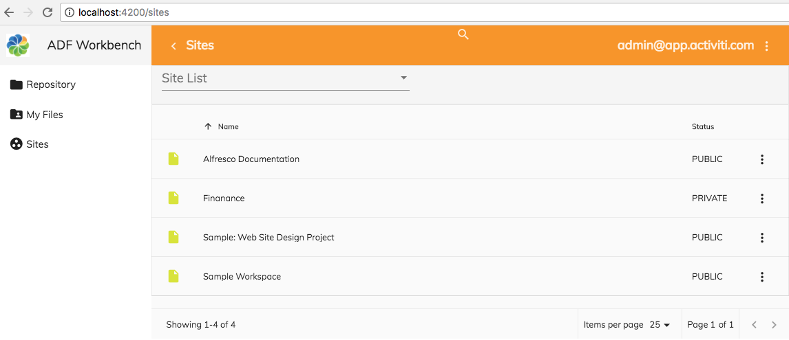
The toolbar with Upload file and Create folder buttons will be disabled when listing the sites.
Clicking the Site List drop down displays all the available sites that the user has permission to see (in this screenshot we are logged in as admin, and hence can see everything, even private sites):

Selecting one of the sites takes you directly into the Document Library for that site, which is where you usually want to work with folders and files:
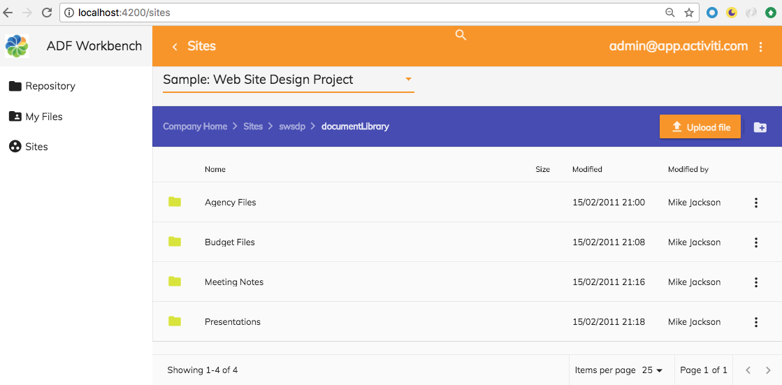
We will use the default document list column layout when working within the site Document Library. An extra toolbar will be added to host the new Site List drop down to the left.
When we implement this we want to reuse as much as possible from the Repository List page and the Repository Details page. The ADF “site control” in the new toolbar is available in the ADF Core library.
Generating new Sites module and page components
We are going to need a Sites parent page component and a Sites list page child component. Plus a module to keep everything organized.
As usual, we can easily create a new module and the needed components with the Angular CLI tool. Standing in the adf-workbench-content20 do:
Martins-MacBook-Pro:adf-workbench-content20 mbergljung$ ng g module sites --flat false --routing
create src/app/sites/sites-routing.module.ts (248 bytes)
create src/app/sites/sites.module.ts (275 bytes)
Martins-MacBook-Pro:adf-workbench-content20 mbergljung$ cd src/app/sites/
Martins-MacBook-Pro:sites mbergljung$ ng g component sites-page
create src/app/sites/sites-page/sites-page.component.css (0 bytes)
create src/app/sites/sites-page/sites-page.component.html (29 bytes)
create src/app/sites/sites-page/sites-page.component.spec.ts (650 bytes)
create src/app/sites/sites-page/sites-page.component.ts (284 bytes)
update src/app/sites/sites.module.ts (365 bytes)
Martins-MacBook-Pro:sites mbergljung$ ng g component sites-list-page
create src/app/sites/sites-list-page/sites-list-page.component.css (0 bytes)
create src/app/sites/sites-list-page/sites-list-page.component.html (34 bytes)
create src/app/sites/sites-list-page/sites-list-page.component.spec.ts (679 bytes)
create src/app/sites/sites-list-page/sites-list-page.component.ts (303 bytes)
update src/app/sites/sites.module.ts (475 bytes)
This creates a sites module with routing, a sites parent page, and a sites list page component where we will display the Sites List.
We need to set up a new route configuration similar to what we did for Repository and My Files. A parent route with two child routes for list and detail pages. Let’s add it in the src/app/sites/sites-routing.module.ts file as follows:
import { NgModule } from '@angular/core';
import { Routes, RouterModule } from '@angular/router';
import { SitesPageComponent } from './sites-page/sites-page.component';
import { SitesListPageComponent } from './sites-list-page/sites-list-page.component';
import { RepositoryDetailsPageComponent } from '../repository/repository-details-page/repository-details-page.component';
import { AuthGuardEcm } from '@alfresco/adf-core';
const routes: Routes = [{
path: 'sites',
component: SitesPageComponent,
canActivate: [AuthGuardEcm],
data: {
title: 'Sites',
icon: 'group_work',
hidden: false,
needEcmAuth: true,
isLogin: false
},
children: [
{ path: '', component: SitesListPageComponent, canActivate: [AuthGuardEcm] },
{ path: ':node-id', component: RepositoryDetailsPageComponent, canActivate: [AuthGuardEcm] }
]
}];
@NgModule({
imports: [RouterModule.forChild(routes)],
exports: [RouterModule]
})
export class SitesRoutingModule { }As with the My Files implementation, we will reuse the Repository Details page as a details page for Site Document Library content. The route configuration should be familiar and straightforward by now. This parent route is not hidden and should appear in the left navigation section.
We also need to make the new page and route known to the main app. Open up the src/app/app.module.ts file and add as follows:
import { BrowserModule } from '@angular/platform-browser';
import { NgModule } from '@angular/core';
import { AppRoutingModule } from './app-routing.module';
import { AppComponent } from './app.component';
import { AppCommonModule } from './app-common/app-common.module';
import { AppLoginRoutingModule } from './app-login/app-login-routing.module';
import { AppLoginModule } from './app-login/app-login.module';
import { AppMenuService } from './app-menu/app-menu.service';
import { RepositoryRoutingModule } from './repository/repository-routing.module';
import { RepositoryModule } from './repository/repository.module';
import { ContentSearchRoutingModule} from './content-search/content-search-routing.module';
import { ContentSearchModule} from './content-search/content-search.module';
import { MyFilesModule } from './my-files/my-files.module';
import { MyFilesRoutingModule } from './my-files/my-files-routing.module';
import { SitesRoutingModule } from './sites/sites-routing.module';
import { SitesModule } from './sites/sites.module';
@NgModule({
declarations: [
AppComponent
],
imports: [
BrowserModule,
AppRoutingModule,
AppCommonModule,
AppLoginModule,
AppLoginRoutingModule,
RepositoryModule,
RepositoryRoutingModule,
ContentSearchModule,
ContentSearchRoutingModule,
MyFilesModule,
MyFilesRoutingModule,
SitesModule,
SitesRoutingModule
],
providers: [AppMenuService],
bootstrap: [AppComponent]
})
export class AppModule { }Implementing the Sites Parent component
The parent component just provides the router-outlet. Open up the src/app/sites/sites-page/sites-page.component.html file and replace whatever is there with the following:
<router-outlet></router-outlet>Implementing the Sites List component
Now we can move on and implement the Sites List component that will provide a Document List of the sites at the top level and a Document List of the files and folders that exists in the /Company Home/Sites/<id>/documentLibrary folder for a site. Let’s start with the page template. Open up the src/app/sites/sites-list-page/sites-list-page.component.html file and replace whatever is there with the following:
<adf-toolbar>
<div class="app-site-container-style">
<adf-sites-dropdown
[hideMyFiles]="true"
(change)="getSiteContent($event)">
</adf-sites-dropdown>
</div>
</adf-toolbar>
<adf-toolbar [color]="'accent'" *ngIf="!siteListing()">
<adf-toolbar-title>
<adf-breadcrumb
root="Company Home"
[target]="documentList"
[folderNode]="documentList.folderNode">
</adf-breadcrumb>
</adf-toolbar-title>
<adf-upload-button
[rootFolderId]="getDocumentListCurrentFolderId()"
[uploadFolders]="false"
[multipleFiles]="true"
[acceptedFilesType]="'*'"
[versioning]="false"
[adf-node-permission]="'create'"
[adf-nodes]="getNodesForPermissionCheck()"
(success)="onButtonUploadSuccess($event)">
</adf-upload-button>
<adf-toolbar-divider></adf-toolbar-divider>
<button
mat-icon-button
[disabled]="!canCreateContent(documentList.folderNode)"
[adf-create-folder]="getDocumentListCurrentFolderId()">
<mat-icon>create_new_folder</mat-icon>
</button>
</adf-toolbar>
<adf-upload-drag-area
[parentId]="getDocumentListCurrentFolderId()"
[adf-node-permission]="'create'"
[adf-nodes]="getNodesForPermissionCheck()"
(success)="onDragAndDropUploadSuccess($event)">
<adf-document-list
#documentList
[navigationMode]="'click'"
[currentFolderId]="getDocumentListCurrentFolderId()"
[contextMenuActions]="true"
[contentActions]="true">
<content-actions>
<!-- Folder actions -->
<content-action
title="{{'DOCUMENT_LIST.ACTIONS.FOLDER.DETAILS' | translate}}"
[icon]="'folder'"
[target]="'folder'"
(execute)="onDetails($event)">
</content-action>
<content-action
title="{{'DOCUMENT_LIST.ACTIONS.FOLDER.DELETE' | translate}}"
[icon]="'delete'"
[target]="'folder'"
[permission]="'delete'"
[disableWithNoPermission]="true"
[handler]="'delete'"
(permissionEvent)="onContentActionPermissionError($event)"
(error)="onContentActionError($event)"
(success)="onContentActionSuccess($event)">
</content-action>
<!-- File actions -->
<content-action
title="{{'DOCUMENT_LIST.ACTIONS.DOCUMENT.DETAILS' | translate}}"
[icon]="'insert_drive_file'"
[target]="'document'"
(execute)="onDetails($event)">
</content-action>
<content-action
title="{{'DOCUMENT_LIST.ACTIONS.DOCUMENT.DELETE' | translate}}"
[icon]="'delete'"
[target]="'document'"
[permission]="'delete'"
[disableWithNoPermission]="true"
[handler]="'delete'"
(permissionEvent)="onContentActionPermissionError($event)"
(error)="onContentActionError($event)"
(success)="onContentActionSuccess($event)">
</content-action>
</content-actions>
</adf-document-list>
<adf-pagination
[target]="documentList">
</adf-pagination>
</adf-upload-drag-area>What we have done here is copy the My Files list template and then added an extra toolbar at the top with the <adf-sites-dropdown ADF control drop down. Note that in contrast to My Files we do not customize the data-table column layout. For the site list drop down to work we need to implement the getSiteContent function that should return what content (i.e. folder) that should be displayed for the site when it is selected.
We will also hide the toolbar with the Upload files and Create Folder buttons if we are listing just the sites. This is checked by the siteListing() function.
That should do it as far as the page template goes. We need a bit of styling around the adf-sites-dropdown so add the app-site-container-style CSS class as follows in the src/app/sites/sites-list-page/sites-list-page.component.scss file:
.app-site-container-style {
margin-top: 10px;
margin-bottom: 10px;
width: 100%;
min-width: 250px;
}
.adf-site-dropdown-container {
width: 400px;
.mat-form-field {
display: block;
margin-bottom: 15px;
}
}Note how we also override one of the ADF CSS classes called adf-site-dropdown-container to be able to set the width. For this to work we need to set component encapsulation to ViewEncapsulation.None. See the component class implementation next.
Now we need to implement the backing component class. We don’t want to implement everything from scratch like we did for the Repository List page component. Instead we want to reuse as much as possible. Open up the src/app/sites/sites-list-page/sites-list-page.component.ts file and update it to look as follows:
import { Component, OnInit, ViewEncapsulation } from '@angular/core';
import { ActivatedRoute, Router } from '@angular/router';
import { MatDialog } from '@angular/material';
import { SiteModel, NotificationService, ContentService, AlfrescoApiService } from '@alfresco/adf-core';
import { RepositoryListPageComponent } from '../../repository/repository-list-page/repository-list-page.component';
import { MinimalNodeEntity, MinimalNodeEntryEntity } from 'alfresco-js-api';
@Component({
selector: 'app-sites-list-page',
templateUrl: './sites-list-page.component.html',
styleUrls: ['./sites-list-page.component.scss'],
encapsulation: ViewEncapsulation.None
})
export class SitesListPageComponent extends RepositoryListPageComponent implements OnInit {
sitesDataStore = '-sites-'; // By default display /Company Home/Sites
currentFolderId = this.sitesDataStore;
constructor(notificationService: NotificationService,
contentService: ContentService,
dialog: MatDialog,
activatedRoute: ActivatedRoute,
router: Router,
private apiService: AlfrescoApiService) {
super(notificationService, contentService, dialog , activatedRoute, router);
}
ngOnInit() {
super.ngOnInit();
}
siteListing() {
return this.currentFolderId === this.sitesDataStore;
}
getSiteContent(site: SiteModel) {
if (site && site.guid) {
this.getDocumentLibrarySiteContainer(site);
} else {
this.currentFolderId = this.sitesDataStore;
}
}
onDetails(event: any) {
const entry: MinimalNodeEntryEntity = event.value.entry;
this.router.navigate(['/sites', entry.id]);
}
private getDocumentLibrarySiteContainer(site: SiteModel): any {
const include = ['properties'];
const documentLibraryContainerId = 'documentLibrary';
this.apiService.getInstance().core.sitesApi.getSiteContainer(
site.id, documentLibraryContainerId, include).then((nodeEntity: MinimalNodeEntity) => {
const node: MinimalNodeEntryEntity = nodeEntity.entry;
this.currentFolderId = node.id;
});
}
}The main thing to note here is that we are extending and reusing the functionality we implemented for the Repository List page component. As usual when extending another class we need to make sure the correct constructor is called with super(). We also make sure to call the super ngOnInit function.
Then we do the fundamental change that will make the document list display the /Company Home/Sites folder by default. We set the currentFolderId to the pre configured data store -sites-. This also customises the document list view when you are just looking at a list of sites. Only the Name and Status columns are visible, the toolbar buttons are disabled, and there are no breadcrumbs. When you select a site from the Site List drop down the Document Library content is displayed in the default data table layout with the standard columns Name, Size, Modified, and Modified By.
This is achieved by the getSiteContent function implementation:
getSiteContent(site: SiteModel) {
if (site && site.guid) {
this.getDocumentLibrarySiteContainer(site);
} else {
this.currentFolderId = this.sitesDataStore;
}
}
It calls a method called getDocumentLibrarySiteContainer:
private getDocumentLibrarySiteContainer(site: SiteModel): any {
const include = ['properties'];
const documentLibraryContainerId = 'documentLibrary';
this.apiService.getInstance().core.sitesApi.getSiteContainer(
site.id, documentLibraryContainerId, include).then((nodeEntity: MinimalNodeEntity) => {
const node: MinimalNodeEntryEntity = nodeEntity.entry;
this.currentFolderId = node.id;
});
}This function uses the sitesApi to get the documentLibrary container for a specific site id.
When the user clicks the Details content action for an item in the list we want the route to be from sites parent to the reused Repository Details page. So we override the onFolderDetails and onDocumentDetails functions. This way when you do go back from the details page you will end up again in the Site document list.
That’s pretty much it. The only thing left to do now is to import the components we are using, such as Document List, into the Sites module. Open up the src/app/sites/sites.module.ts file and add the following:
import { NgModule } from '@angular/core';
import { CommonModule } from '@angular/common';
import { SitesRoutingModule } from './sites-routing.module';
import { SitesPageComponent } from './sites-page/sites-page.component';
import { SitesListPageComponent } from './sites-list-page/sites-list-page.component';
import { AppCommonModule } from '../app-common/app-common.module';
@NgModule({
imports: [
CommonModule,
SitesRoutingModule,
/* Common App imports (Angular Core and Material, ADF Core, Content, and Process */
AppCommonModule
],
declarations: [SitesPageComponent, SitesListPageComponent]
})
export class SitesModule { }Summary
To work with version 2.0 of the Alfresco Application Development Framework (ADF) is a very rewarding journey. The extensive range of ADF components that are available means that you can build a content management application from scratch in no time, picking the pieces you need.
My goal was to build a content management application where I could login and browse the repository, search the repository, upload files, view the details for folders and files, create new folders, edit metadata, and see a preview of the files. I was a bit sceptical in the beginning if it would be possible to do all that by just picking and choosing components, adding as I went along. But it really does work!
Next you might want to do the same on the APS side, check out the Building a Process Management App with ADF 2.0.0 article.
Blog posts and updates about Application Development Framework (ADF).
- Extending the Alfresco Digital Workspace (ADW)
- Developing Take Ownership Extension for ACA 2.8.0
- Creating your first extension for Alfresco Content...
- ADF 4.0.0 is out!
- Hey Front-End Developer, what are your preferred o...
- We want to (thank and) reward our ADF contributors...
- How to update ADF from version 2.5.0 to 2.6.1
- Application Development Framework (ADF) 2.6.1 Rele...
- ADF 2.6.0 Release Note
- How to update ADF from version 2.4.0 to 2.5.0
- ADF 2.5.0 Release Note
- ADF 2.4.0 Release Note
- How to deploy an ADF APP
- How To Add The New Sidenav Layout Component In You...
- How to integrate ADF log service with Mixpanel an...
We use cookies on this site to enhance your user experience
By using this site, you are agreeing to allow us to collect and use cookies as outlined in Alfresco’s Cookie Statement and Terms of Use (and you have a legitimate interest in Alfresco and our products, authorizing us to contact you in such methods). If you are not ok with these terms, please do not use this website.
