Create a Tooltip in Alfresco Process Services Forms
Turn on suggestions
Auto-suggest helps you quickly narrow down your search results by suggesting possible matches as you type.
Showing results for
- Alfresco Hub
- :
- APS & Activiti - Hub Docs
- :
- Create a Tooltip in Alfresco Process Services Form...
Create a Tooltip in Alfresco Process Services Forms
- Subscribe to RSS Feed
- Mark as New
- Mark as Read
- Bookmark
- Subscribe
- Printer Friendly Page
- Report Inappropriate Content
31 Oct 2017
4:24 PM
This article will show how to use the stencil feature in Alfresco Process Services powered by Activiti to implement a tooltip in forms. I'll be using the Tooltip directives from Angular UI Bootstrap component for this implementation.
- Download the javascript library from Angular directives for Bootstrap.
- Copy the downloaded file "ui-bootstrap-tpls-2.5.0.min.js" to your APS web app "activiti-app/libs/ui-bootstrap-tpls-2.5.0/ui-bootstrap-tpls-2.5.0.min.js"
- Include this library in "activiti-app/workflow/index.html" as shown below
<script src="../libs/ui-bootstrap-tpls-2.5.0/ui-bootstrap-tpls-2.5.0.min.js"></script> - Open the resource loader (activiti-app/scripts/resource-loader.js) file and include this dependency prior to bootstrap as shown below. Line# 10-13 is all I added.
for (var i = 0, il = res.length; i < il; i++) {
load(res[i], resourceLoaderElement, function(){
loadedResources++;
if (loadedResources == res.length) {
// Let angular resume bootstrap
var interval = window.setInterval(function(){
if (angular && typeof angular.bootstrap == 'function') {
angular.element(document.body).ready(function() {
// Add custom module dependencies
if(angularModuleName == "activitiApp"){
angular.module(angularModuleName).requires.push("ui.bootstrap.tooltip");
}
// angular, all of our resources & the document body are ready, lets bootstrap the app
angular.bootstrap(document.body, [angularModuleName]);
});
window.clearInterval(interval);
}
}, 20);
}
});
} - Now we need to update the form-element template to show this tooltip. For example, if you want to show the tooltip on a text field, open the activiti-app/workflow/views/templates/form-element-template.html and add lines 6-9 shown below to the file. For more details on the usage please refer Angular directives for Bootstrap
<div ng-switch-when="text" class="form-group {{field.className}}" ng-show="field.isVisible" ng-class="{'has-error': field.required && isEmpty(field)}">
<label class="control-label">{{field.name}}</label>
<span class="marker" ng-if="field.required">*</span>
<input id="{{activitiFieldIdPrefix + field.id}}" type="text" name="{{field.id}}" class="form-control" placeholder="{{field.placeholder}}" ng-model="field.value" ng-change="onFieldValueChange(field)" ng-blur="onFieldBlur(field)" ng-focus="onFieldFocus(field)"
uib-tooltip="{{field.params.customProperties.tooltip}}"
tooltip-placement="'top'"
tooltip-trigger="'focus'"
tooltip-enable="true"
ng-required="field.required"
ng-minlength="field.minLength || ''"
ng-maxlength="field.maxLength || ''"
maxlength="{{field.maxLength || ''}}"
ng-pattern="field.regexPattern || ''"
ng-model-options="{ allowInvalid: true }"
masked-input="{{field.params.inputMask}}"
masked-input-placeholder="{{field.params.inputMaskPlaceholder}}"
masked-input-reversed="{{field.params.inputMaskReversed}}">
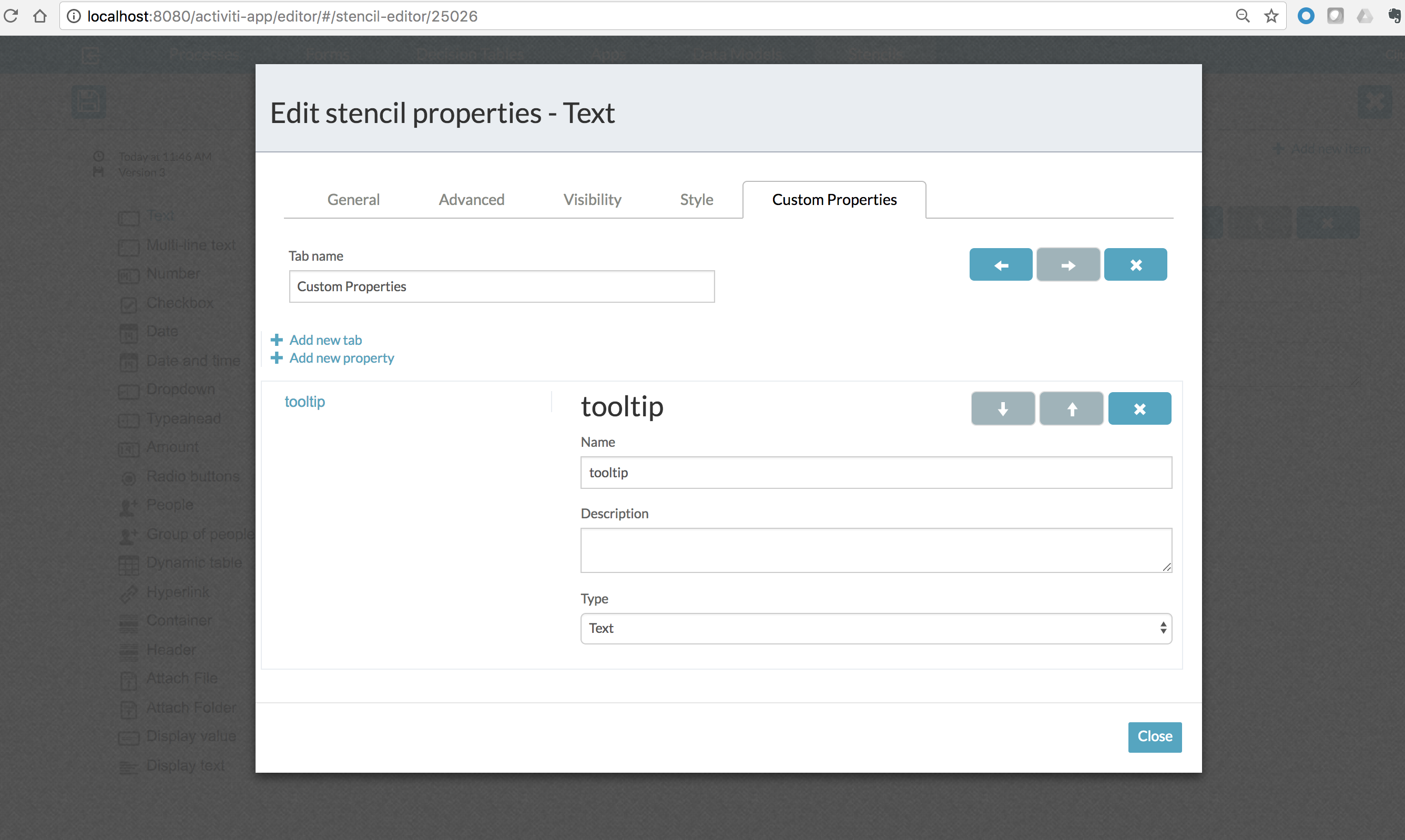
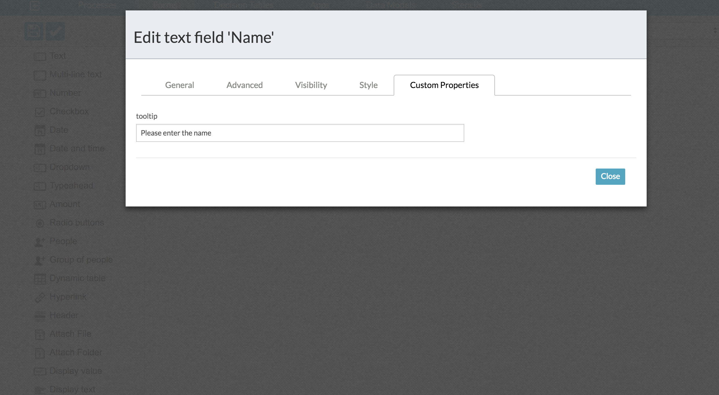
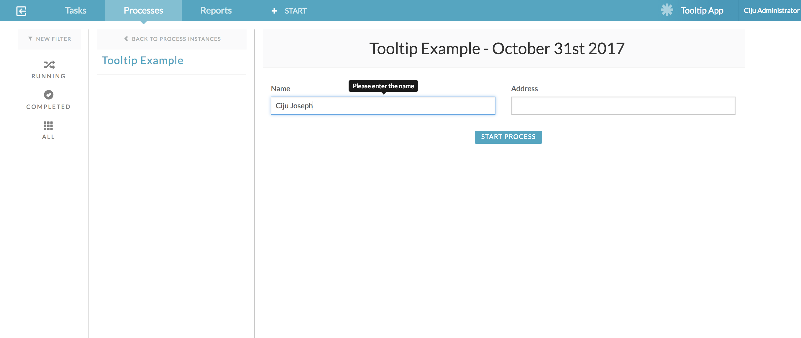
</div> - Now import my example app into APS via App Designer (Kickstart App) -> Apps -> Import App. Once the “App” is successfully imported, the stencil along with an example process and form will also get imported which will make it easy for you to see this examples in action! Given below are some screenshots of stencil, form design time and form runtime. For more details on stencil configuration and form configuration please check the imported stencil and process form.
Stencil Configuration

Form Designtime

Form Runtime

1 Comment
Alfresco Process Services Archive Docs
Alfresco Hub documents relating to Alfresco Process Services and Activiti.
Latest Articles
- GAAP.bpmn20.xml
- Create a Tooltip in Alfresco Process Services Form...
- Alfresco Process Services 1.7 Available Now
- AnnualBonusActiviti6.zip
- Annual bonus (1).zip
- Single ticket price calculator.dmn
- REST Example.zip
- TestJava7SerializationBug.bpmn
- Getting Started with Alfresco Process Services
- Installing Alfresco Process Services Trial using a...
- Welcome to the New Alfresco Process Service & Acti...
- Activiti - Engine 5.21.0 API
- 10 Minute Tutorial
- Activiti ReadMe
We use cookies on this site to enhance your user experience
By using this site, you are agreeing to allow us to collect and use cookies as outlined in Alfresco’s Cookie Statement and Terms of Use (and you have a legitimate interest in Alfresco and our products, authorizing us to contact you in such methods). If you are not ok with these terms, please do not use this website.
